
 By
By
A rash start into adventure
So we told our client that yes, of course, we would do their Firefox OS app. We didn’t know much about FFOS at the time. But, hey, we had just completed refactoring their native iOS and Android apps. Web applications were our core business all along. So what was to be feared?
More than we thought, it turned out. Some of the dragons along the way we fought and defeated ourselves. At times we feared that we wouldn’t be able to rescue the princess in time (i.e. before MWC 2013). But whenever we got really lost in detail forest, the brave knights from Mozilla came to our rescue. In the end, it all turned out well and the team lived happily ever after.
But here’s the full story:
Mission & challenge
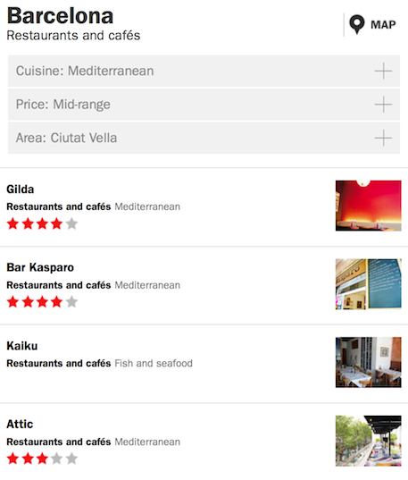
Just like their iOS and Android apps, Time Out‘s new Firefox OS app was supposed to allow browsing their rich content on bars, restaurants, things to do and more by category, area, proximity or keyword search, patient zero being Barcelona. We would need to show results as illustrated lists as well as visually on a map and have a decent detail view, complete with ratings, access details, phone button and social tools.
But most importantly, and in addition to what the native apps did, this app was supposed to do all of that even when offline.
Oh, and there needed to be a presentable, working prototype in four weeks time.
Cross-platform reusability of the code as a mobile website or as the base of HTML5 apps on other mobile platforms was clearly prio 2 but still to be kept in mind.
The princess was clearly in danger. So we arrested everyone on the floor that could possibly be of help and locked them into a room to get the basics sorted out. It quickly emerged that the main architectural challenges were that
- we had a lot of things to store on the phone, including the app itself, a full street-level map of Barcelona, and Time Out’s information on every venue in town (text, images, position & meta info),
- at least some of this would need to be loaded from within the app; once initially and synchronizable later,
- the app would need to remain interactively usable during these potentially lengthy downloads, so they’d need to be asynchronous,
- whenever the browser location changed, this would be interrupted
In effect, all the different functionalities would have to live within one single HTML document.
One document plus hash tags
For dynamically rendering, changing and moving content around as required in a one-page-does-all scenario, JavaScript alone didn’t seem like a wise choice. We’d been warned that Firefox OS was going to roll out on a mix of devices including the very low cost class, so it was clear that fancy transitions of entire full-screen contents couldn’t be orchestrated through JS loops if they were to happen smoothly.
On the plus side, there was no need for JS-based presentation mechanics. With Firefox OS not bringing any graveyard of half-dead legacy versions to cater to, we could (finally!) rely on HTML5 and CSS3 alone and without fallbacks. Even beyond FFOS, the quick update cycles in the mobile environment didn’t seem to block the path for taking a pure CSS3 approach further to more platforms later.
That much being clear, which better place to look for best practice examples than Mozilla Hacks? After some digging, Thomas found Hacking Firefox OS in which Luca Greco describes the use of fragment identifiers (aka hashtags) appended to the URL to switch and transition content via CSS alone, which we happily adopted.
Another valuable source of ideas was a list of GAIA building blocks on Mozilla’s website, which has since been replaced by the even more useful Building Firefox OS site.
In effect, we ended up thinking in terms of screens. Each physically a <div>, whose visibility and transitions are governed by :target CSS selectors that draw on the browser location’s hashtag. Luckily, there’s also the <a href="https://developer.mozilla.org/en-US/docs/Web/API/window.onhashchange">onHashChange</a> event that we could additionally listen to in order to handle the app-level aspects of such screen changes in JavaScript.
Our main HTML and CSS structure hence looked like this:
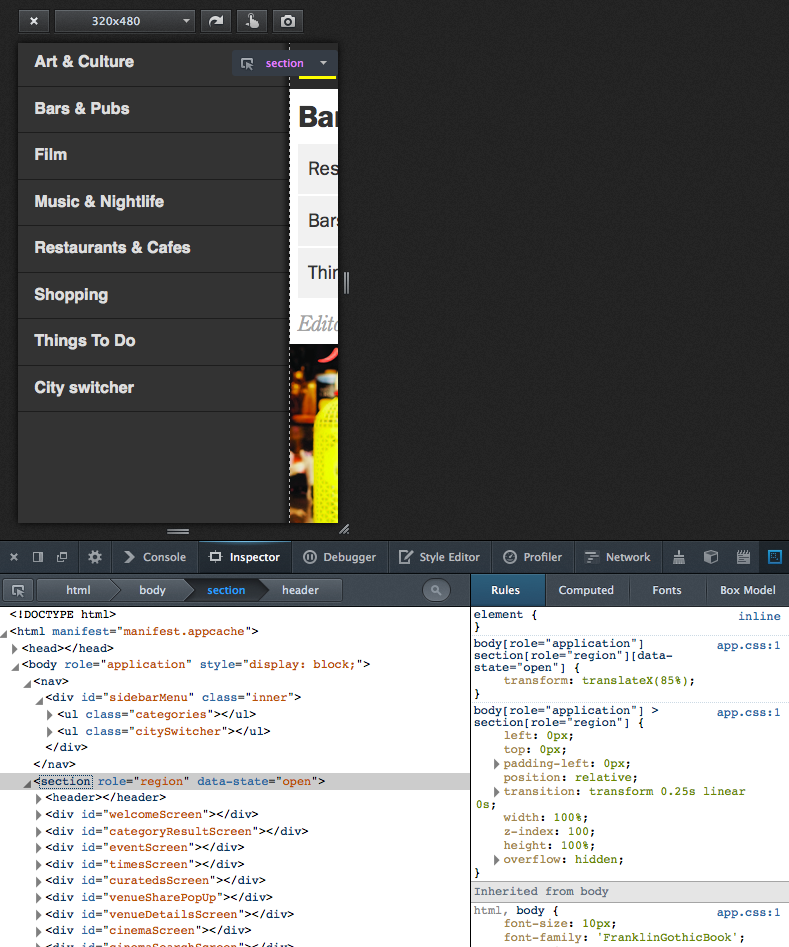
And a menu
We modeled the drawer menu very similarily, just that it sits in a <nav> element on the same level as the <section> container holding all the screens. Its activation and deactivation works by catching the menu icon clicks, then actively changing the screen container’s data-state attribute from JS, which triggers the corresponding CSS3 slide-in / slide-out transition (of the screen container, revealing the menu beneath).
This served as our “Hello, World!” test for CSS3-based UI performance on low-end devices, plus as a test case for combining presentation-level CSS3 automation with app-level explicit status handling. We took down a “yes” for both.
UI
By the time we had put together a dummy around these concepts, the first design mockups from Time Out came in so that we could start to implement the front end and think about connecting it to the data sources.
For presentation, we tried hard to keep the HTML and CSS to the absolute minimum. Mozilla’s GAIA examples being a very valuable source of ideas once more.
Again, targeting Firefox OS alone allowed us to break free of the backwards compatibility hell that we were still living in, desktop-wise. No one would ask us Will it display well in IE8? or worse things. We could finally use real <section>, <nav>, <header>, and <menu> tags instead of an army of different classes of <div>. What a relief!
The clear, rectangular, flat and minimalistic design we got from Time Out also did its part to keep the UI HTML simple and clean. After we were done with creating and styling the UI for 15 screens, our HTML had only ~250 lines. We later improved that to 150 while extending the functionality, but that’s a different story.
Speaking of styling, not everything that had looked good on desktop Firefox even in its responsive design view displayed equally well on actual mobile devices. Some things that we fought with and won:
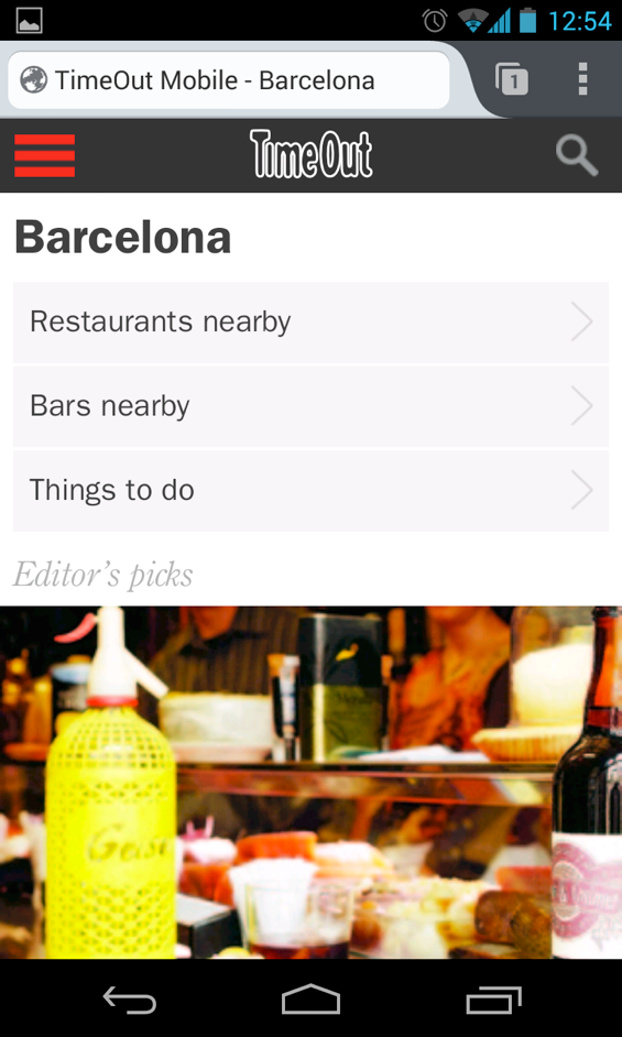
Scale: The app looked quite different when viewed on the reference device (a TurkCell branded ZTE device that Mozilla had sent us for testing) and on our brand new Nexus 4s:

After a lot of experimenting, tearing some hair and looking around how others had addressed graceful, proportional scaling for a consistent look & feel across resolutions, we stumbled upon this magic incantation:
<meta name="viewport" content="user-scalable=no, initial-scale=1, maximum-scale=1, width=device-width" /> |
What it does, to quote an article at Opera, is to tell the browser that there is “No scaling needed, thank you very much. Just make the viewport as many pixels wide as the device screen width”. It also prevents accidental scaling while the map is zoomed. There is more information on the topic at MDN.
Then there are things that necessarily get pixelated when scaled up to high resolutions, such as the API based venue images. Not a lot we could do about that. But we could at least make the icons and logo in the app’s chrome look nice in any resolution by transforming them to SVG.
Another issue on mobile devices was that users have to touch the content in order to scroll it, so we wanted to prevent the automatic highlighting that comes with that:
li, a, span, button, div
{
    outline:none;
    -moz-tap-highlight-color: transparent;
    -moz-user-select: none;
    -moz-user-focus:ignore
}
|
We’ve since been warned that suppressing the default highlighting can be an issue in terms of accessibility, so you might wanted to consider this carefully.
Connecting to the live data sources
So now we had the app’s presentational base structure and the UI HTML / CSS in place. It all looked nice with dummy data, but it was still dead.
Trouble with bringing it to life was that Time Out was in the middle of a big project to replace its legacy API with a modern Graffiti based service and thus had little bandwidth for catering to our project’s specific needs. The new scheme was still prototypical and quickly evolving, so we couldn’t build against it.
The legacy construct already comprised a proxy that wrapped the raw API into something more suitable for consumption by their iOS and Android apps, but after close examination we found that we better re-re-wrap that on the fly in PHP for a couple of purposes:
- Adding CORS support to avoid XSS issues, with the API and the app living in different subdomains of timeout.com,
- stripping API output down to what the FFOS app really needed, which we could see would reduce bandwidth and increase speed by magnitude,
- laying the foundation for harvesting of API based data for offline use, which we already knew we’d need to do later
As an alternative to server-side CORS support, one could also think of using the SystemXHR API. It is a mighty and potentially dangerous tool however. We also wanted to avoid any needless dependency on FFOS-only APIs.
So while the approach wasn’t exactly future proof, it helped us a lot to get to results quickly, because the endpoints that the app was calling were entirely of our own choice and making, so that we could adapt them as needed without time loss in communication.
Populating content elements
For all things dynamic and API-driven, we used the same approach at making it visible in the app:
- Have a simple, minimalistic, empty, hidden, singleton HTML template,
- clone that template (N-fold for repeated elements),
- ID and fill the clone(s) with API based content.
- For super simple elements, such as
<li>s, save the cloning and whip up the HTML on the fly while filling.
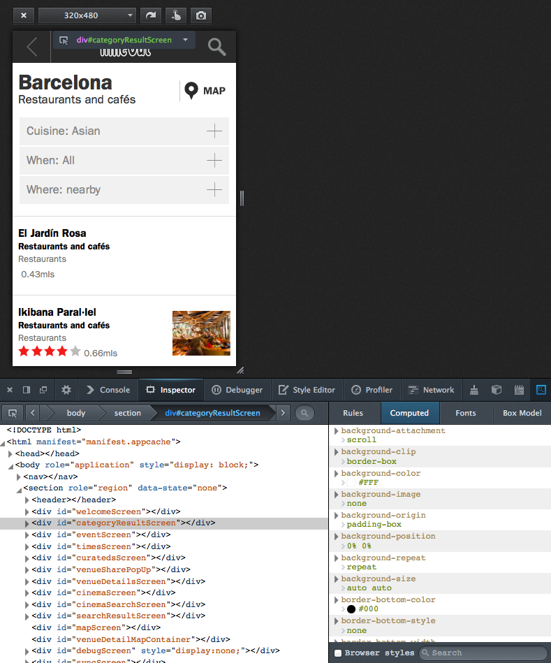
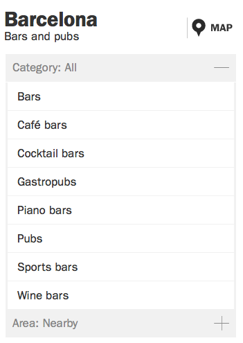
As an example, let’s consider the filters for finding venues. Cuisine is a suitable filter for restaurants, but certainly not for museums. Same is true for filter values. There are vegetarian restaurants in Barcelona, but certainly no vegetarian bars. So the filter names and lists of possible values need to be asked of the API after the venue type is selected.
In the UI, the collapsible category filter for bars & pubs looks like this:
The template for one filter is a direct child of the one and only
<div id="templateContainer"> |
which serves as our central template repository for everything cloned and filled at runtime and whose only interesting property is being invisible. Inside it, the template for search filters is:
<div id="filterBoxTemplate"> <span></span> <ul></ul> </div> |
So for each filter that we get for any given category, all we had to do was to clone, label, and then fill this template:
$('#filterBoxTemplate').clone().attr('id', filterItem.id).appendTo(
'#categoryResultScreen .filter-container');
...
$("#" + filterItem.id).children('.filter-button').html(
filterItem.name);
|
As you certainly guessed, we then had to to call the API once again for each filter in order to learn about its possible values, which were then rendered into <li> elements within the filter‘s <ul> on the fly:
$("#" + filterId).children('.filter_options').html(
'<li><span>Loading ...</span></li>');

apiClient.call(filterItem.api_method, function (filterOptions)
{
  ...
  $.each(filterOptions, function(key, option)
  {
    var entry = $('<li filterId="' + option.id + '"><span>'
      + option.name + '</span></li>');

    if (selectedOptionId && selectedOptionId == filterOptionId)
    {
      entry.addClass('filter-selected');
    }

    $("#" + filterId).children('.filter_options').append(entry);
  });
...
});
|
DOM based caching
To save bandwidth and increase responsiveness in on-line use, we took this simple approach a little further and consciously stored more application level information in the DOM than needed for the current display if that information was likely needed in the next step. This way, we’d have easy and quick local access to it without calling – and waiting for – the API again.
The technical way we did so was a funny hack. Let’s look at the transition from the search result list to the venue detail view to illustrate:
 ➔
➔
As for the filters above, the screen class for the detailView has an init() method that populates the DOM structure based on API input as encapsulated on the application level. The trick now is, while rendering the search result list, to register anonymous click handlers for each of its rows, which – JavaScript passing magic – contain a copy of, rather than a reference to, the venue objects used to render the rows themselves:
renderItems: function (itemArray)
{
  ...

  $.each(itemArray, function(key, itemData)
  {
    var item = screen.dom.resultRowTemplate.clone().attr('id',
      itemData.uid).addClass('venueinfo').click(function()
    {
      $('#mapScreen').hide();
      screen.showDetails(itemData);
    });

    $('.result-name', item).text(itemData.name);
    $('.result-type-label', item).text(itemData.section);
    $('.result-type', item).text(itemData.subSection);

    ...

    listContainer.append(item);
  });
},

...

showDetails: function (venue)
{
  require(['screen/detailView'], function (detailView)
  {
    detailView.init(venue);
  });
},
|
In effect, there’s a copy of the data for rendering each venue’s detail view stored in the DOM. But neither in hidden elements nor in custom attributes of the node object, but rather conveniently in each of the anonymous pass-by-value-based click event handlers for the result list rows, with the added benefit that they don’t need to be explicitly read again but actively feed themselves into the venue details screen as soon a row receives a touch event.
And dummy feeds
Finishing the app before MWC 2013 was pretty much a race against time, both for us and for Time Out’s API folks, who had an entirely different and equally – if not more so – sportive thing to do. Therefore they had very limited time for adding to the (legacy) API that we were building against. For one data feed, this meant that we had to resort to including static JSON files into the app’s manifest and distribution; then use relative, self-referencing URLs as fake API endpoints. The illustrated list of top venues on the app’s main screen was driven this way.
Not exactly nice, but much better than throwing static content into the HTML! Also, it kept the display code already fit for switching to the dynamic data source that eventually materialized later, and compatible with our offline data caching strategy.
As the lack of live data on top venues then extended right to their teaser images, we made the latter physically part of the JSON dummy feed. In Base64  But even the low-end reference device did a graceful job of handling this huge load of ASCII garbage.
State preservation
We had a whopping 5M of local storage to spam, and different plans already (as well as much higher needs) for storing the map and application data for offline use. So what to do with this liberal and easily accessed storage location? We thought we could at least preserve the current application state here, so you’d find the app exactly as you left it when you returned to it.

Map
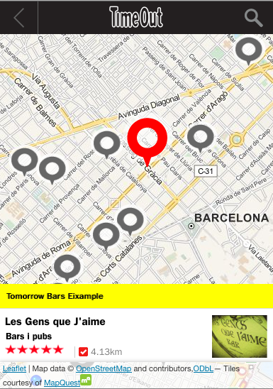
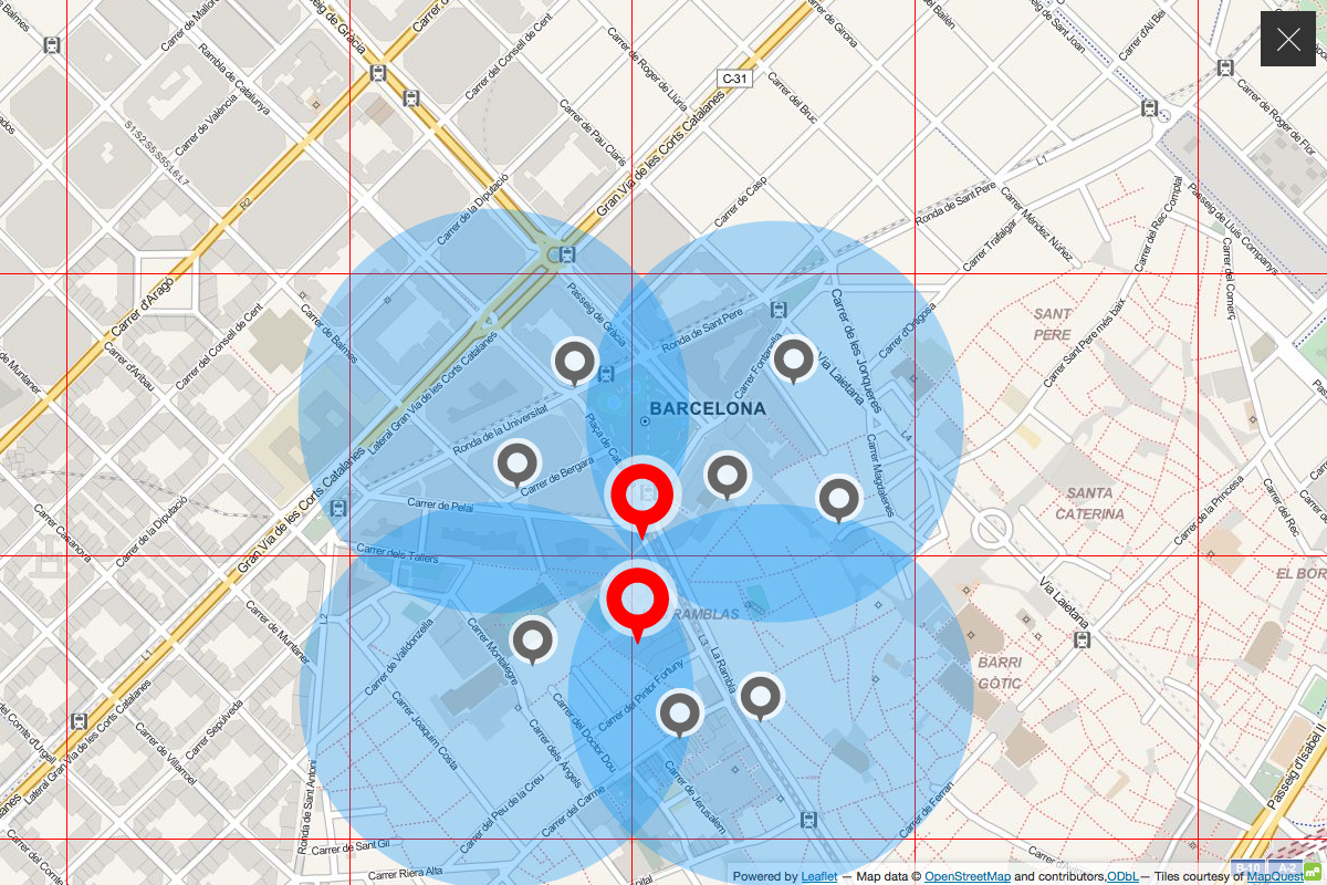
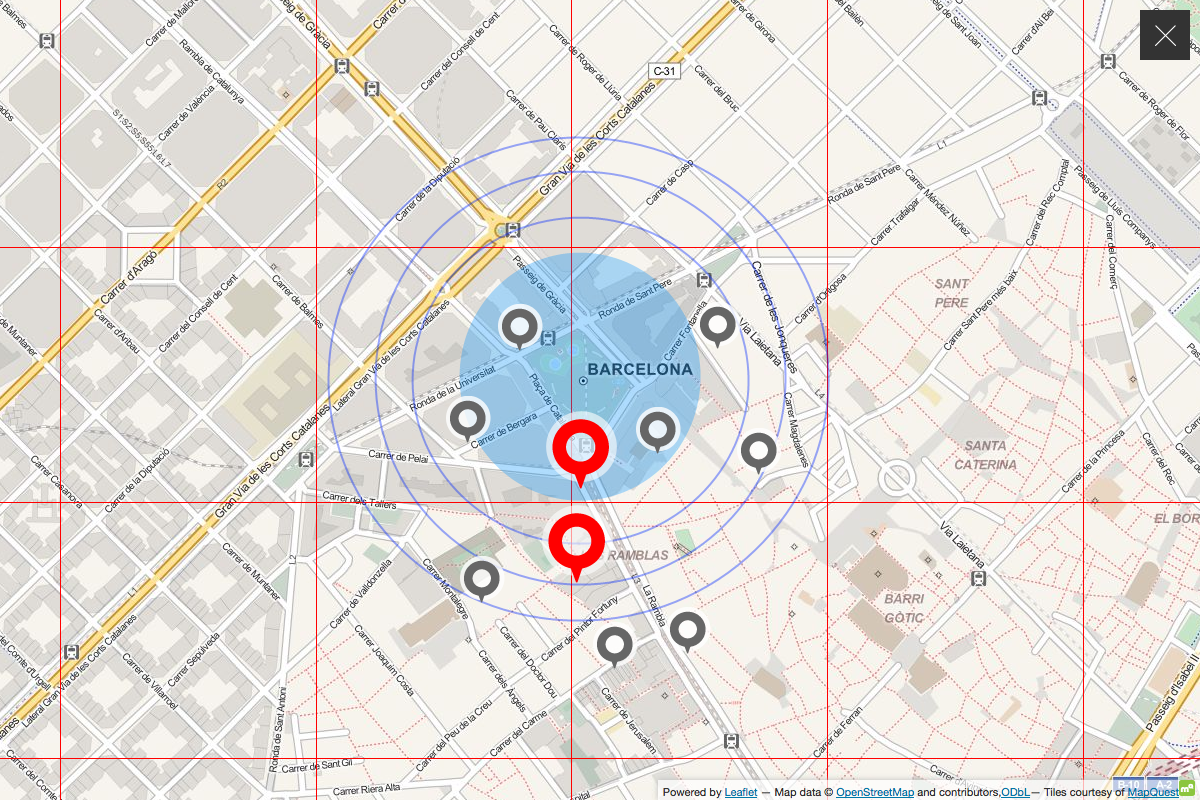
A city guide is the very showcase of an app that’s not only geo aware but geo centric. Maps fit for quick rendering and interaction in both online and offline use were naturally a paramount requirement.
After looking around what was available, we decided to go with Leaflet, a free, easy to integrate, mobile friendly JavaScript library. It proved to be really flexible with respect to both behaviour and map sources.
With its support for pinching, panning and graceful touch handling plus a clean and easy API, Leaflet made us arrive at a well-usable, decent-looking map with moderate effort and little pain:
For a different project, we later rendered the OSM vector data for most of Europe into terabytes of PNG tiles in cloud storage using on-demand cloud power. Which we’d recommend as an approach if there’s a good reason not to rely on 3rd party hosted apps, as long as you don’t try this at home; Moving the tiles may well be slower and more costly than their generation.
But as time was tight before the initial release of this app, we just – legally and cautiously(!) – scraped ready-to use OSM tiles off MapQuest.com.
The packaging of the tiles for offline use was rather easy for Barcelona because about 1000 map tiles are sufficient to cover the whole city area up to street level (zoom level 16). So we could add each tile as a single line into the manifest.appache file. The resulting, fully automatic, browser-based download on first use was only 10M.
This left us with a lot of lines like
/mobile/maps/barcelona/15/16575/12234.png /mobile/maps/barcelona/15/16575/12235.png ... |
in the manifest and wishing for a $GENERATE clause as for DNS zone files.
As convenient as it may seem to throw all your offline dependencies’ locations into a single file and just expect them to be available as a consequence, there are significant drawbacks to this approach. The article Application Cache is a Douchebag by Jake Archibald summarizes them and some help is given at Html5Rocks by Eric Bidleman.
We found at the time that the degree of control over the current download state, and the process of resuming the app cache load in case that the initial time users spent in our app didn’t suffice for that to complete was rather tiresome.
For Barcelona, we resorted to marking the cache state as dirty in Local Storage and clearing that flag only after we received the updateready event of the window.applicationCache object but in the later generalization to more cities, we moved the map away from the app cache altogether.
Offline storage
The first step towards offline-readiness was obviously to know if the device was online or offline, so we’d be able to switch the data source between live and local.
This sounds easier than it was. Even with cross-platform considerations aside, neither the online state property (window.navigator.onLine), the events fired on the <body> element for state changes (“online” and “offline”, again on the <body>), nor the navigator.connection object that was supposed to have the on/offline state plus bandwidth and more, really turned out reliable enough.
Standardization is still ongoing around all of the above, and some implementations are labeled as experimental for a good reason
We ultimately ended up writing a NetworkStateService class that uses all of the above as hints, but ultimately and very pragmatically convinces itself with regular HEAD requests to a known live URL that no event went missing and the state is correct.
That settled, we still needed to make the app work in offline mode. In terms of storage opportunities, we were looking at:
| Storage | Capacity | Updates | Access | Typical use |
|---|---|---|---|---|
| App / app cache, i.e. everything listed in the file that the value of appcache_path in the app‘s webapp.manifest points to, and which is and therefore downloaded onto the device when the app is installed. | <= 50M. On other platforms (e.g. iOS/Safari), user interaction required from 10M+. Recommendation from Moziila was to stay <2M. | Hard. Requires user interaction / consent, and only wholesale update of entire app possible. | By (relative) path | HTML, JS, CSS, static assets such as UI icons |
| LocalStorage | 5M on UTF8-platforms such as FFOS, 2.5M in UTF16, e.g. on Chrome. Details here | Anytime from app | By name | Key-value storage of app status, user input, or entire data of modest apps |
| Device Storage (often SD card) | Limited only by hardware | Anytime from app (unless mounted as UDB drive when cionnected to desktop computer) | By path, through Device Storage API | Big things |
| FileSystem API | Bad idea | |||
| Database | Unlimited on FFOS. Mileage on other platforms varies | Anytime from app | Quick and by arbitrary properties | Databases |
Some aspects of where to store the data for offline operation were decided upon easily, others not so much:
- the app, i.e. the HTML, JS, CSS, and UI images would go into the app cache
- state would be maintained in Local Storage
- map tiles again in the app cache. Which was a rather dumb decision, as we learned later. Barcelona up to zoom level 16 was 10M, but later cities were different. London was >200M and even reduced to max. zoom 15 still worth 61M. So we moved that to Device Storage and added an actively managed download process for later releases.
- The venue information, i.e. all the names, locations, images, reviews, details, showtimes etc. of the places that Time Out shows in Barcelona. Seeing that we needed lots of space, efficient and arbitrary access plus dynamic updates, this had to to go into the Database. But how?
The state of affairs across the different mobile HTML5 platforms was confusing at best, with Firefox OS already supporting IndexedDB, but Safari and Chrome (considering earlier versions up to Android 2.x) still relying on a swamp of similar but different sqlite / WebSQL variations.
So we cried for help and received it, as always when we had reached out to the Mozilla team. This time in the form of a pointer to pouchDB, a JS-based DB layer that at the same time wraps away the different native DB storage engines behind a CouchDB-like interface and adds super easy on-demand synchronization to a remote CouchDB-hosted master DB out there.
Back last year it still was in pre-alpha state but very usable already. There were some drawbacks, such as the need for adding a shim for WebSql based platforms. Which in turn meant we couldn’t rely on storage being 8 bit clean, so that we had to base64 our binaries, most of all the venue images. Not exactly pouchDB’s fault, but still blowing up the size.
Harvesting
The DB platform being chosen, we next had to think how we’d harvest all the venue data from Time Out’s API into the DB. There were a couple of endpoints at our disposal. The most promising for this task was proximity search with no category or other restrictions applied, as we thought it would let us harvest a given city square by square.
Trouble with distance metrics however being that they produce circles rather than squares. So step 1 of our thinking would miss venues in the corners of our theoretical grid
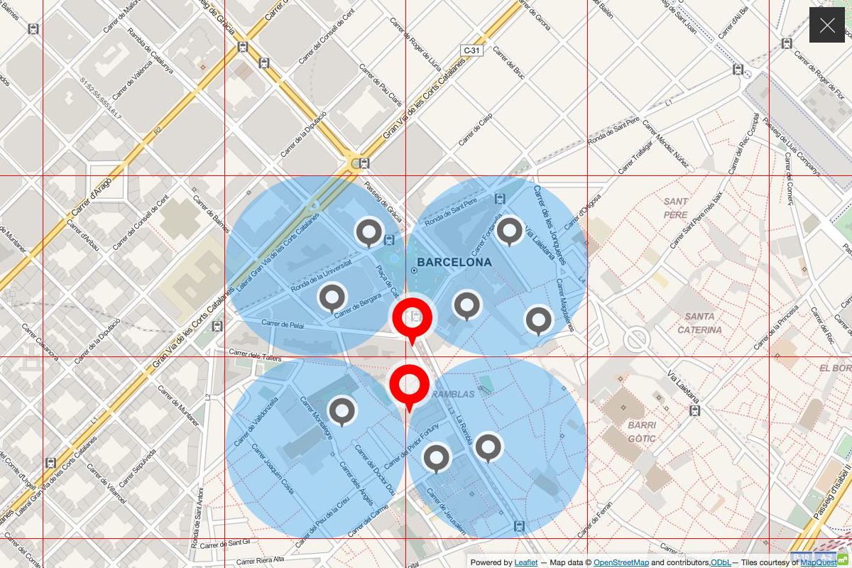
while extending the radius to (half the) the grid’s diagonal, would produce redundant hits and necessitate deduplication.
In the end, we simply searched by proximity to a city center location, paginating through the result indefinitely, so that we could be sure to to encounter every venue, and only once:
Technically, we built the harvester in PHP as an extension to the CORS-enabled, result-reducing API proxy for live operation that was already in place. It fed the venue information in to the master CouchDB co-hosted there.
Time left before MWC 2013 getting tight, we didn’t spend much time on a sophisticated data organization and just pushed the venue information into the DB as one table per category, one row per venue, indexed by location.
This allowed us to support category based and area / proximity based (map and list) browsing. We developed an idea how offline keyword search might be made possible, but it never came to that. So the app simply removes the search icon when it goes offline, and puts it back when it has live connectivity again.
Overall, the app now
- supported live operation out of box,
- checked its synchronization state to the remote master DB on startup,
- asked, if needed, permission to make the big (initial or update) download,
- supported all use cases but keyword search when offline.
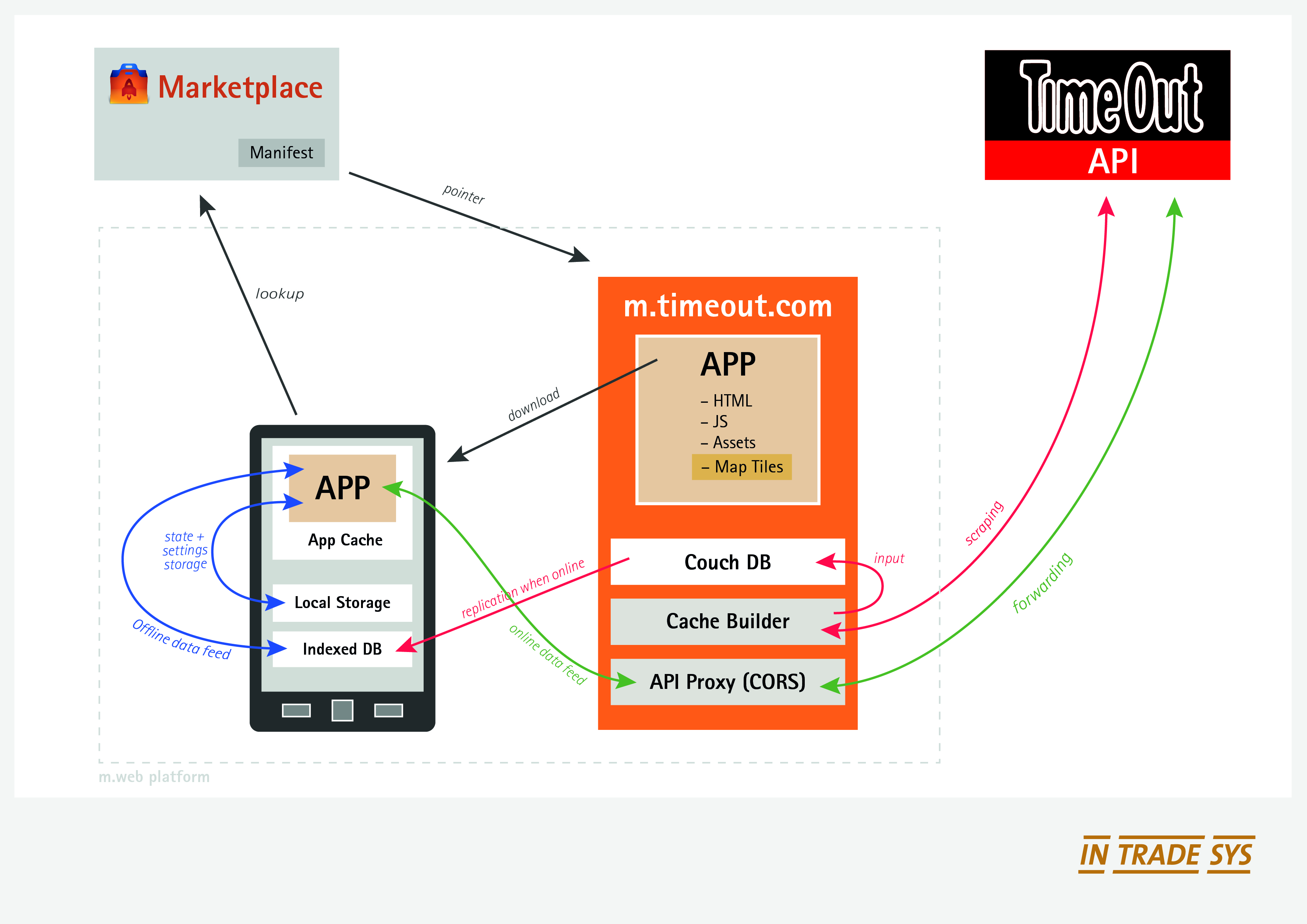
The involved components and their interactions are summarized in this diagram:
Organizing vs. Optimizing the code
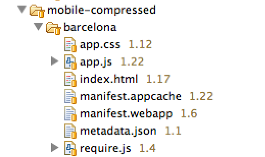
For the development of the app, we maintained the code in a well-structured and extensive source tree, with e.g. each JavaScript class residing in a file of its own. Part of the source tree is shown below:

This was, however, not ideal for deployment of the app, especially as a hosted Firefox OS app or mobile web site, where download would be the faster, the fewer and smaller files we had.
Here, Require.js came to our rescue.
It provides a very elegant way of smart and asynchronous requirement handling (AMD), but more importantly for our purpose, comes with an optimizer that minifies and combines the JS and CSS source into one file each:
To enable asynchronous dependency management, modules and their requirements must be made known to the AMD API through declarations, essentially of a function that returns the constructor for the class you’re defining.
Applied to the search result screen of our application, this looks like this:
define
(
  // new class being definied
  'screensSearchResultScreen',

  // its dependencies
  ['screens/abstractResultScreen', 'app/applicationController'],

  // its anonymous constructor
  function (AbstractResultScreen, ApplicationController)
  {
    var SearchResultScreen = $.extend(true, {}, AbstractResultScreen,
    {
      // properties and methods
      dom:
      {
        resultRowTemplate: $('#searchResultRowTemplate'),
        list: $('#search-result-screen-inner-list'),
        ...
      }
      ...
    }
    ...

    return SearchResultScreen;
  }
);
|
For executing the optimization step in the build & deployment process, we used Rhino, Mozilla’s Java-based JavaScript engine:
java -classpath ./lib/js.jar:./lib/compiler.jar org.mozilla.javascript.tools.shell.Main ./lib/r.js -o /tmp/timeout-webapp/ $1_config.js |
CSS bundling and minification is supported, too, and requires just another call with a different config.
Outcome
Four weeks had been a very tight timeline to start with, and we had completely underestimated the intricacies of taking HTML5 to a mobile and offline-enabled context, and wrapping up the result as a Marketplace-ready Firefox OS app.
Debugging capabilities in Firefox OS, especially on the devices themselves, were still at an early stage (compared to clicking about:app-manager today). So the lights in our Cologne office remained lit until pretty late then.
Having built the app with a clear separation between functionality and presentation also turned out a wise choice when a week before T0 new mock-ups for most of the front end came in
But it was great and exciting fun, we learned a lot in the process, and ended up with some very useful shiny new tools in our box. Often based on pointers from the super helpful team at Mozilla.
Truth be told, we had started into the project with mixed expectations as to how close to the native app experience we could get. We came back fully convinced and eager for more.
In the end, we made the deadline and as a fellow hacker you can probably imagine our relief. The app finally even received its 70 seconds of fame, when Jay Sullivan shortly demoed it at Mozilla’s MWC 2013 press conference as a showcase for HTML5′s and Firefox OS’s offline readiness (Time Out piece at 7:50). We were so proud!
If you want to play with it, you can find the app in the marketplace or go ahead try it online (no offline mode then).
Since then, the Time Out Firefox OS app has continued to evolve, and we as a team have used the chance to continue to play with and build apps for FFOS. To some degree, the reusable part of this has become a framework in the meantime, but that’s a story for another day..
We’d like to thank everyone who helped us along the way, especially Taylor Wescoatt, Sophie Lewis and Dave Cook from Time Out, Desigan Chinniah and Harald Kirschner from Mozilla, who were always there when we needed help, and of course Robert Nyman, who patiently coached us through writing this up.
About Andreas Oesterhelt
Works at InTradeSys, a Cologne based development firm specializing in agile, incremental development of often prototypical web applications that still need to scale to production use at large scale sites such as eBay or Groupon. He takes care of things including coffee supply, team development and helping with software architecture.
More articles by Andreas Oesterhelt…
About Thomas Biniasch
Thomas is a team lead at InTradeSys, where he helps with web applications and mobile app engineering. He doubles as head stuntman when it comes to boldly go, technology-wise, where no colleague has gone before.
More articles by Thomas Biniasch…
About Robert Nyman [Editor emeritus]
Technical Evangelist & Editor of Mozilla Hacks. Gives talks & blogs about HTML5, JavaScript & the Open Web. Robert is a strong believer in HTML5 and the Open Web and has been working since 1999 with Front End development for the web - in Sweden and in New York City. He regularly also blogs at http://robertnyman.com and loves to travel and meet people.
2 comments