Firefox 4 Demos: Awesome CSS3 Planetarium

O hai pixel lovers! Check out this gorgeous CSS3 demo: Planetarium, by the LittleWorkshop team (@glecollinet & @whatthefranck).

planetarium

Screencast:

Youtube link.

Gorgeous Animations

The principal feature show-cased in this demo is CSS3 Transitions. The animation between the welcome-screen and the planet-screen, and the animation between the different planets are powered by transitions. But there are many little effects in this demo. Take a look at the Twitter button, the ruler, the credit page or the back button. These effects are CSS3 Transitions too.
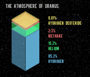
Another interesting detail. Next to the planet, you have some different animations. The way the animations is played depends on if you’re coming from the left, the right or from the home screen.

Try it yourself: Click on the planet Earth, from the home screen. See the text “falling” from the top? Now, go to Mars, and come back to Earth. Now the text is “flying” from the right. Designers will love that :)

Beautiful fonts

@font-face allows you to use your own font for creative design. Combined with text-shadow and font-feature-settings, you can accurately forge and style your typographic content.

Your turn!

These are features you can use today.
This demo works perfectly in Firefox 4, Safari and Chrome. Also, Transitions and font-face are easily degradable. Go. Check out the source code, read the documention, and if you’re proud of your code, feel free to submit a demo!

About Paul Rouget

Paul is a Firefox developer.

More articles by Paul Rouget…


27 comments

  1. Lucas

    Poor Pluto.

    March 16th, 2011 at 10:57

  2. Matt

    The advancement of the web is so awesome right now!

    Mozilla you guys rock, keep up the superb work.

    March 16th, 2011 at 11:15

  3. j2

    Zooming and zooming out (on Safari) doesn’t exactly behave as expected (note the space view – zooming in results in SMALLER planets). Is this what we can expect from CSS3?

    March 16th, 2011 at 12:16

    1. Rich

      No, it’s just that they’ve decided to size the planets so they always fit on the screen. That means that zooming in makes the planets realign to fit.

      They didn’t have to code it like that, but I can’t think of a better way to design this demo that wouldn’t have that behaviour.

      It’s got nothing to do with CSS3.

      March 16th, 2011 at 12:57

  4. vdo

    Very impressive BUT for me, this is not a CSS3 demo. This is a CSS3+HTML5+JS demo. I think we (developers) have to make the difference between new web technologies. What do you think ?

    March 16th, 2011 at 12:55

  5. Evan Reeves

    Does this mean that relevant and useful content on the web will continue to erode in place of fancy-schmancy animated infographics?

    March 16th, 2011 at 17:28

  6. Mr.doob

    Beautiful!

    March 16th, 2011 at 20:17

  7. jonas

    Looks really awesome!

    But i think, i’ve found a small bug: the “view credits”-link from the home screen is still clickable (though not visible) when zoomed to a planet (the clickable area is somewhere near the “DISTANCE FROM THE SUN”-label, depending on the size of the browser window).

    March 16th, 2011 at 21:07

  8. Ken Saunders

    Simply awesome! Very sharp. Very cool.

    Uranus is really quite large.
    Perhaps you should see a doctor about that. :|
    (some people never grow up)

    Poor Pluto.
    +1

    March 16th, 2011 at 23:04

  9. Ken Saunders

    This looks great in full screen, and it scales very well when zooming in.
    I love it.

    That little ticket link to the demos is also cool.

    March 16th, 2011 at 23:20

  10. hugo

    For Mercury, it says “…is the […] densest planet of the Solar System”.
    And for Earth, it says “…is […] the densest […] of the eight planets in the Solar System.”

    Probably only one planet is the densest one (hint: http://en.wikipedia.org/wiki/List_of_Solar_System_objects_in_hydrostatic_equilibrium#Planets )

    March 16th, 2011 at 23:31

  11. Henry

    I’m sorry to write this, but i tried the demo on firefox 4.0 and on Chrome 10. The result is much better on Chrome (on firefox is slower) can anyone explains this.

    March 17th, 2011 at 09:46

  12. Kawika

    Whoa. This is… gamechanging.

    March 17th, 2011 at 11:15

  13. Ken Saunders

    Does this mean that relevant and useful content on the web will continue to erode in place of fancy-schmancy animated infographics?

    Oh brother.
    Ya, soon it will just be all porn beamed directly to your brain.

    Ask a student if they’d prefer to learn about the Solar System this way, or in a book, or on Wikipedia.
    Ask anyone would they prefer to learn about anything through visual interactive means or by static ones.

    I’m sorry to write this, but i tried the demo on firefox 4.0 and on Chrome 10. The result is much better on Chrome (on firefox is slower)

    That’s because Chrome rocks and Firefox sucks!
    Seriously, why does Mozilla even bother?
    God himself has nothing on Chrome.

    March 18th, 2011 at 08:46

  14. nemo

    @vdo
    If you disable javascript, you’ll see it is indeed a CSS demo. Well, CSS + SVG really, but a whole lot of CSS.

    The trick is, and I e-mailed the guys this, that you have to first enter the planetarium *then* disable javascript in options, since pretty much the only part that doesn’t degrade gracefully is the front loading screen.

    You can’t disable in firebug ’cause it’ll force a reload.

    But anyway, once you’ve done that you’ll see it is indeed mostly CSS. Quite impressive.

    March 21st, 2011 at 07:30

  15. vdo

    @nemo:
    “*then* disable javascript” : ok that’s what i say! This demo need javascript…

    March 21st, 2011 at 09:09

  16. nemo

    Well. That’s my point. They didn’t actually *need* javascript.
    They just neglected to make the loading screen degrade gracefully.
    Almost then entire demo is CSS + SVG.
    There are some stats which load in javascript (although they could have degrade to non-javascript too, since the JS was just used for some spinning numbers).

    Anyway. It is one thing to just be a bit sloppy in degrading gracefully on a load screen, and another to have done the entire thing in javascript. It is still an awesome CSS/SVG demo.

    March 23rd, 2011 at 13:41

  17. Antwan

    Awesome concept of NEXT/PREVIOUS cursor-sticking arrows :D

    March 24th, 2011 at 09:50

  18. Stephen

    Has anyone checked this out in IE9.0.. its so sad!

    March 25th, 2011 at 06:33

  19. badlybrad

    I think that its an awesome format form. I like the way the planet are line up, but I probably would had created the planets rotating around the sun and when a user hover over the planet it stop rotating around the sun and then a screen is popped up with all of the planets information that Nasa can provide. I like astronomy and this could alternate your great idea into realistic idea, instead of the lining of the planets and scrolling. This is just a thought because I can’t do any of it honestly, but I’m just now learning about how to use notebook 2 and html in college. Looking at this or any other web page I can get some advanced ideas, but can’t do them myself. Other than that, I think that this is a very good idea because most people like objects and amazing image displays on web pages. Its like no body like to read anymore but to see visual effects displayed in text and images. I really like this format though.

    April 20th, 2011 at 22:57

  20. Carlo Rizzante

    Well, ehj, this is cool. Sweet graphic, too.

    It’s also time that the average Joe will dedicate some minutes thinking about the out there. So, welcome your good work!

    I enjoyed it, thanks.
    Carlo

    April 27th, 2011 at 04:44

  21. JM

    It’s awesome! I’ll build everything in HTML 5 and CSS 3 and SVG and tell people to stop using Internet Explorer… oh I’m sorry, but I’ll have to play the party pooper card again. You know, there’s always one, sorry about that. :-)

    This doesn’t even degrade gracefully in IE 8, it just sits there spinning pitifully. I hate these demos because they show us what we *could* do, commercially, in a few years maybe, when IE has caught up with the rest and the IE users have caught up with the latest IE. Unless your commercial audience is web designers, your first point of business should be to make sure the site is at least serviceable in IE. If you don’t have that, all the cool stuff in the world won’t make up for it. (And yes, this is of course a site specifically hosted on a domain intended to do Firefox demos and it has no commercial goal — I’m not arguing that this site specifically has a problem, but it does illustrate the issue.)

    It’s like being shown an awesome car that unfortunately isn’t allowed to drive on highways yet. Sure, you can have fun with it, but it’ll remain a hobby. The cooler these sites are (and this one is without a doubt very cool, as cool as the acid cloud layers of Venus) the worse this stings. Maximizing the audience would mean this site would have to be built in Flash, which would surely please no-one (except Adobe, of course).

    May 17th, 2011 at 15:16

  22. Joys Acevedo

    I love this code page….. i we learn html 5

    August 4th, 2011 at 18:50

  23. Doug

    The link’s currently 403ing.

    January 4th, 2013 at 09:18

    1. Robert Nyman

      Thanks for the heads-up. I’ve corrected the link to the Planetarium now.

      January 8th, 2013 at 12:26

  24. Doug

    Don’t forget the call to action graphic :)

    January 9th, 2013 at 02:15

    1. Robert Nyman

      Thanks. :-)

      January 10th, 2013 at 02:56

Comments are closed for this article.