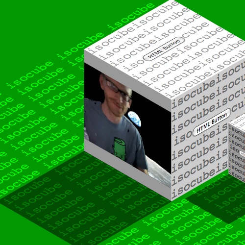
This demo was created by Zachary Johnson, a Minneapolis, MN based web developer who has also authored a jQuery plugin for animated “3D” rotation.
I’d like to show an example of a visual effect that can be accomplished using the new -moz-transform CSS transformation property that is available in the Firefox 3.5 browser. I was very excited to see this feature added to Firefox because I knew it would allow me to produce a faux-3D isometric effect, also sometimes called 2.5D. I created a demo where HTML content is mapped onto the faces of a “3D” isometric cube:
The -moz-transform property can take a list of CSS transform functions including rotate, scale, skew, and translate. Or, multiple transformations can be done simultaneously using a single 2D affine transformation matrix. Because all of the CSS transformation functions work in two dimensions, true 3D transformations with perspective projection cannot yet be accomplished. In this demo, I use the rotate and skew transformation functions in order to create the isometric effect.
First, I define a container div for the cube, and then a square div for the top, left, and right faces of the cube.
.cube {
    position: absolute;
}

.face {
    position: absolute;
    width: 200px;
    height: 200px;
}
Without getting too wrapped up in isometric projection math, we have to rotate and skew the cube faces in order to turn each square div into a parallelogram where the angles of the vertices are 60° or 120°. Here are what those transformations look like using the new -moz-transform CSS property:
.top {
    -moz-transform: rotate(-45deg) skew(15deg, 15deg);
}

.left {
    -moz-transform: rotate(15deg) skew(15deg, 15deg);
}

.right {
    -moz-transform: rotate(-15deg) skew(-15deg, -15deg);
}
Now all that is left to do is to use absolute positioning to connect each transformed div in order to form the faces of the isometric cube. You can use matrix math to do this, or you could just move the faces around until they line up and it looks right.
To add to the 3D effect, I’ve shaded the isometric cube by assigning different colors to the faces. I also gave the cube a shadow. You can see that the shadow is basically just a copy of the top face of the cube moved down to the bottom left, and then I gave the shadow div a black background color and set opacity: 0.5; in the CSS to make it filter over the page background.
Any HTML, such as the text and form buttons in this example, can be put inside the div for any face of the cube. It will be translated into the correct perspective. Christopher Blizzard gave me the idea to throw video onto one side of the cube using the new HTML5 video tag now supported in Firefox 3.5. As you can see, it works great.
Finally, by making a copy of the cube markup and using two more of the CSS transformation functions, I was able to create a second cube. I made the cube 50% as big using a scale(0.5) transformation, and I moved it into place by using translate(600px, 400px).
I hope you found this demo to be interesting and that it opened up your mind to some exciting possibilities that Firefox 3.5 CSS transformations bring to the web.
CSS transformations are also supported by Safari 3.1+ and Chrome using the -webkit-transform CSS property.
About Christopher Blizzard
Making the web better, one release at a time.


51 comments