
 By
By
The source of the code examples in this post is available on GitHub and you can see the demo in action.
There are dozens of video players that allow you to do all the normal things with videos: play, pause, jump to a certain time and so on. More advanced ones also allow you to fast forward and reverse the video and support subtitles.
One thing I haven’t found yet though is zooming and rotation of a video. Granted, an edge use case, but sometimes it is cool to be able to zoom into a detail like a blooper (boom mic in the background) or an easter egg (check for the term “A 113” in every Pixar movie – an homage to the classroom most of the original Pixar cast learned their trade in).
Rotation might come in handy when you recorded your video in portrait instead of landscape on your camera and you don’t want to re-encode it before you put it on the web.
The HTML5 video tag allows you to style the video with CSS and CSS3 transforms allow both for scaling and for rotation. So let’s put those together.
Embedding a video is as simple as this (see this in action on the demo page):
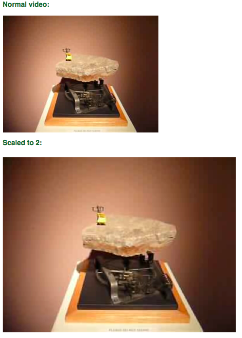
Now, to scale this video you can use CSS3 transform:scale:
video{
  display:block;
  width:400px;
  height:300px;
}
video.scale2{
  -moz-transform:scale(1.5);
  -webkit-transform:scale(1.5);
  -o-transform:scale(1.5);
  -ms-transform:scale(1.5);
  transform:scale(1.5);
}
You can rotate with CSS3 transform:rotate:
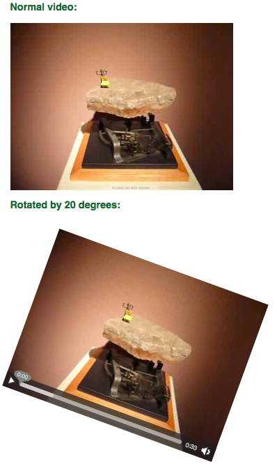
video{
  -moz-transform:rotate(20deg);
  -webkit-transform:rotate(20deg);
  -o-transform:rotate(20deg);
  -ms-transform:rotate(20deg);
  transform:rotate(20deg);
}
And you can do both:
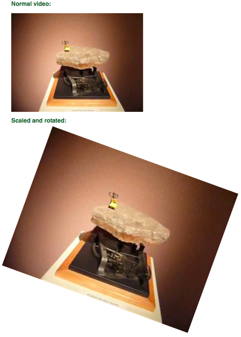
video{
  -moz-transform:scale(1.5) rotate(20deg);
  -webkit-transform:scale(1.5) rotate(20deg);
  -o-transform:scale(1.5) rotate(20deg);
  -ms-transform:scale(1.5) rotate(20deg);
  transform:scale(1.5) rotate(20deg);
}
Now, this doesn’t make much sense though as it changes the dimension of the video (in the demo page I needed to change the margin for each video accordingly). To really provide a “zoom” functionality, we’d need to keep the original size and cut off the parts we don’t need. We could do this using a CANVAS element, but why go that far when a simple DIV does the job for us?
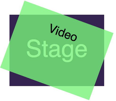
All we need to do to keep the space is nest our videos in a DIV with the class stage:
The CSS to make the cropping work is the following:
.stage{
  width:400px;
  height:300px;
  position:relative;
}
video{
  width:400px;
  height:300px;
  position:absolute;
  top:0;
  left:0;
}
Absolutely positioned elements are taken out of the normal flow of the document. If you put an absolutely positioned element inside one that is relatively positioned, its top and left values are relative to the other element. In other words: the video now covers the stage completely.
If we rotate the video we still have triangular spaces showing like in this example:
.demostage{
  width:400px;
  height:300px;
  position:relative;
}
.demovideo{
  position:absolute;
  top:0;
  left:0;
  -moz-transform:rotate(20deg);
  -webkit-transform:rotate(20deg);
  -o-transform:rotate(20deg);
  -ms-transform:rotate(20deg);
  transform:rotate(20deg);
  width:400px;
  height:300px;
}
To work around this, we must add a overflow:hidden to the stage DIV:
.demostage{
  width:400px;
  height:300px;
  position:relative;
  overflow:hidden;
}
.demovideo{
  position:absolute;
  top:0;
  left:0;
  -moz-transform:rotate(20deg);
  -webkit-transform:rotate(20deg);
  -o-transform:rotate(20deg);
  -ms-transform:rotate(20deg);
  transform:rotate(20deg);
  width:400px;
  height:300px;
}
In order to provide a zoom and rotate functionality, we need to use JavaScript and buttons for the end user. The first hurdle here is – as you probably already realised from the CSS – browser differences in the syntax. Therefore we need to detect which of the transformations the current browser supports. The safest way is to ask the browser:
var properties = ['transform', 'WebkitTransform', 'MozTransform',
'msTransform', 'OTransform'];
var prop = properties[0];
for(var i=0,j=properties.length;i
Once this runs we can set a transformation with the following JavaScript syntax:
var zoom = 1.5;
var rotate = 20;
v.style[prop]='rotate('+rotate+'deg) scale('+zoom+')';
Of course it doesn't make much sense to rotate the controls with the video. Therefore you need to provide your own. You can use any of the aforementioned players for that or roll your own. To demonstrate, I just built one with a single button allowing you to play and pause the video:
The full source is available on GitHub, read the comments to see what is going on here.
Just a quick example of what you can do with open technologies.
About
Chris Heilmann
Evangelist for HTML5 and open web. Let's fix this!
6 comments