
On March 1st, 2022, MDN Web Docs released a new design and a new brand identity. Overall, the community responded to the redesign enthusiastically and we received many positive messages and kudos. We also received valuable feedback on some of the things we didn’t get quite right, like the browser compatibility table changes as well as some accessibility and readability issues.
For us, MDN Web Docs has always been synonymous with the term Ubuntu, “I am because we are.” Translated in this context, “MDN Web Docs is the amazing resource it is because of our community’s support, feedback, and contributions.”
Since the initial launch of the redesign and of MDN Plus afterwards, we have been humbled and overwhelmed by the level of support we received from our community of readers. We do our best to listen to what you have to say and to act on suggestions so that together, we make MDN better.
Here is a summary of how we went about addressing the feedback we received.
Eight days after the redesign launch, we started the MDN Web Docs Readability Project. Our first task was to triage all issues submitted by the community that related to readability and accessibility on MDN Web Docs. Next up, we identified common themes and collected them in this meta issue. Over time, this grew into 27 unique issues and several related discussions and comments. We collected feedback on GitHub and also from our communities on Twitter and Matrix.
With the main pain points identified, we opened a discussion on GitHub, inviting our readers to follow along and provide feedback on the changes as they were rolled out to a staging instance of the website. Today, roughly six weeks later, we are pleased to announce that all these changes are in production. This was not the effort of any one person but is made up of the work and contributions of people across staff and community.
Below are some of the highlights from this work.
Dark mode
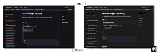
We updated the color palette used in dark mode in particular.
- We reworked the initial color palette to use colors that are slightly more subtle in dark mode while ensuring that we still meet AA accessibility guidelines for color contrast.
- We reconsidered the darkness of the primary background color in dark mode and settled on a compromise that improved the experience for the majority of readers.
- We cleaned up the notecards that indicate notices such as warnings, experimental features, items not on the standards track, etc.
Readability
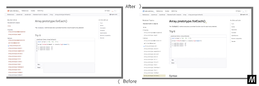
We got a clear sense from some of our community folks that readers found it more difficult to skim content and find sections of interest after the redesign. To address these issues, we made the following improvements:
- We implemented a clearly defined type-scale adjusted for mobile to optimize legibility and to effectively use space, especially on smaller screens.
- We made the distinction between the different heading levels clearer.
- We moved away from changing link colors across different areas of MDN Web Docs. We still retain some of the intent of this design decision, but this is now more subtle.
- The font size was bumped up across all pages, including the home page. We have also optimized letter and line spacing for a more effortless reading experience. This has also improved the reading experience for our Asian readers, for whom line heights were much too tight.
- Missing links are clearly distinguishable from other links and content.
- We improved the layout and readability of specifications pages across desktop and small screen devices.
- We addressed a bug in how the highlighting in the table of contents worked and moved to use an IntersectionObserver.
- We made styling for tables consistent across all pages.
- To ensure readers are always oriented regarding which page they are currently viewing, we have made the header (which includes the breadcrumbs) sticky on desktop and mobile.
- We fixed our accessibility skip navigation to now offer skip to content, skip to search, and skip to language selectors.
- We fixed a tricky issue that caused some elements to flicker when interacting with the page, especially in dark mode. Many thanks to Daniel Holbert for his assistance in diagnosing the problem.
Browser compatibility tables
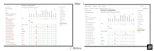
Another area of the site for which we received feedback after the redesign launch was the browser compatibility tables. Almost its own project inside the larger readability effort, the work we invested here resulted, we believe, in a much-improved user experience. All of the changes listed below are now in production:
- We restored version numbers in the overview, which are now color-coded across desktop and mobile.
- The font size has been bumped up for easier reading and skimming.
- The line height of rows has been increased for readability.
- We reduced the table cells to one focusable button element.
- Browser icons have been restored in the overview header.
- We reordered support history chronologically to make the version range that the support notes refer to visually unambiguous.
We also fixed the following bugs:
- Color-coded pre-release versions in the overview
- Showing consistent mouseover titles with release dates
- Added the missing footnote icon in the overview
- Showing correct support status for edge cases (e.g., omit prefix symbol if prefixed and unprefixed support)
- Streamlined mobile dark mode
We believe this is a big step in the right direction but we are not done. We can, and will, continue to improve site-wide readability and functionality of page areas, such as the sidebars and general accessibility. As with the current improvements, we invite you to provide us with your feedback and always welcome your pull requests to address known issues.
This was a collective effort, but we’d like to mention folks who went above and beyond. Schalk Neethling and Claas Augner from the MDN Team were responsible for most of the updates. From the community, we’d like to especially thank Onkar Ruikar, Daniel Jacobs, Dave King, and Queen Vinyl Da.i’gyu-Kazotetsu.
About Hermina
Hermina is Head of Product for MDN, at Mozilla, leading the MDN content, engineering and product teams. She is based in Paris, France.