
 By
By
As an industry, generative AI is moving quickly, and so requires teams exploring new ideas and technologies to move quickly as well. To do so, we have been using Gradio, a low-code prototyping toolkit from Hugging Face, to spin up experiments and experiences. Gradio has allowed us to validate concepts through prototyping without large investments of time, effort, or infrastructure.
Although Gradio has made the development phase of prototyping easier, the design phase has been largely the same. Even with Gradio, designers have had to create components in Figma, outline expected user flows and behaviors, and hand off designs for developers in the same way they have always done. While working on a recent exploration, we realized something was needed: a set of Figma components based on Gradio that enabled designers to create wireframes quickly.
Today, we are releasing our library of design components for Gradio for others to use. The components are based on version 4.23.0 of Gradio and will be available through our Figma profile: Mozilla Innovation Projects, https://www.figma.com/@futureatmozilla. We hope these components help teams accelerate their discovery and experimentation with ML and generative AI.
You can find out more about Gradio at https://www.gradio.app/ and more about innovation at Mozilla at https://future.mozilla.org
Thanks to Amy Chiu and Anais Ron who created the components and to the Gradio team for their work. Happy designing!
What’s Inside Gradio UI for Figma?
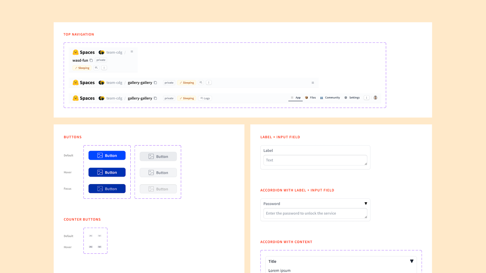
Because Gradio is an ever-changing prototyping kit, current components are based on version 4.23.0 of Gradio. We selected components based on their wide array of potential uses. Here is a list of the components inside the kit:
- Typography (e.g. headers, body fonts)
- Iconography (e.g. chevrons, arrows, corner expanders)
Small Components:
- Buttons
- Checkbox
- Radio
- Sliders
- Tabs
- Accordion
- Delete Button
- Error Message
- Media Type Labels
- Media Player Controller
Big Components:
- Label + Textbox
- Accordion with Label + Input
- Video Player
- Label + Counter
- Label + Slider
- Accordion + Label
- Checkbox with Label
- Radio with Label
- Accordion with Content
- Accordion with Label + Input
- Top navigation
How to Access and Use Gradio UI for Figma
To start using the library, follow these simple steps:
- Access the Library: Access the component library directly by visiting our public Figma profile (https://www.figma.com/@futureatmozilla) or by searching for “Gradio UI for Figma” within the Figma Community section of your web or desktop Figma application.
- Explore the Documentation: Familiarize yourself with the components and guidelines to make the most out of your design process.
- Connect with Us: Connect with us by following our Figma profile or emailing us at innovations@mozilla.com
About Thomas Lodato
More articles by Thomas Lodato…
About Dan Brown
Creator, developer, strategist, homebrewer, runner, sock enthusiast, beard evangelist, writer, drummer, adventurer, Oxford comma advocate, and human Swiss Army Knife.