
 By
By
The easing (or timing function) of an animation is what dictates the way it progresses through time.
For example, a linear easing means that an animation runs at the same speed throughout its duration. This means that if an element isn’t moving at first and then starts to move, it will do so instantly, as if it didn’t even need to accelerate. Often, web developers choose other easings that look more natural, more life-like. There are a few built-in ones like ease, ease-in, ease-out and ease-in-out and it’s even possible to create your own using the cubic-bezier() function.
It’s worth noting that the Inspector panel in Firefox already allows you to edit animations easing in its CSS rules view.
Starting with Firefox 52 the animation inspector panel now displays animations easing directly within its timeline:
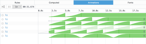
This is very useful to get more information about animations at a glance.
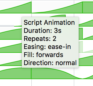
There is also a handy tooltip that appears when hovering over animations. It contains all the timing information you might need for a given animation: including its easing, as well as durations, iterations, delays, direction, etc.
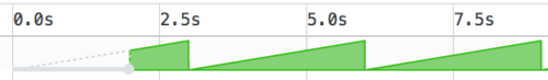
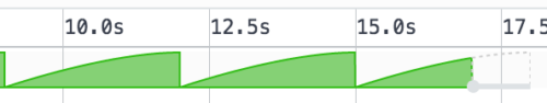
Here are various examples of how easing is represented in the timeline:
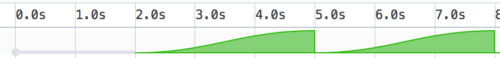
- An animation that repeats 3 times, with an
ease-in-outeasing:
- An infinite animation, with linear easing:

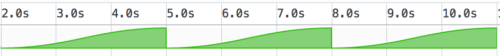
- An animation that repeats 5 times, with an alternate direction,
easeeasing and forwards filling:

And here is a video illustrating several types of easing in the animation inspector panel:
About delays
There are 2 types of delays you can use in animations: delay and end-delay.
The latter can only be used with animations created with the Web Animations API. End-delay is useful to synchronize several animations, e.g. when you want one animation to start exactly 1s after the first has ended.
Both the delay and end-delay can be positive or negative.
The animation inspector now also represents those delays visually. Here are a few examples:
- Positive delay:
- Positive end-delay:

- Negative delay:
- Negative end-delay:
Effect easing vs. keyframe easing
There are 2 ways to apply easing to an animation: either across the whole iteration of an animation, affecting all properties alike (effect easing), or between keyframes and only affecting the properties specified on those keyframes (keyframe easing).
CSS animations only allow for keyframe easing and this confuses a lot of people. Nearly everyone assumes that animation-timing-function does effect easing but it does keyframe easing instead. However, animations created using the Web Animations API can use both types of easing.
Right now, the animation inspector only displays effect easing. This means that even if you define a CSS animation with a non-linear animation-timing-function, the timeline will display a linear progression.
Bug 1309468 will address this and make keyframe easing visible in the animation inspector too. We welcome your thoughts and constructive feedback in the comments section here, or send a tweet to @FirefoxDevTools.
About Patrick Brosset
Patrick manages the DevTools engineering team at Mozilla
One comment