There’s a tool in CSS that you might not have heard of yet. It’s powerful. It’s been there for a while. And it’ll likely become one of your favorite new things about CSS.
Behold, the @supports rule. Also known as Feature Queries.
With @supports, you can write a small test in your CSS to see whether or not a particular “feature” (CSS property or value) is supported, and apply a block of code (or not) based on the answer. Like this:
@supports (display: grid) {
   // code that will only run if CSS Grid is supported by the browser
 }
If the browser understands display: grid, then all of the styling inside the brackets will be applied. Otherwise all of that styling will be skipped.
Now, there seems to be a bit of confusion about what Feature Queries are for. This is not some kind of external verification that analyzes whether or not a browser has properly implemented a CSS property. If you are looking for that, look elsewhere. Feature Queries ask the browser to self-report on whether or not a certain CSS property/value is supported, and use the answer to decide whether or not to apply a block of CSS. If a browser has implemented a feature improperly or incompletely, @supports won’t help you. If the browser is misreporting what CSS it supports, @supports won’t help you. It’s not a magic wand for making browser bugs disappear.
That said, I’ve found @supports to be incredibly helpful. The @supports rule has repeatedly let me use new CSS far earlier than I could without it.
For years, developers have used Modernizr to do what Feature Queries do — but Modernizr requires JavaScript. While the scripts might be tiny, CSS architected with Modernizr requires the JavaScript file to download, to execute, and to complete before the CSS is applied. Involving JavaScript will always be slower than only using CSS. Requiring JavaScript opens up the possibility of failure — what happens if the JavaScript doesn’t execute? Plus, Modernizr requires an additional layer of complexity that many projects just can’t handle. Feature Queries are faster, more robust, and much simpler to use.
You might notice the syntax of a Feature Query is a lot like a Media Query. I think of them as cousins.
@supports (display: grid) {
  main {
    display: grid;
    grid-template-columns: repeat(auto-fit, minmax(280px, 1fr));
  }
}
Now most of the time, you do not need such a test in your CSS. For example, you can write this code without testing for support:
aside {
  border: 1px solid black;
  border-radius: 1em;
}
If a browser understands border-radius, then it will put rounded corners on the aside box. If it doesn’t, it will skip that line of code and move on, leaving the edges of the box to be square. There is no reason to run a test or use a Feature Query. This is just how CSS works. It’s a fundamental principle in architecting solid, progressively-enhanced CSS. Browsers simply skip over code they don’t understand, without throwing an error.

border-radius: 1em as the result on the right. Internet Explorer 6, 7 and 8, however, will not round the corners, and you’ll see the result on the left. Check out this example at codepen.io/jensimmons/pen/EydmkK You do not need a Feature Query for this.
So when do you want to use @supports? A Feature Query is a tool for bundling together CSS declarations so that they’ll run as a group under certain conditions. Use a Feature Query when you want to apply a mix of old and new CSS, but only when the new CSS is supported.
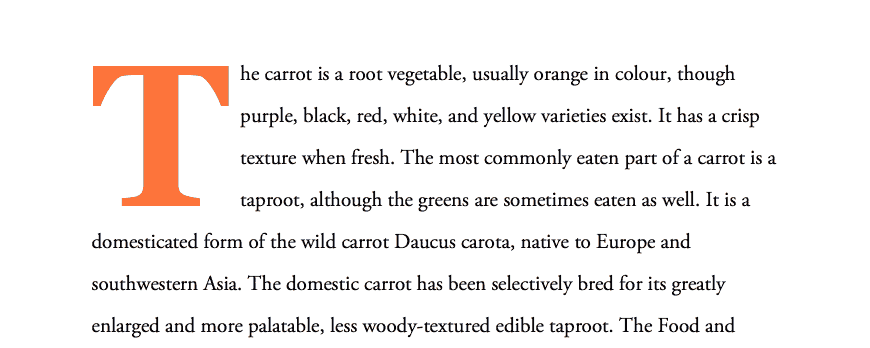
Let’s look at an example using the Initial Letter property. This new property initial-letter tells the browser to make the element in question bigger — like for a drop cap. Here, the first letter of the first word in a paragraph is being told to be the size of four lines of text. Fabulous. Oh, but I would also like to make that letter bold, and put a bit of margin on its right side, and hey, let’s make it a nice orange color. Cool.
  p::first-letter {
     -webkit-initial-letter: 4;
     initial-letter: 4;
     color: #FE742F;
     font-weight: bold;
     margin-right: 0.5em;
  }

Now let’s see what will happen in all the other browsers…

Well, that’s not acceptable. We don’t want to change the color of the letter, or add a margin, or make it bold unless it’s also going to be made bigger by the Initial Letter property. We need a way to test and see whether or not the browser understands initial-letter, and only apply the change to color, weight, and margin if it does. Enter the Feature Query.
@supports (initial-letter: 4) or (-webkit-initial-letter: 4) {
  p::first-letter {
     -webkit-initial-letter: 4;
     initial-letter: 4;
     color: #FE742F;
     font-weight: bold;
     margin-right: 0.5em;
  }
}
Notice, you do need to test a full string with both the property and value. This confused me at first. Why am I testing initial-letter: 4 ? Is the value of 4 important? What if I put 17? Does it need to match the value that is further down in my code?
The @supports rule tests a string that contains both the property and value because sometimes it’s the property that needs the test, and sometimes it’s the value. For the initial-letter example, it doesn’t really matter what you put for the value. But consider @supports (display: grid) and you’ll see the need for both. Every browser understands display. Only experimental browsers understand display: grid (at the moment).
Back to our example: Currently initial-letter is only supported in Safari 9, and it requires a prefix. So I’ve written the prefix, making sure to also include the unprefixed version, and I’ve written the test to look for one or the other. Yes, you can have or, and, and not statements in your Feature Queries.
Here’s the new result. The browsers that understand initial-letter show a giant bolded, orange drop-cap. The other browsers act like the drop cap doesn’t exist — the same way they would if I’d waited to use this feature until more browsers had support for it. (We are currently implementing Initial Letter in Firefox, by the way.)

Organizing Your Code
Now you might be tempted to use this tool to cleanly fork your code into two branches. “Hey browser, if you understand Viewport Units, do this, and if you do not understand them, do this other thing.” That feels nice and tidy.
@supports (height: 100vh) {
  // my layout that uses viewport height
}
@supports not (height: 100vh) {
  // the alternative layout for older browsers
}
// WE MIGHT WISH. BUT THIS IS BAD CODE.
This is not a good idea — at least not yet. Do you see the problem?
Well, not all browsers support Feature Queries. And the browsers that do not understand @supports will skip over both blocks of code. That’s probably bad.
Does this mean we can’t use Feature Queries until 100% of browsers support them? Nope. We can, and we should use Feature Queries today. Simply do not write your code like the last example.
How do we do this right? Well, in much the same way we used Media Queries before they were 100% supported. And well, actually it’s easier to use Feature Queries in this transitional period than it was to use Media Queries. You just have to be smart about it.
You want to structure your code knowing that the oldest browsers won’t support Feature Queries or the feature you are testing for. I’ll show you how.
(Of course, sometime in the far future, once 100% of the browsers have Feature Queries, we can make heavier use of @supports not and organize our code in that way. But it’ll be many years until we get there.)
Support for Feature Queries
So how far back are Feature Queries supported?
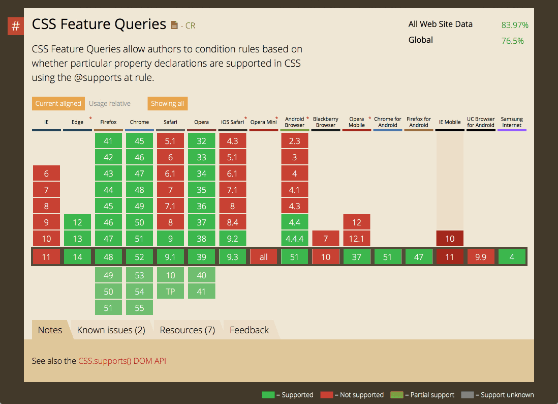
Well @supports has worked in Firefox, Chrome, and Opera since mid–2013. It also works in every version of Edge. Safari shipped it in Fall 2015, in Safari 9. Feature Queries are not supported in any version of Internet Explorer, Opera Mini, Blackberry Browser, or UC Browser.

You might think the fact Internet Explorer doesn’t have support for Feature Queries is a big problem. Actually, it’s usually not. I’ll show you why in a moment. I believe the biggest hurdle is Safari 8. We need to keep an eye out for what happens there.
Let’s look at another example. Say we have some layout code we want to apply that requires using object-fit: cover in order to work properly. For the browsers that don’t understand object-fit, we want to apply different layout CSS.

So let’s write:
div {
  width: 300px;
  background: yellow;
  // some complex code for a fallback layout
}
@supports (object-fit: cover) {
  img {
    object-fit: cover;
  }
  div {
    width: auto;
    background: green;
   // some other complex code for the fancy new layout
  }
}
So what happens? Feature Queries is either supported or not, and the new feature object-fit: cover is either supported or not. Combine those, and we get four possibilities:
| Feature Query Support? | Feature support? | What Happens? | Is This What We Want? |
|---|---|---|---|
| Supports Feature Queries | Supports the feature in question | ||
| Supports Feature Queries | Does not support the feature | ||
| Does not support Feature Queries | Does not support the feature | ||
| Does not support Feature Queries | Supports the feature in question |
Situation 1: Browsers that support Feature Queries, and support the feature in question
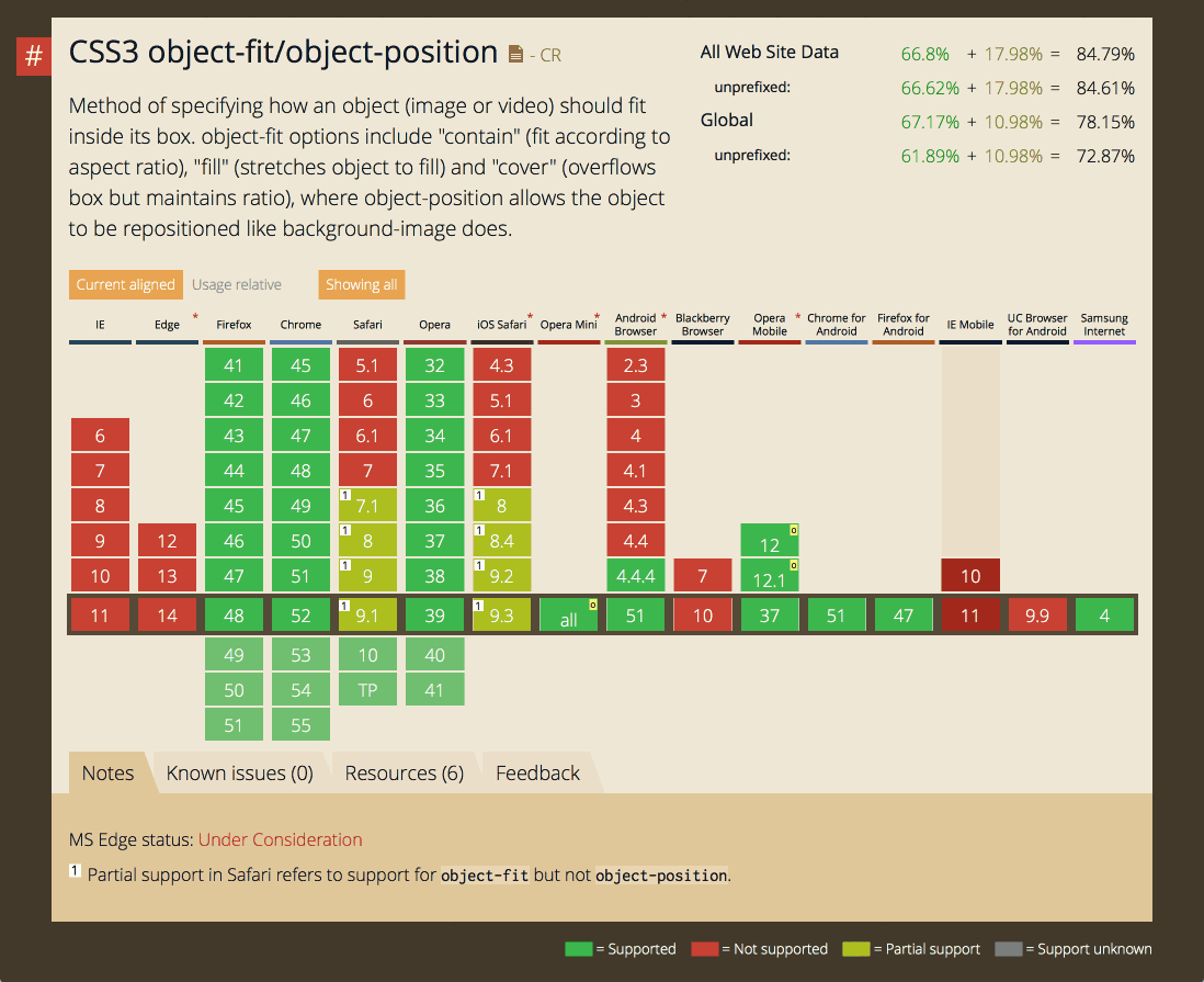
Firefox, Chrome, Opera, and Safari 9 all support object-fit and support @supports, so this test will run just fine, and the code inside this block will be applied. Our image will be cropped using object-fit: cover, and our div background will be green.
Situation 2: Browsers that support Feature Queries, and do not support the feature in question
Edge does not support object-fit, but it does support @supports, so this test will run and fail, preventing the code block from being applied. The image will not have object-fit applied, and the div will have a yellow background.
This is what we want.
Situation 3: Browsers that do not support Feature Queries, and do not support the feature in question
This is where our classic nemesis Internet Explorer appears. IE does not understand @supports and it does not understand object-fit. You might think this means we can’t use a Feature Query — but that’s not true.
Think about the result we want. We want IE to skip over this entire block of code. And that’s exactly what will happen. Why? Because when it reaches @supports, it doesn’t recognize the syntax, and it skips to the end.
It might be skipping the code “for the wrong reasons” — it skips over the code because it doesn’t understand @supports, instead of because it doesn’t understand object-fit — but who cares! We still get exactly the result we want.
This same thing happens with the Blackberry Browser and UC Browser for Android. They don’t understand object-fit, nor @supports, so we are all set. It works out great.
The bottom line — anytime you use a Feature Query in a browser that does not support Feature Queries, it’s fine as long as that browser also does not support the feature you are testing.
Think through the logic of your code. Ask yourself, what happens when the browser skips over this code? If that’s what you want, you are all set.
Situation 4: Browsers that support do not Feature Queries, yet do support the feature in question
The problem is this fourth combination — when the test proposed by a Feature Query doesn’t run, but the browser does support that feature and should run that code.
For example, object-fit is supported by Safari 7.1 (on Mac) and 8 (Mac and iOS) — but neither browser supports Feature Queries. The same is true for Opera Mini — it will support object-fit but not @supports.
What happens? Those browsers get to this block of code, and instead of using the code, applying object-fit:cover to the image and turning the background color of the div green, it skips the whole block of code, leaving yellow as the background color.
And this is not really what we want.
| Feature Query Support? | Feature support? | What Happens? | Is This What We Want? |
|---|---|---|---|
| Supports Feature Queries | Supports the feature in question | CSS is applied | Yes |
| Supports Feature Queries | Does not support the feature | CSS is not applied | Yes |
| Does not support Feature Queries | Does not support the feature | CSS is not applied | Yes |
| Does not support Feature Queries | Supports the feature in question | CSS is not applied | No, likely not. |
Of course, it depends on the particular use case. Perhaps this is a result we can live with. The older browser gets an experience planned for older browsers. The web page still works.
But much of the time, we will want that browser to be able to use any feature that it does support. This is why Safari 8 is likely the biggest problem when it comes to Feature Queries, not Internet Explorer. There are many newer properties that Safari 8 does support — like Flexbox. You probably don’t want to block Safari 8 from these properties. That’s why I rarely use @supports with Flexbox, or when I have, I’ve written at least three forks in my code, one with a not. (Which gets complicated fast, so I’m not even going to try to explain it here.)
If you are using a feature that has better support in older browsers than Feature Queries, then think through all of the combinations as you write your code. Be sure not to exclude browsers from getting something you want them to get.
Meanwhile, it’s easy to use @supports with the newest CSS features — CSS Grid for example, and Initial Letter. No browser will ever support CSS Grid without supporting Feature Queries. We don’t have to worry about our fourth, problematic combination with the newest features, which makes Feature Queries incredibly useful as we go forward.
All of this means that while IE11 will likely be around for many years to come, we can use Feature Queries liberally with the newest advances in CSS.
Best Practices
So now we realize why we can’t write our code like this:
@supports not (display: grid) {
    // code for older browsers
    // DO NOT COPY THIS EXAMPLE
}
@supports (display: grid) {
    // code for newer browsers
    // DID I SAY THIS IS REALLY BAD?
}
If we do, we’ll stop the older browsers from getting the code they need.
Instead, structure your code like this:
// fallback code for older browsers

@supports (display: grid) {
    // code for newer browsers
    // including overrides of the code above, if needed
}
This is exactly the strategy we applied to using Media Queries when supporting old versions of IE. This strategy is what gave rise to the phrase “mobile first”.
I expect CSS Grid to land in browsers in 2017, and I bet we will use Feature Queries quite a lot when implementing future layouts. It’s going to be much less of a hassle, and much faster, than involving JavaScript. And @supports will let us doing interesting and complex things for browsers that support CSS Grid, while providing layout options for the browser that don’t.
Feature Queries have been around since mid–2013. With the imminent release of Safari 10, I believe it’s past time for us to add @supports to our toolbox.
About Jen Simmons
Jen Simmons is a Designer and Developer Advocate at Mozilla, specializing in CSS and layout design on the web. She is a member of the CSS Working Group, and speaks at many conferences including An Event Apart, SXSW, Fluent, Smashing Conf and more.


16 comments