
 By
By
Firefox Developer Edition 46 is now here! In this version, we’ve added various memory profiling features and improved many of our current tools as well. This post covers some of the big changes that landed in this release.
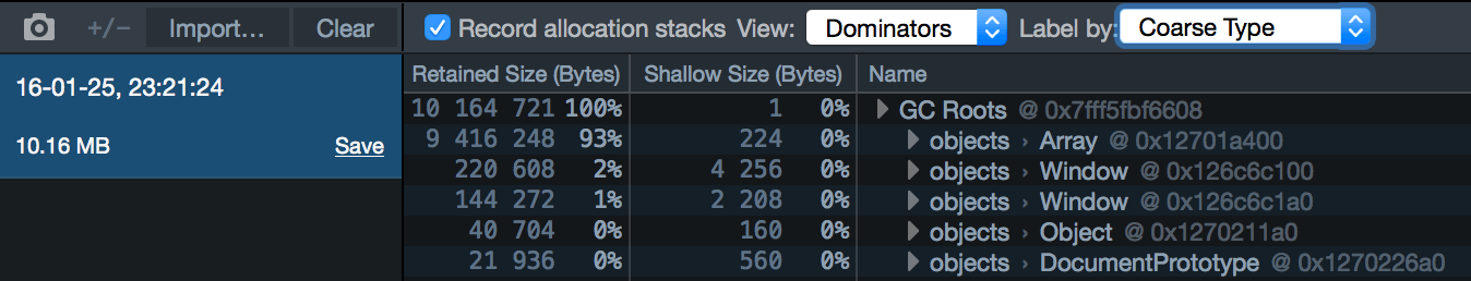
Dominator view in the memory tool
A new view is now available within the Memory Tool that will aid in debugging and profiling memory intensive web applications. Dominator view provides insight into object memory allocation. This is a cumulative view indicating the size of the objects (shallow) and any referenced objects (retained) that are currently allocated. This allows you to easily see the impact a particular object is having on memory. Using this view also lets developers quickly locate the code responsible for creating a specific object. You can read more about this feature here.
Here’s a screenshot of the Dominator view:
Performance tool and GC profiling
The performance tool now allows you to include allocations in your recordings. This is useful to help you reduce the amount of GC done in your web app for more responsiveness. You can enable allocations in the performance tool by clicking on the settings cog, then by checking the “Record Allocations” menu item.
Here’s a screenshot of the Allocations view:

Emscripten demangling feature
When compiling native code through Emscripten, you will notice that the function names are changed by the compiler. We’ve now added support for demangling C function names in the profiler call tree, so you can easily refer to your original uncompiled code (development notes)
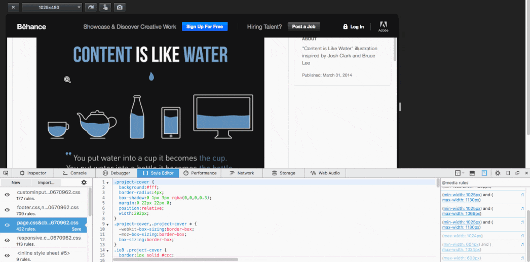
Style Editor and @media queries
Firefox Developer Tools provides a Responsive Design View, used to develop responsive websites that can respond to accommodate many screen sizes. You can use this view along with the media query sidebar to quickly see which media rules are currently activated for a given screen size selection. The new release of the media query sidebar now provides quick links on each media rule that automatically adjust the screen view size in the Responsive Design View. You can check the development notes here.
Here’s a screencast of the feature in action:
Always-on Debugger
Also, the debugger will now always pause on debugger statements when the toolbox is opened, even if the panel hasn’t been activated yet. You can read James Long’s blog post for more technical detail.
More polish
In addition to the improvements above, we’ve also polished many areas of the toolbox, in particular:
- Added the ability to clear out heap snapshots in the memory tool (development notes)
- Improved contrast for the inspector infobar on dark pages (development notes)
- Performance tool call tree text is now selectable (development notes)
- Improved console.log performance when lots of logs are added asynchronously (development notes)
- The number of items in the storage inspector is no longer capped (development notes)
Thanks to everyone that has contributed to this Developer Edition release! Grab a copy of the latest Developer Edition now and let us know what you think!
About Tim Nguyen
I work on web browsers.
One comment