The Mozilla Developer Network has a New Face

Last summer the Mozilla Developer Network (MDN) underwent a massive platform change, moving from a hosted third-party solution to our own custom Django application code-named Kuma. That move laid the ground work for our latest major MDN upgrade: a complete front-end redesign, included many new features as well as usability and accessibility enhancements. Let me provide you with a quick overview of what you can expect to see on the new MDN and what features we’re cooking up for the future!

New MDN Features

Increased Commitment to Search

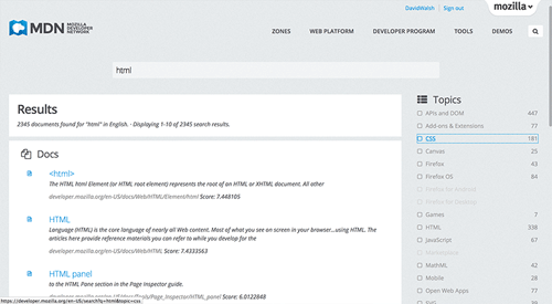
The majority of MDN users are looking to find documentation the moment they land on the MDN homepage, so we’ve placed search front and center:

We’ve also added search filters to the mix, allowing users to narrow down search results to their specific needs:

From a technical perspective, we’ve moved to Elasticsearch for search, allowing us to continue making indexing and filtering improvements, as well as add new search features at will. We anticipate fine-tuning search as we receive feedback so we’ll continue the push to get you to better documentation faster.

Ease in Navigation

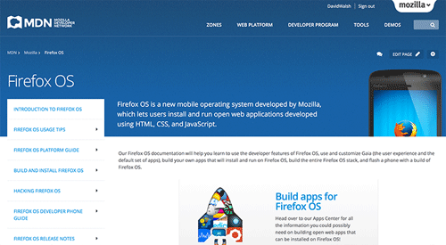
Getting from document to document was a pain point in the previous design, so we’ve fixed that in two ways. The first was creating Content Zones, a method for creating navigation for a given topic. We’ve started with the most prominent parts of MDN, including App Center, Firefox, Firefox OS, Firefox Marketplace, Add-ons, and Persona:

Content Zones

MDN’s new Content Zones provide a complete collection of documentation about a given topic, encompassing the very basics of a topic to API details and advanced techniques. We’ll be kicking off with the following zones:

Firefox OS

Highlights of the Firefox OS zone include:

  • A detailed Platform Guide
  • Build and Install details
  • Hacking Firefox OS
  • App Design & Development
Firefox Marketplace

Highlights of this zone include:

  • App submission and review
  • App publishing and monetization
  • Marketplace API information
App Center

Highlights of the App Center zone include:

  • Quickstart Guide
  • Design and Build tips
  • App publishing guidelines
  • API references
Persona

Highlights of the Persona zone include:

  • Guide to using Persona on your site
  • Becoming an identify provider
  • Details on the Persona project
Firefox

Highlights of the Firefox zone include:

  • A complete Firefox Add-on overview
  • Information on Firefox internals
  • Detailed instructions for building Firefox and contributing
Add-ons

Highlights of the Add-ons zone include:

  • XUL extension information
  • Best practice tips
  • Theming
  • Add-on publishing guidelines

“See Also” Links

We’ve also implemented “See Also” links which may appear in any wiki page, linking to documents which may be relevant based on the document you’re currently viewing.

Both the zone subnavigation and “See Also” link sidebar widgets are built from basic link lists in the wiki document, so adding links and shuffling navigation is easy for anyone looking to contribute to MDN. These link lists can also be built using MDN’s macro language, Kumascript, and our writing team has done a great job automating “See Also” links so that contributors can save on the manual labor of hunting down other relevant documents.

Top level navigation

In the top level navigation, you will have access to five distinct areas:

  • The above-mentioned Content Zones
  • Web Platform, including direct links to more information on technologies, references and guides
  • Developer Program – To be able to help developers and establish long-term relationships and channels, we have created the Mozilla Developer Program. We have a lot of plans and ideas for iteratively expanding the Program, and we want you involved as we do so! So, sign up! You will get a membership, be able to subscribe to our newsletter and get access to features over time as we roll them out.
  • Tools – more information on the Firefox Developer Tools and their features
  • Demos, being a direct link to the Demo Studio

Enhanced Kumascript Macro Features

Kumascript, MDN’s dynamic macro language, was also outfitted with the ability to read external RSS feeds. At present MDN is using the feed reader capability to pull forum posts from StackOverflow and blog posts from the Mozilla Hacks blog. Check out the MDN:Common macro to view the fetchJSONResource and fetchHTTPResource methods which aid in displaying feed content in wiki documents.

Future Features

This visual redesign is just the beginning of our push to make MDN more dynamic and usable. The MDN development and UX teams have plenty more coming in 2014. Here are a few peeks into what you can expect to see!

Dynamic Search Filtering

To improve the efficiency in user search, we plan to implement hashtag-prefixed text filtering which may be added in the initial search — doing so will prevent the need for additional filtering when the user lands on the search results page.
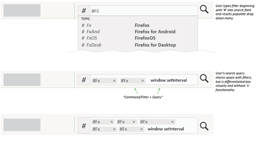
Holly Habstritt Gaal has detailed this query system in detail on her blog. Check out her blog post to see implementation details.

Docs Navigator

So you’ve completed a search and you click the first link you thought would be applicable, but you want to move onward and view other results. Instead of backing out to the search results page again, the wiki page (if the user came from search) will display a doc navigator to move to the next or previous result, or you can view the entire list of results from your original search:

image

Just another handy way of finding what you need faster!

Demo Studio and Dev Derby Redesign

A redesign to the MDN Demo Studio and Dev Derby will be coming shortly. We have an excellent design in review and we hope to roll that out in early 2014.

If you have a suggestion or find any bugs within the new MDN, please let us know.

Look forward to more from MDN in 2014 and beyond. The MDN platform promises to expand and improve the way we view, write, and experience documentation and web technologies!

About Robert Nyman [Editor emeritus]

Technical Evangelist & Editor of Mozilla Hacks. Gives talks & blogs about HTML5, JavaScript & the Open Web. Robert is a strong believer in HTML5 and the Open Web and has been working since 1999 with Front End development for the web - in Sweden and in New York City. He regularly also blogs at http://robertnyman.com and loves to travel and meet people.

More articles by Robert Nyman [Editor emeritus]…


57 comments

  1. ChrisArchitect

    So Hot. Congrats everyone.

    December 9th, 2013 at 13:42

    1. groovecoder

      Thanks Chris. It’s been a long road but the redesign has actually helped us while working on the redesign itself! So meta.

      December 9th, 2013 at 14:08

  2. Lance

    It looks absolutely fantastic guys !

    Many thanks, your hard work is *really* appreciated.

    December 9th, 2013 at 14:10

    1. Robert Nyman [Editor]

      Thank you, good to hear!

      December 10th, 2013 at 03:07

  3. gabriele vidali

    Why no social commenting system has been allowed yet here ? ( Persona and disqus )

    December 9th, 2013 at 14:26

    1. Robert Nyman [Editor]

      Hopefully we will have Persona here over time.

      December 9th, 2013 at 14:27

  4. Chris More

    Nice job everyone on getting this launched! Website redesigns are one of the hardest website projects that can be imagined and usually are harder than launching a completely new website.

    December 9th, 2013 at 14:45

    1. Robert Nyman [Editor]

      Thank you Chris! And yes, it does bring some extra challenges!

      December 10th, 2013 at 03:08

  5. Ivan Dejanovic

    The stuff I saw so far looks pretty good. You made the change while I was using MDN to get some examples to use in my app. In one second it was red and orange and all of a sudded it turned blue. :)

    MDN was pretty good in the previous version, I used it all the time in my development, but it was at least for me hard to navigate at times. Some information regarding how to write a manifest for Firefox OS app where on several separate documents and not a single document contained all information I needed so I had to switch all the time while I was trying to publish my first app. Hopefully this will be better with the new look.

    Keep up with the good work.

    December 9th, 2013 at 16:02

    1. Robert Nyman [Editor]

      Thanks! Hopefully the navigation helps, but also, if you believe some information should be in the same page rather than spread out, feel free to edit it. MDN is a wiki and wouldn’t be possible without all the contributions it gets.

      December 10th, 2013 at 02:20

  6. Maurizio

    I could try the beta version of this layout, and I like it a lot. Good job

    December 9th, 2013 at 16:29

    1. Robert Nyman [Editor]

      Thanks for trying the beta, and glad you like this!

      December 10th, 2013 at 02:20

  7. Randy Apuzzo

    I love guys, keep it up, you’re importance to the web is beyond explanation.

    December 9th, 2013 at 17:04

    1. Robert Nyman [Editor]

      Thanks! I’d like to believe that the important thing is all of us doing this together for a better web. :-)

      December 10th, 2013 at 02:21

  8. Yaroslaff Fedin

    Is it me or layout on the screenshot is broken?

    December 9th, 2013 at 18:39

    1. Robert Nyman [Editor]

      Which screenshot?

      December 10th, 2013 at 03:02

  9. Andrea Giammarchi

    Nice one guys!

    December 9th, 2013 at 19:10

    1. Robert Nyman [Editor]

      Thank you!

      December 10th, 2013 at 03:03

  10. Rudolf Olah

    Very very very nice! I’m liking it and what I really love is that the search URL didn’t change so I can still search using the search keyword in firefox and !mdn in duckduckgo! :-D

    December 9th, 2013 at 22:41

    1. Robert Nyman [Editor]

      Thank you, and glad things work like you want them to!

      December 10th, 2013 at 03:03

  11. Rolfen

    These colors are horrible. Someone was very uninspired, and then had a look at MSDN… and this is what we get. Even the logo is blue now.
    Also, how about giving users some choice or warning?

    December 9th, 2013 at 23:04

    1. Robert Nyman [Editor]

      I’m not sure maintaining two version of the web site would scale. Also, we’ve had a banner for months on MDN where users could choose to try the new design before we launched it. As mentioned in the post, any feedback is welcome: http://mzl.la/mdn-post-redesign-feedback.

      December 10th, 2013 at 03:06

  12. Vikash

    ~AWESOME~

    December 10th, 2013 at 00:11

    1. Robert Nyman [Editor]

      Thanks!

      December 10th, 2013 at 03:03

  13. Francisc

    It’s OK, but I liked the older one better.
    The new one has too much white screaming at you (my monitor is 30″).
    The one before had darker colours and it was easier to read.
    To me, anyway.

    December 10th, 2013 at 05:37

    1. Robert Nyman [Editor]

      Thanks for the feedback. Feel free to share that at http://mzl.la/mdn-post-redesign-feedback too!

      December 10th, 2013 at 05:53

  14. ady

    Hi guys :) Really nice work – the design is much prettier than the previous version. Yet it has one downside – very bright colors. I’m used to work with darker themes (Dark Visual Studio anyone?) and really liked how dim your previous colors theme was. Any way to get darker version of your theme? (I am not even referring to previous colors, just darker).

    December 10th, 2013 at 06:06

    1. Robert Nyman [Editor]

      Thanks for the feedback! There’s no way to get other colors, unless we change the default ones – so please submit your feedback with above link.

      December 10th, 2013 at 06:37

      1. ady

        Ok :) Once more – thanks for those awesome changes! :D

        December 10th, 2013 at 09:44

  15. thelolcat

    uh it looks a random Microsoft website now. Did you guys use a themeforest theme? Because all those themes all copy Microsoft styles…

    Well it’s pretty bad. I mean yeah it’s prettier than the previous version, but less ergonomic. You cannot stay on the site for more than 5 seconds before your eyes start to bleed. Programmers don’t care about prettiness, they care about ease of use, and MDN is useless now.

    At least make the old style available somehow, a stylesheet changer or smth…

    December 10th, 2013 at 08:04

    1. Robert Nyman [Editor]

      As mentioned in the article and a few times above in the comments, please submit your feedback at http://mzl.la/mdn-post-redesign-feedback.

      December 10th, 2013 at 08:21

  16. John Soutar

    Congrats to everyone involved. It looks great.

    December 10th, 2013 at 09:59

    1. Robert Nyman [Editor]

      Thank you!

      December 10th, 2013 at 12:52

  17. Tin Aung Lin

    You guys made it up after a chain of continuous hard works.

    Cheers

    December 10th, 2013 at 11:34

    1. Robert Nyman [Editor]

      Thanks!

      December 10th, 2013 at 12:52

  18. Andre Jaenisch

    … just another “modern” site. Well, have to learn the navigation there again.

    Meanwhile I’d like to ask you to apply verbose alt-attributes to your images. Not only it displayes nothing on my RSS feed reader (reading offline on-the-go), but screenreaders won’t read anything, too. Ask Marco Zehe from Mozilla’s QA team ;-)

    Oh, and while I’m at it. Please, move the “Notify me on followup comments via e-mail” above the submit button. I didn’t saw it last time I commented here.

    You asked for feedback ;-)

    December 10th, 2013 at 14:40

    1. Robert Nyman [Editor]

      Good input. Can you please submit that feedback at http://mzl.la/mdn-post-redesign-feedback?
      Point taken about the Notify checkbox!

      December 11th, 2013 at 04:00

  19. lem torov

    Awesome. So neat and nice. If i could make something like this.
    Beautiful.

    how do u make a blue square grid with gradient? I cant find it in code.

    It could be an single image with blue gradient and grid with gradient, which is not.
    It could be an 2 images layered one with just a grid and above image has transparent white gradient.
    or image with grid and element positioned z-index abouve about with gradient made by css.

    But i cant find such images. I did look in css for base64 image didnt find :)

    Just saw it . IT is responsive.

    December 10th, 2013 at 23:12

    1. Robert Nyman [Editor]

      Thank you!
      The background grid for the page? It’s multiple background images in the CSS code for the body element.

      December 11th, 2013 at 04:01

  20. Rummy

    Hi! Usability is great. But now it’s a bit hard to visually navigate over documentation, text, notes, links looks a bit non contrast.

    December 11th, 2013 at 04:31

    1. Robert Nyman [Editor]

      Thank you! Please submit that feedback at http://mzl.la/mdn-post-redesign-feedback.

      December 11th, 2013 at 04:36

  21. Felipe Nascimento de Moura

    Looks awesome! :)
    useful, as well, congratulations!

    December 11th, 2013 at 14:17

    1. Robert Nyman [Editor]

      Thank you!

      December 11th, 2013 at 15:07

  22. Abin Abraham

    nice look and feel

    December 11th, 2013 at 21:20

    1. Robert Nyman [Editor]

      Thanks, glad you like it!

      December 12th, 2013 at 02:41

  23. Derek

    The new design of MDN is really nice, but one thing I don’t like is that it is too white. It lacks contrast and I’m having a hard time reading the text. (The whole page is too white and it’s difficult to focus on the main content.) Also, the page isn’t centered as before, which now requires me to turn my head to the left to read the text. If it’s to the right it might be okay, but left, it’s a little be to far.

    December 12th, 2013 at 02:09

    1. Robert Nyman [Editor]

      Thanks for your thoughts. As stated above, please submit that feedback at http://mzl.la/mdn-post-redesign-feedback?

      December 12th, 2013 at 02:42

  24. Dwayne

    Great work guys. I’m excited abut these and future changes. The MDN is such a fantastic resource to have as a developer so I appreciate all the effort being made to make it even more user friendly and awesome.

    December 12th, 2013 at 06:28

    1. Robert Nyman [Editor]

      Thank you, Dwayne!

      December 12th, 2013 at 12:21

  25. Robert Ivan

    The site looks great. I have some questions though.
    1. why django
    2. why elasticsearch and not solr
    3. the responsiveness is seamless. black magic?

    December 12th, 2013 at 16:24

    1. groovecoder

      1. We use django for many Mozilla websites, so we have lots of django expertise in-house. [1] Mozilla moved a number of larger sites from PHP (specifically CakePHP I believe) to python & django about 4 years ago.

      2. Similarly, many Mozilla web platforms (AMO, SUMO, Input, etc.) use ElasticSearch. I personally used Solr while I was at SourceForge.net, so I like ES because it has all the familiar Lucene functionality, but it also includes a dynamic schema and clustering architecture.

      [1] https://blog.mozilla.org/webdev/tag/django/

      December 16th, 2013 at 09:02

  26. Roma Matusevich

    Great work guys. I like new “face” of MDN.

    December 14th, 2013 at 06:44

    1. Robert Nyman [Editor]

      Thank you!

      December 16th, 2013 at 04:12

  27. Tyson

    The design refresh is just excellent. Good job everyone!

    December 14th, 2013 at 21:29

    1. Robert Nyman [Editor]

      Thanks, good to hear!

      December 16th, 2013 at 04:13

  28. Steve

    This is great news, seems to be good one. Great work done by the developers.

    Good color combination and also good navigation.

    December 15th, 2013 at 04:22

    1. Robert Nyman [Editor]

      Thank you, glad you like it!

      December 16th, 2013 at 04:13

Comments are closed for this article.