
 By
By
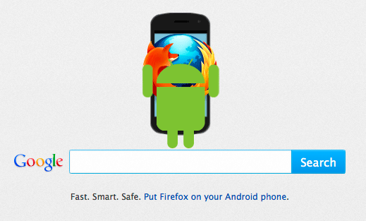
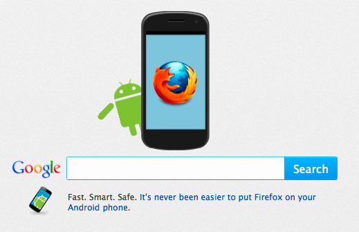
In Firefox, we offer various content in our about:home page – the start page for many Firefox users – to make people aware of new features and possibilities. As you might have seen recently, we have some animations with the Android robot and Firefox, highlighting that Firefox is available on Android. For you developers out there, we’d like to talk more about how these animations were made.
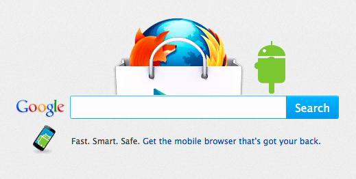
We have three different animations:
Make sure to interact with the Android robot by moving the mouse over him!
Please note that these about:home snippets have been created specifically for in-product use in Firefox, and one vital factor there is to keep them as compact as possible. This means that there is, for instance, -moz specific CSS prefixes without fallbacks for other web browsers (since that has never been the target), because the goal was to make them optimal in a closed and controlled environment.
Making them work in other web browsers is easily tended to, though, by adding necessary CSS prefixes.
Introducing Mozilla Hacks on GitHub
Since we have a number of demos, code testing and using APIs examples, we wanted to have a more unified approach both to how we share these with you, but also making it as easy as possible to fork, play and build on top of the code we share.
Therefore, I’m happy to announce that we now have a dedicated GitHub repository for Mozilla Hacks demos and we’ll have blog post specific demos available!
As part of that, these about:home snippets are on GitHub with some boiler plate code, where you can see them in action.
Interview with Bruce MacFarlane, snippet creator
Bruce MacFarlane is the lead programmer at Particle for this project with the Android/Firefox about:home snippets, and helped develop the creative abstracts into actual animation. In this interview, with Mozilla’s Barry Munsterteiger, he goes through aspects of the process of creating these animations:
Thanks for helping us with the animations again, it looks like you really had some fun with these. Can you walk us through the process on how these were made?
Of course! Probably the best place to start is with the creation of the Android character in CSS. This was done as a separate piece and at a scale large enough so we could use it in a number of different animation scenarios, just adjusting it’s scale to whichever size worked best in a particular setup.
To use as a reference we were given an image of the green Android character. This image was added to the html file as an overlay at a low opacity as we were building so we could make sure we were matching our css design as close as possible.
Before we began, we had to consider the sort of movements the android would (or could) make during it’s animation, then adjust our layout accordingly. The easiest way to break this task down was to list out what could move on it’s own separate from the other parts of the android and then set up a container div for each that we knew we could apply the animation to:!
- The entire Android in x/y/z space
- Head (possibly)
- Arms able to move and rotate individually – Legs able to move and rotate individually – Eyes able to blink
- Antennas able to wiggle individually
Example Code:
#perspective-container { position: absolute; top: 0px; width: 264px; height: 336px; background-color: rgba(0,0,0,.05); -moz-transform-style: preserve-3d; -moz-perspective: 800px;}

#android { position: absolute; top: 0px; width: 264px; height: 336px;}

#android .body { position: absolute; top: 110px; left: 48px; width: 168px; height: 152px; border-radius: 0px 0px 30px 30px; background-color: #96c03c;}

#android .head { position: absolute; top: 30px; left: 48px; width: 168px; height: 68px; border-top-left-radius: 50% 100%; border-top-right-radius: 50% 100%; background-color: #96c03c; }

#android .eyes { position: absolute; top: 25px; width: 168px; height: 20px;}

#android .eye {position: absolute; width: 20px; height: 20px; border-radius: 10px 10px 10px 10px; background-color: white;}

#android .eye.left { left: 38px; } #android .eye.right { right: 38px; }

#android .antenna { position: absolute; top: -22px; width: 6px; height: 32px; border-radius: 15px 15px 0px 0px; -moz-transform-origin: 50% 100%; background-color: #96c03c; }

#android .antenna.left {left: 56px; -moz-transform: rotate(-32deg); }

#android .antenna.right { right: 56px; -moz-transform: rotate(32deg); }

#android .arm { position: absolute; top: 110px; width: 36px; height: 114px; border-radius: 18px 18px 18px 18px; background-color: #96c03c; -moz-transform-origin: 50% 20%;}

#android .arm.left { left: 0px; }

#android .arm.right { left: 228px; }

#android .leg {position: absolute; top: 262px; width: 36px; height: 60px; border-radius: 0px 0px 18px 18px; background-color: #96c03c;}

#android .leg.left { left: 86px; }

#android .leg.right { right: 86px;}
Do you have any new coding tricks that you employed on this round?
When running a long animation with many moving parts sometimes I find it helpful to set an animation duration a little longer than the entire length of the sequence on all the individual parts. The benefit of this is avoiding animation delays of varying lengths, and just working with percentages.
So say the entire animation duration is ten seconds, then moving the android across the screen at two seconds within the sequence for a length of one second would mean moving the #android element starting at 20% and completing at 30%, then have the Android wave from 30% to 35%, etc.
What were the biggest challenges with these animations? and how did you get around these challenges?
In looking over the animation specifications another issue we discovered early on was trying to figure out how to best handle how to have the Android rotate to it’s side. The problem being we can’t curve elements back into Z space, so if we just rotated the Android on it’s Y axis (the Androids profile) we would just be looking at a flat 2d rendering which would all together disappear when rotated 90 degrees towards us. The solution turned out to be a little complex.
Since the body was supposed to be cylindrical we didn’t have to worry about how that would animate since it’s profile would look the same wether from the front or the side. For the rest of the body (antennas, arms, and legs) we moved those elements into a separate container from the body that would be able to move on the Y axis. When this containing element was rotated, we had to do a counter rotation on all the items within tricking the eye into believing these elements had depth in each direction. To handle the eyes, during the rotation they are animated to the side within a container that has it’s overflow set to hidden.
Once the heavy lifting of setting up the Android was complete, the rest was relatively easy.
Example code:
body {margin: 0; padding: 0; }

#perspective-container { position: absolute; top: 0px; width: 264px; height: 336px; -moz-transform-style: preserve-3d; -moz-transform: translate3d(0,0,0); -moz-perspective: 800px; background-color: rgba(0,0,0,.05);}

#android {position: absolute; top: 0px; width: 264px; height: 336px; -moz-transform-style: preserve-3d;}

#android .rotating-container { position: absolute; width: 264px; height: 336px; -moz-transform-style: preserve-3d; -moz-transform: translate3d(0,0,0); }

#android.spin .rotating-container { -moz-animation: spin 400ms ease-in 500ms forwards; }

#android .body { position: absolute; top: 110px; left: 48px; width: 168px; height: 152px; border-radius: 0px 0px 30px 30px; background-color: #96c03c; }

#android .head { position: absolute; top: 30px; left: 48px; width: 168px; height: 68px; border-top-left-radius: 50% 100%; border-top-right-radius: 50% 100%; background-color: #96c03c; }

#android .eyes-overflow-wrapper { position: absolute; top: 25px; left: 8px; width: 152px; height: 20px; overflow: hidden;}

#android .eyes { position: absolute; width: 152px; height: 20px; -moz-transform: translate3d(0,0,0); }

#android.spin .eyes { -moz-animation: slide-eyes 400ms ease-in 500ms forwards; }

#android .eye { position: absolute; width: 20px; height: 20px; border-radius: 10px 10px 10px 10px; background-color: white;}

#android .eye.left { left: 30px; } #android .eye.right { right: 30px; }

#android .antenna { position: absolute; top: 8px; width: 6px; height: 32px; border-radius: 15px 15px 0px 0px; -moz-transform-origin: 50% 100%; -webkit-transform-origin: 50% 100%; background-color: #96c03c;}

#android .antenna.left { left: 104px; -moz-transform: translate3d(0,0,0) rotateZ(-32deg); -webkit-transform: translate3d(0,0,0) rotateZ(-32deg);}

#android.spin .antenna.left { -moz-animation: reverse-spin-left-antenna 400ms ease-in 500ms forwards; }

#android .antenna.right { right: 104px; -moz-transform: translate3d(0,0,0) rotateZ(32deg); -webkit-transform: translate3d(0,0,0) rotateZ(32deg);}

#android.spin .antenna.right { -moz-animation: reverse-spin-right-antenna 400ms ease-in 500ms forwards; }

#android .arm { position: absolute; top: 110px; width: 36px; height: 114px; border-radius: 18px 18px 18px 18px; background-color: #96c03c; -moz-transform-origin: 50% 20%; -webkit-transform-origin: 50% 20%; -moz-transform: translate3d(0,0,0) rotateY(0deg); }

#android .arm.left {left: 0px; }

#android .arm.right { left: 228px;}

#android.spin .arm { -moz-animation: reverse-spin 400ms ease-in 500ms forwards; }

#android .leg { position: absolute; top: 250px; width: 36px; height: 72px; border-radius: 0px 0px 18px 18px; background-color: #96c03c; -moz-transform: translate3d(0,0,0) rotateY(0deg);}

#android .leg.left {left: 86px; }

#android .leg.right { right: 86px; }

#android.spin .leg { -moz-animation: reverse-spin 400ms ease-in 500ms forwards; }

@-moz-keyframes spin {0%{ -moz-transform: translate3d(0,0,0) rotateY(0deg); } 100%{ -moz-transform: translate3d(0,0,0) rotateY(-180deg); }}

@-moz-keyframes reverse-spin {0%{ -moz-transform: translate3d(0,0,0) rotateY(0deg); } 100%{ -moz-transform: translate3d(0,0,0) rotateY(180deg); }}

@-moz-keyframes reverse-spin-left-antenna {0%{ -moz-transform: translate3d(0,0,0) rotateZ(-32deg) rotateY(0deg); } 100%{ -moz-transform: translate3d(0,0,0) rotateZ(-32deg) rotateY(180deg); }}

@-moz-keyframes reverse-spin-right-antenna {0%{ -moz-transform: translate3d(0,0,0) rotateZ(32deg) rotateY(0deg); } 100%{ -moz-transform: translate3d(0,0,0) rotateZ(32deg) rotateY(180deg); }}

@-moz-keyframes slide-eyes {0%{ -moz-transform: translate3d(0,0,0); }100%{ -moz-transform: translate3d(-280px,0,0); }}
How do you see animation progressing as more and more developers pick up these techniques?
The real interesting thing is going to the blurring of the line between WebGL and CSS.
It is far more commonplace to build WebApps that have a native app feel through the use of transitions and views that typical web experiences didn’t have a couple years ago.
Great, Thanks again for such great work.
About Robert Nyman [Editor emeritus]
Technical Evangelist & Editor of Mozilla Hacks. Gives talks & blogs about HTML5, JavaScript & the Open Web. Robert is a strong believer in HTML5 and the Open Web and has been working since 1999 with Front End development for the web - in Sweden and in New York City. He regularly also blogs at http://robertnyman.com and loves to travel and meet people.
7 comments