This article about the Flexible Box Layout was written by Jérémie Patonnier, French open Web enthusiast.
The flexible box model
CSS 3 introduces a brand new box model in addition of the traditional box model from CSS 1 and 2. The flexible box model determines the way boxes are distributed inside other boxes and the way they share the available space.
You can see the specification here.
This box model is similar to the one used by XUL (the user interface language used by Firefox). Some others languages use similar box models such as XAML or GladeXML.
Usually the flexible box model is exactly what you need if you want to create fluid layouts which adapt themselves to the size of the browser window or elastic layouts which adapt themselves to the font size.
In this article, all my examples are based on the following HTML code:
  1
  2
  3
Distributing boxes: so what?
By default, the traditional CSS box model distributes boxes vertically depending on the HTML flow. With the flexible box model, it’s possible to specify the order explicitly. You can even reverse it. To switch to the flexible box model, set the property display to the value box (or inline-box) on a box which has child boxes.
display: box;
Horizontal or vertical distribution
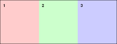
The box-orient property lets you specify the distribution axis. vertical and horizontal values define how boxes are displayed. Other values (inline-axis and block-axis) have the same effect, but also let you define the baseline alignment itself (basically the boxes are treated like “inline” boxes).
body{
  display: box;
  box-orient: horizontal;
}
Reversed distribution
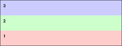
The property box-direction allows you to set the order in which the boxes appear. By default–when you simply specify the distribution axis–the boxes follow the HTML flow and are distributed from top to bottom if you are using a vertical axis and from left to right if you are using a horizontal axis. By setting box-direction to reverse, you can reverse the boxes’ distribution order. It acts as if you actually reversed the order of the elements in the HTML.
Be careful with this property because it changes the way some other properties work, which can produce some unexpected behavior.
body {
  display: box;
  box-orient: vertical;
  box-direction: reverse;
}
Explicit distribution
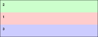
The property box-ordinal-group lets you specify the order in which the boxes will be distributed. This is the ultimate customization opportunity, because you can define the order you want, regardless of the HTML flow order. Those groups are defined by a number starting at 1 (which is the default value). So the box model will first distribute those groups, then all the boxes inside each group. The distribution occurs from the lowest value (the group numbered 1) to the highest (the groups numbered 2 and above).
body {
  display: box;
  box-orient: vertical;
  box-direction : reverse;
}
#box1 {
  box-ordinal-group: 2;
}
#box2 {
  box-ordinal-group: 2;
}
#box3 {
  box-ordinal-group: 1;
}
And what about flexibility?
If changing the natural HTML flow order is huge, the real fun begins when you start to deal with the available space.
Box sizing
By default, a box is not flexible. It becomes flexible only if it has the property box-flex with a value of at least 1.
If a box is not flexible, it will be as wide as possible to make its content visible without any overflow. Its size can be forced with the properties width and height (or their min-*, and max-* alternatives).
If a box is flexible, its size will be computed as follows:
- The explicit size declarations (
width,height,min-*andmax-*) - The size of the parent box and all the remaining available inner space.
So, if the boxes haven’t any size declarations, their sizes will fully depend on their parent box’s size. It will work like this: the size of box is equal to the size of its parent multiplied by the value of the its box-flex property divided by the sum of all the box-flex properties values of all boxes included in its parent.
On the other hand, if one or more boxes have an explicit size statements, the size of all those boxes is computed and all the flexible boxes share the remaining available space on the same principle as above.
It probably sounds a bit tricky, but with some examples it will become easier.
All boxes are flexible
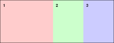
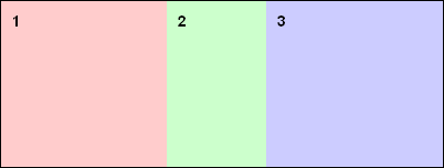
In the next example, box 1 is twice the size of box 2 and box 2 has the same size as box 3. It looks the same as using percentages to set the boxes’ sizes. But there is a big difference. If you add a box, you don’t need to recalculate its size. With the flexible box model, each time you add a box, all the others automatically shrink to make room for the new one.
body {
  display: box;
  box-orient: horizontal;
}
#box1 {
  box-flex: 2;
}
#box2 {
  box-flex: 1;
}
#box3 {
  box-flex: 1;
}
Some boxes have a fixed size
In the next example, box 3, which is not flexible, is 160px in width. In this case, there’s 240px of free space available for boxes 1 and 2. So, box 1 will be 160px in width (240px x 2/3) and box 2 will be 80px in width (240px x 1/3). If you wish, you can make box 3 flexible as well. In this case the way the size of this box is computed will be almost the same as with the property min-width.
body {
  display: box;
  box-orient: horizontal;
  width: 400px;
}
#box1 {
  box-flex: 2;
}
#box2 {
  box-flex: 1;
}
#box3 {
  width: 160px;
}
Managing overflow
Because we can mix flexible boxes, inflexible boxes, and flexible boxes which have preset sizes, It’s possible for the sum of all the boxes’ sizes to be larger or smaller than the parent box size. So you can have too much space or not enough.
I have too much space available; what do I do?
The available space gets distributed depending on the properties box-align and box-pack
The property box-pack manages the way the space is distributed on the horizontal axis and can have one of four possible values: start, end, justify, or center
start: All the boxes are on the left side of the parent box and all the remaining space is on the right side.end: All the boxes are on the right and the remaining space is on the leftjustify: The available space is divided evenly in-between each boxescenter: The available space is divided evenly on each side of the parent box
The property box-align manages the way the space is distributed on the vertical axis and can have one of five values: start, end, center, baseline, and stretch
start: The top edge of each box is placed along the top of the parent box and all the remaining space is placed below.end: The bottom edge of each box is placed along the bottom of the parent box and all the remaining space is placed above.center: The available space is divided evenly and placed half above and half below.baseline: All children are placed with their baselines aligned and the remaining space is placed before or after as necessary (This is a simplification about how this value really works, but you see the point).stretch: The height of each boxes is adjusted to fit the parent box height
A warning about how those properties work: they are strongly influenced by the use of the properties box-orient and box-direction. They can cause some unexpected behavior (for example, the behavior of values start and end could be fully reversed). I hope that once the specification is finalized, we’ll have more information about how those properties work together.
body {
  display: box;
  box-orient: horizontal;
  /* The content of the body is horizontally centered */
  box-pack: center;
  /* and vertically as well ... o/ */
  box-align: center;
  width: 100%;
  height : 100%;
}
What happens if I don’t have enough space?
Just like with the traditional box model, the overflow property lets you to define the way it’s managed. No surprise here.
However, you must be careful here too. Indeed, the use of the properties box-orient and box-direction can mess it up. For example, you can see elements overflowed to the right instead of the left or to the top instead of the bottom. Take the time to experiment before trying to use it on a big project or you could go mad.
You can also avoid overflow by making the boxes run over multiple lines (or columns, depending on the orientation) by setting the property box-lines to multiple.
Okay, cool, but does it work in real life?
Yes it does! Both Gecko and WebKit have vendor-prefixed implementations of a box model (Note: The current state of the specification does not reflect Mozilla’s or WebKit’s implementation). This means that Firefox, Safari, Chrome, and any browsers that use one of those rendering engines are able to use the features described in this article. If you use one of those awesome browsers, here is a little demo of the flexible box model in action.
If you’re not using a browser implementing a box model, this screenshot shows you what it looks like:

To conclude
You can start to use this box model to layout your HTML documents with modern web browsers. Be careful though, it’s the really first iteration of a W3C Working Draft. There will certainly be some changes. Anyway, the implementations available in Gecko and Webkit are extremely consistent and mature, so if there are changes, they should not be that troublesome.
This box model is a very easy and simple way to solve some usual problems in web design (form layout, page footers, vertical centering, disassociation of visual flow from HTML flow, etc.). I strongly suggest you become familiar with it because it could become a standard tool for web designers in the near future (if Microsoft decides to include it in IE, it could become so very fast).
What is already available is a good start to play with. But at this point, the way the traditional box model and the flexible box model interact is not very clear (for example, it’s impossible to use position:relative with the properties left or top on a box which uses the property box-ordinal-group). This will be improved, but don’t be surprised if your work habits are somewhat undermined. Another tricky point: the way all the properties relative to this new box model interact can be sometimes really confusing. This should remind you of the day you discovered the float property. ;)
For further information
- Shawn J. Goff: CSS3 Flexible Box Layout Module
- CSS3.info: Introducing the flexible box layout module
- W3C: Flexible Box Layout Module
About Paul Rouget
Paul is a Firefox developer.



105 comments