
 By
By
Today’s demo comes from Lim Chee Aun, the creator of the Phoenity icons and themes, and web developer in Malaysia.
The border-radius property is probably one of the most interesting parts of the CSS3 specification, where it allows you to create rounded corners on elements. For example:
div {
  border-radius: 10px;
  -moz-border-radius: 10px;
  -webkit-border-radius: 10px;
}
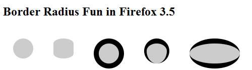
In Firefox 3.5, -moz-border-radius has been updated to match the latest revision to the CSS3 specification. Thus now, we can create elliptical borders.
So, what does that mean? According to the specification, the syntax is:
-moz-border-radius: {1,4} [ / {1,4}]?
It shows the set of values accepted for this property, plus an optional slash with another set of values. This is where the magic comes from. If two sets of values are given, values before the slash set the horizontal radius and values after it set the vertical radius.
This opens a few interesting possibilities. This demo shows some experiments on certain types of shapes that you can play with.
In the demo, it’s not only possible to modify the border width, style and radius, but also the style as well, such as ridge, double and groove. As of now, dotted and dashed doesn’t work yet and being rendered as solid. For more information, see Mozilla bug 431176 .
7 comments