
 By
By
 Today we have a guest post by James Long (@jlongster).
James is the tech lead for mozilla.com on the Web Development team. James is passionate about interactive graphics on the open web.
Today he explains how you can create 3D objects using CSS without having 3D transforms support. Take it away, James.
Recently I was tinkering with CSS3 and I discovered that it enabled me to do primitive 3D rendering, which I found fascinating! This led to the creation of dom3d, a JavaScript library that uses CSS to render basic 3D objects.
Now the question is: why? Aren’t canvas, WebGL, and even SVG better technologies to work with for this? Possibly. However, CSS is becoming a powerful language for describing complex effects and shapes, and we should experiment.
Keep that in mind, because CSS definitely isn’t intended to do this, but it’s worth trying to see where we should take CSS in the future.
Advantages
Although this is more of an experiment, it has a few real world benefits:
All rendering libraries available for the web (canvas, WebGL, SVG) require a canvas, which is a constrained box on the page with a specific width and height. It is not possible to render anything outside this box. The canvas also captures all DOM events (like clicks), even completely transparent sections. Theoretically, this could make it difficult to do effects that overlay large parts of the page or are somehow deeply integrated to the content.
Using CSS, we aren’t constrained to a box, and the effect can overlay large portions of the page without covering any the the links or other content requiring interaction.
Other advantages include no need to initialize canvas 2D or WebGL, and a simplistic API making it easy to pick up even if you don’t know much about 3D. It might be easier for kids to start playing around with this before they jump into WebGL or something else. Also, because it’s just a dump of DOM elements you can embed it anywhere (without animation).
So keep in mind that this is a hack, but with the above advantages. This might be good for certain effects: 3D cursor, nav transitions, and others.
How it works
Three-D objects are just a bunch of triangles put together, so let’s start with one simple triangle. If we get that working, it’s a simple step forward to render multiple triangles to form a 3D object.
Rendering a 3d triangle on a 2D screen involves something called “projection”. This is the act of taking a 3D point and projecting it onto a 2D screen. Plug in a 3D triangle to a simple math equation, and you get a 2D triangle representing how the 3D one would look on the screen.
The math is remarkably simple but may seem weird if you aren’t familiar with linear algebra. You can take a look at the renderer code.
Now comes the fun part: can you render any 2D triangle simply with CSS3 transforms? Turns out you can! It just takes some fiddling to figure out which transforms to generate. CSS3 transforms are composed of translate, scale, rotate, and skew values, and we need a few equations to compute these values for a specific 2D triangle.
First, let’s take a simple DOM element and turn it into a triangle. We can do this with the linear-gradient background image (another way is border triangles).
Now let’s draw the following blue triangle with the points [20, 20], [50, 120], and [120, 30]. A vital step is to set a few initial reference points which set everything in the same space. Our equations will assume these coordinate spaces. This is how the points A, B, C and the side AB are related.
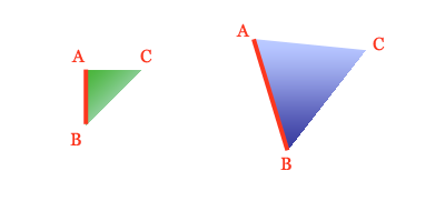
If we take a closer look at this, we can derive the transform values. First, get an idea of which angles and values we need and then use geometry to form the equations (in pseudo-code). The red box represents the DOM element, the form AB represents the side formed by points A and B, and rotation occurs clockwise.
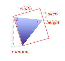
rotation = atan2(AB.x, AB.y)
AC' = rotate(AC, -rotation)
width = AC'.x
height = length(AB)
skew = atan2(AC'.y, AC'.x)
translate = A
Awesome! Let’s try it out. Here is a live DOM element being transformed by applying each of our equations:
The resulting triangle matches our target triangle! Here is the final CSS:
width: 93px;
height: 104px;
background: -moz-linear-gradient(-0.727211rad, #0000FF 50%, transparent 0pt);
-moz-transform: translate(20px, 20px) rotate(-0.291457rad) skewY(0.391125rad);
-moz-transform-origin: top left;
Note: The tranform-origin: top left line is important. Normally transforms happen relative to the center of the element, but our equations assume the top left.
Note: dom3d also generates code with the -webkit and -o prefixes for WebKit and Opera support.
You can view the implementation of these equations. It turns out that these equations work for any triangle, as long as the points given are in counter-clockwise order, which is standard in the graphics world.
Taking it all the way
Since we can project a 3D triangle into 2D space and render it with CSS, all we have to do now is apply that to several 3D triangles to form a 3D object!
We need some 3D data at this point. I used Blender to export a teapot into the simple OBJ file format and wrote a script to dump the data as JavaScript. Rendering all those triangles with this technique produces the following:
Teapot! However, we can do much better. A big part of the 3D effect is shading. If we calculate normals, a vector representing where the triangle is facing, and specify a light direction, we can take the dot product of the normal and light for each triangle to get flat shading. View the code for flat shading.
There are many tweaks that take this even further. For example, the above objects have z-indexing enabled. Without this, a triangle that is supposed to be behind another may actually appear on top because it was rendered later. The dom3d uses a heap to render the triangles from back to front.
Real-time animation can be achieved with a setTimeout or requestAnimationFrame function that continually renders the object. The dom3d supports the scale, translate, yaw, and pitch transformations, but there’s nothing stopping you from modifying the object data however you like between renderings. See some examples over at the dom3d website.
Here is the code which renders the teapot animation with dom3d:
It’s more appropriate for webpages to update an animation in response to user interaction instead of constantly rendering and hogging the CPU. See the pole example on the dom3d site for an example.
Improvements and last thoughts
The most interesting possibility with this is to include actual page elements as part of 3D objects. A navigation item could pop out and swirl around in 3d space, and the nav item is seamlessly transformed along with it.
That’s where this hack starts to show its faults, though. Unfortunately this is a little too hacky to provide an appropriate web experience. Because it tricks DIVs into fake triangles, it removes the possibility of integrating any page elements with it. With the coming of 3D CSS transforms though, we can start building true 3D objects made up of any kind of page elements. The only restriction with 3D transforms is that the 3D objects need to built with rectangles instead of triangles.
Other people have already experimented with 3D transforms, like building a pure CSS 3D city. There’s another cool library, Sprite3D, which provides a JavaScript API for building basic 3d objects from page elements.
The most glaring problem with dom3d is the seams in the object, which appear in all browsers. Apparently there are a few bugs in rendering engines when stressing their CSS3 transforms and using linear-gradients!
The dom3d library provides an API to work with all of this, but is hasn’t been documented very well yet. Feel free to browse the README and code on github. These APIs could be improved as well. It also provides an SVG rendering backend, seen here, but I don’t this is the right direction to take. We should focus on building basic 3D objects with page elements.
This was a fun experiment and I’m excited by how fast and capable browsers are becoming. The web is an exciting platform and getting richer and more powerful every year!
About Chris Heilmann
Evangelist for HTML5 and open web. Let's fix this!
3 comments