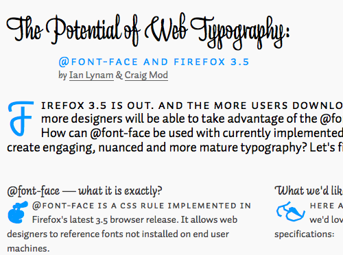
This post counts as both a demo and commentary about the changing nature of typography on the web. Ian Lynam and Craig Mod have put together a page that is an excellent example of typography in action, but also offer some suggestions on what the next steps for typography on the web might look like. The page itself takes advantage of a number of typefaces that Craig and Ian got permission to use and uses a pleasing multi-column layout. Please click through to the complete article to get the full effect.
Comments are closed for this article.


44 comments