
 By
By
This is the first post in a two-part series for getting started with CSS Grid Layout. If you are interesting in learning more about CSS Grid and the new CSS Grid Layout feature in Firefox, visit the Firefox DevTools Playground.
CSS Grid Layout is completely changing the game for web design. It allows us to create complex layouts on the web using simple CSS.
“But wait! I can already create layouts with floats/hacks/tables/frameworks.”
This is true, but CSS Grid Layout is a two-dimensional grid system that is native to CSS. It is a web standard, just like HTML, and it works in all modern browsers. With CSS Grid Layout you can create precise layouts for the web. You can build orderly columns and rows, or artful overlapping content areas to create stunning new designs.
Ready? Let’s get started.
Before we dive into CSS Grid concepts, let’s cover some basic terminology.
Terminology
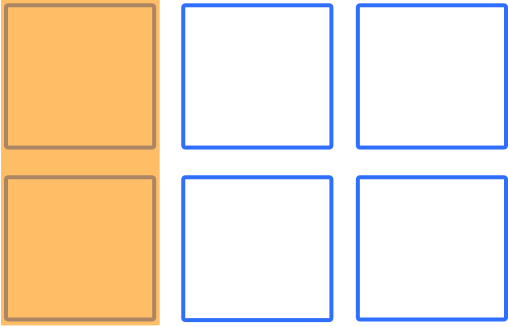
Grid lines
The vertical and horizontal lines that divide the grid and separate the columns and rows.
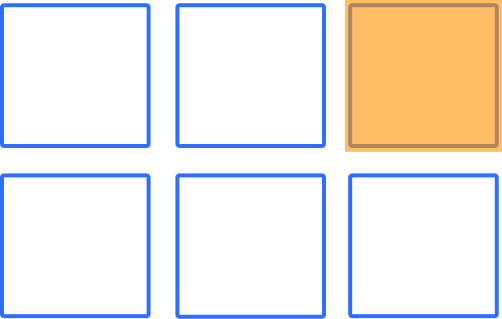
Grid cell
A single unit of a CSS grid.
Grid area
A rectangular space surrounded by four grid lines. A grid area can contain any number of grid cells.

Grid track
The space between two grid lines. This space can be horizontal or vertical
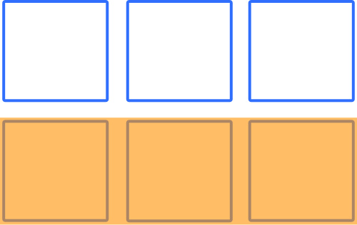
Grid row
A horizontal track of a grid.
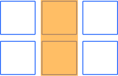
Grid column
A vertical track of a grid.
Note: Rows and columns are switched if you are using a vertical writing mode.
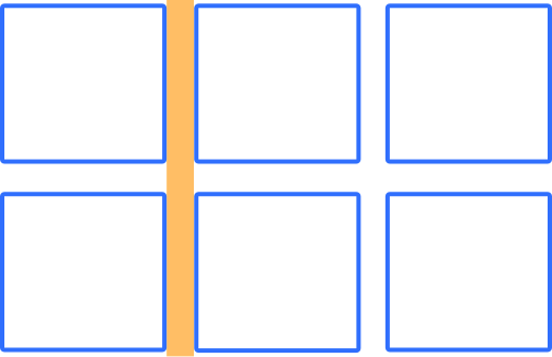
Gutter
The space between rows and columns in a grid.
Grid container
The container that holds the entire CSS grid. It will be the element that has the display: grid or display: inline-grid property on it.
Grid item
Any element that is the direct child of a grid container.
…Got it? Let’s move on now to creating our first grid with CSS Grid Layout.
Create a grid
The first thing we want to do is create a grid container. We can do this by declaring display: grid on the container element. In this example we are using a div with the class of container.
Define rows and columns
There are several ways to define rows and columns. For our first grid, we will use properties grid-template-columns and grid-template-rows. These properties allow us to define the size of the rows and columns for our grid. To create a grid where the first two rows have a fixed-height of 150px and the first three columns have a fixed-width of 150px, simply write:
grid-template-columns: 150px 150px 150px;
grid-template-rows: 150px 150px;
To set the fourth column as 70px wide, write:
grid-template-columns: 150px 150px 150px 70px;
…and so on to add more columns.
Note: In the above example, we defined an explicit grid of 3×2. If we place something outside of that defined grid, then CSS Grid Layout will create those rows and columns in the implicit grid. Implicit grids aren’t covered in this tutorial, but check out this article on MDN to learn more about implicit and explicit grids.
Add a gutter
Adding a gutter to your grid is amazingly easy with CSS Grid Layout. Simply add:
grid-gap: 1rem;
That simple line of code gives you an equal-sized gutter between all rows and columns. To define the gutter size for columns and rows individually, you can use the grid-column-gap and grid-row-gap properties instead.
Now let’s put that all together. Here is our HTML:
<div class="container">
  <div class="item"></div>
  <div class="item"></div>
  <div class="item"></div>
  <div class="item"></div>
  <div class="item"></div>
  <div class="item"></div>
</div>
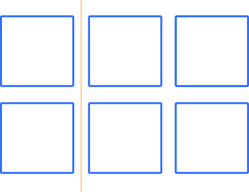
With just a few lines of CSS, we can create a simple grid:
.container {
  display: grid;
  grid-template-columns: 150px 150px 150px;
  grid-template-rows: 150px 150px;
  grid-gap: 1rem;
}
Here is the result:
See the Pen CSS Grid Layout – Basic Grid by Mozilla Developers (@mozilladevelopers) on CodePen.
The fr Unit
Creating grids with a fixed px width is great, but it isn’t very flexible. Thankfully, CSS Grid Layout introduces a new unit of length called fr, which is short for fraction. MDN defines the fr unit as a unit which represents a fraction of the available space in the grid container. If we want to rewrite our previous grid to have three equal-width columns, we could change our CSS to use the fr unit:
.container {
  display: grid;
  width: 800px;
  grid-template-columns: 1fr 1fr 1fr;
  grid-template-rows: 150px 150px;
  grid-gap: 1rem;
}
The repeat() notation
Handy tip: If you find yourself repeating length units, use the repeat() notation. Rewrite the above code like so:
.container {
  display: grid;
  width: 800px;
  grid-template-columns: repeat(3, 1fr);
  grid-template-rows: repeat(2, 150px);
  grid-gap: 1rem;
}
Here is the result:
See the Pen CSS Grid Layout – Fractional Unit by Mozilla Developers (@mozilladevelopers) on CodePen.
When declaring track sizes, you can use fixed sizes with units such as px and em. You can also use flexible sizes such as percentages or the fr unit. The real magic of CSS Grid Layout, however, is the ability to mix these units. The best way to understand is with an example:
.container {
  width: 100%;
  display: grid;
  grid-template-columns: 100px 30% 1fr;
  grid-template-rows: 200px 100px;
  grid-gap: 1rem;
}
Here, we have declared a grid with three columns. The first column is a fixed width of 100px. The second column will occupy 30% of the available space, and the third column is 1fr which means it will take up a fraction of the available space. In this case, it will take up all of the remaining space (1/1).
Here is our HTML:
<div class="container">
  <div class="item"></div>
  <div class="item"></div>
  <div class="item"></div>
  <div class="item"></div>
  <div class="item"></div>
  <div class="item"></div>
</div>
Here is the result:
See the Pen CSS Grid – Mixing Units by Mozilla Developers (@mozilladevelopers) on CodePen.
You can visit our playground for the full guide on how to get started with CSS Grid Layout, or check out Part 2 before you go. If you are ready to dive deeper into CSS Grid Layout, check out the excellent guides on MDN.
About Dan Brown
Creator, developer, strategist, homebrewer, runner, sock enthusiast, beard evangelist, writer, drummer, adventurer, Oxford comma advocate, and human Swiss Army Knife.
One comment