
 By
By
The release of Firefox 54 is just around the corner and it will introduce new features into an already cool CSS property: clip-path.
clip-path is a property that allows us to clip (i.e., cut away) parts of an element. Up until now, in Firefox you could only use an SVG to clip an element:
But with Firefox 54, you will be able to use shapes as well: insets, circles, ellipses and polygons!
Note: this post contains many demos, which require support for clip-path and mask. To be able to see and interact with every demo in this post, you will need Firefox 54 or higher.
Basic usage
It’s important to take into account that clip-path does not accept “images” as input, but as <clipPath> elements:
See the Pen clip-path (static SVG mask) by ladybenko (@ladybenko) on CodePen.
A cool thing is that these <clipPath> elements can contain SVG animations:
See the Pen clip-path (animated SVG) by ladybenko (@ladybenko) on CodePen.
However, with the upcoming Firefox release we will also have CSS shape functions at our disposal. These allow us to define shapes within our stylesheets, so there is no need for an SVG. The shape functions we have at our disposal are: circle, ellipse, inset and polygon. You can see them in action here:
See the Pen oWJBwW by ladybenko (@ladybenko) on CodePen.
And not only that, but we can animate them with CSS as well. The only restrictions are that we cannot “mix” function shapes (i.e., morphing from a circle to an inset), and that when animating polygons, the polygons must preserve the same number of vertices during the whole animation.
Here’s a simple animation using a circle shape:
See the Pen Animated clip-path by ladybenko (@ladybenko) on CodePen.
And here is another animation using polygon. Note: Even though we are restricted to preserving our set number of vertices, we can “merge” them by repeating the values. This creates the illusion of animating to a polygon with any number of sides.
See the Pen Animated clip-path (polygon) by ladybenko (@ladybenko) on CodePen.
Note that clip-path also opens new possibilities layout-wise. The following demo uses clipping to make an image more interesting in a multi-column article:
See the Pen Layout example by ladybenko (@ladybenko) on CodePen.
Spicing things up with JavaScript
Clipping opens up cool possibilities. In the following example, clip-path has been used to isolate elements of a site –in this case, simulating a tour/tutorial:
See the Pen tour with clip-path by ladybenko (@ladybenko) on CodePen.
It’s done with JavaScript by fetching the dimensions of an element on the fly, and calculating the distance with respect to a reference container, and then using that distance to update the inset shape used on the clip-path property.
We can now also dynamically change the clipping according to user input, like in this example that features a “periscope” effect controlled by the mouse:
See the Pen clip-path (periscope) by ladybenko (@ladybenko) on CodePen.
clip-path or mask?
There is a similar CSS property, mask, but it is not identical to clip-path. Depending on your specific use case, you should choose one or the other. Also note that support varies across browsers, and currently Firefox is the only browser that fully supports all the mask features, so you will need to run Firefox 54 to interact with the demos below on Codepen.
Masking can use an image or a <mask> element in an SVG. clip-path, on the other hand, uses an SVG path or a CSS shape.
Masking modifies the appearance of the element it masks. For instance, here is a circular mask filled with a linear gradient:

And remember that you can use bitmap images as well even if they don’t have an alpha channel (i.e., transparency), by tweaking the mask-mode:
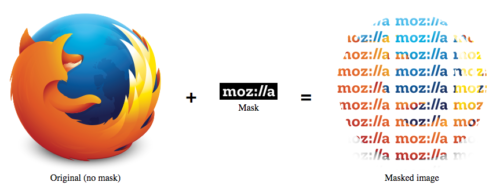
The key concept of masking is that it modifies the pixels of an image, changing their values – to the point of making some of them fully transparent.
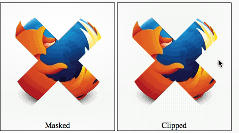
On the other hand, clipping “cuts” the element, and this includes its collision surface. Check out the following demo showing two identical pictures masked and clipped with the same cross shape. Try hovering over the pictures and see what happens. You will notice that in the masked image the collision area also contains the masked parts. In the clipped image, the collision area is only the visible part (i.e., the cross shape) of the element.
Is masking then superior to clipping, or vice versa? No, they are just used for different things.
I hope this post has made you curious about clip-path. Check out the upcoming version of Firefox to try it!
About Belén Albeza
Belén is an engineer and game developer working at Mozilla Developer Relations. She cares about web standards, high-quality code, accesibility and game development.
One comment