CSS coding techniques

Lately, we have seen a lot of people struggling with CSS, from beginners to seasoned developers. Some of them don’t like the way it works, and wonder if replacing CSS with a different language would be better—CSS processors emerged from this thinking. Some use CSS frameworks in the hopes that they will have to write less code (we have seen in a previous article why this is usually not the case). Some are starting to ditch CSS altogether and use JavaScript to apply styles.

But you don’t always need to include a CSS processor in your work pipeline. You don’t need to include a bloated framework as the default starting point for any project. And using JavaScript to do the things CSS is meant for is just a terrible idea.

In this article we will see some tips and recommendation to write better, easier-to-maintain CSS code, so your stylesheets are shorter and have fewer rules. CSS can feel like a handy tool instead of a burden.

The “minimum viable selector”

CSS is a declarative language, in which you specify rules that will style elements in the DOM. In this language, some rules take precedence over others in the order they are applied, like inline styles overriding some previous rules.

For instance, if we have this HTML and CSS code:

<button class="button-warning">
.button-warning {
  background: red;
}

button, input[type=submit] {
  background: gray;
}

Despite .button-warning being defined before the button, input[type=submit] rule, it will override the latter background property. Why? What is the criteria to decide which rule will override the styles of another one?

Specificity.

Some selectors are considered to be more specific than others: for instance an #id selector will override a .class selector.

What happens if we use a selector that is more specific than it really needs to be? If we later want to override those styles, we need an even more specific selector. And if we later need to override this more specific selector, we will need… yes, it’s a snowball growing larger and larger and will eventually become very difficult to maintain.

So, whenever you are writing your selectors, ask yourself: is this the least specific selector that can do the job here?

All of the specificity rules are officially defined in the W3C CSS Selectors specification, which is the way to find out every single detail about CSS Selectors. For something easier to understand, read this article on CSS specificity.

Don’t throw new rules at bugs

Let’s imagine this typical situation: there is a bug in your CSS and you locate which DOM element has the wrong style. And you realise it’s somehow inheriting a property that it shouldn’t have.

Don’t just throw more CSS at it. If you do, your code base will grow a bit larger, and locating future bugs will be a bit harder.

Instead, stop, step back, and use the developer tools in your browser to inspect the element and see the whole cascade. Identify exactly which rule is applying the style you don’t want. And modify that existing rule so that it doesn’t have the unintended consequence.

In Firefox you can debug the cascade by right-clicking on a element in a page and selecting Inspect element.

image00

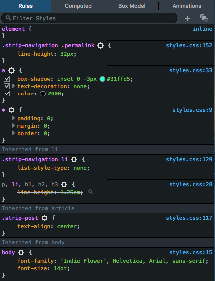
Look at that cascade in all its glory. Here you can see all the rules applied to an element, in the order in which they are applied. The top entries are the ones with more specificity and can override previous styles. You can see that some rules have some properties struck out: that means that a more specific rule is overriding that property.

And you can not only see the rules, but you can actually switch them on and off, or change them on the fly and observe the results. It’s very useful for bug fixing!

The needed fix may be a rule change or it may be a rule change at a different point in the cascade. The fix may require a new rule. At least you will know it was the right call and something that your code base needed.

This is also a good time to look for refactoring opportunities. Although CSS is not a programming language, it is source code and you should give it the same consideration that you give to your JavaScript or Python: it should be clean, readable and be refactored when needed.

Don’t !important things

This is implied in the previous recommendations, but since it’s crucial I want to stress it: Don’t use !important in your code.

!important is a feature in CSS that allows you to break the cascade. CSS stands for “Cascading Style Sheets,” this is a hint.

!important is often used when you are rushing to fix a bug and you don’t have the time or the will to fix your cascade. It is also used a lot when you are including a CSS framework with very specific rules and it’s just too hard to override them.

When you add !important to a property, the browser will ignore other rules with higher specificity. You know you are really in trouble when you !important a rule to override another rule that was marked as !important as well.

There is one legitimate use of !important —and it’s while using  the developer tools to debug something. Sometimes you need to find which values for a property will fix your bug. Using !important in the developer tools and modifying a CSS rule on the fly lets you find these values while you ignore the cascade.

Once you know which bits of CSS will work, you can go back to your code, and look at which point of the cascade you want to include those bits of CSS.

There’s life beyond px and %

Working with px (pixels) and % (percentages) units is quite intuitive, so we will focus here on less-known or less intuitive units.

Em and rem

The most well-known relative unit is em. 1em is equivalent to the font size of that element.

Let’s imagine the following HTML bit:

<article>
  <h1>Title</h1>
  <p>One Ring to bring them all and in the darkness bind the.</p>
</article>

And a stylesheet with just this rule:

article {
  font-size: 1.25em;
}

Most browsers apply a base font size of 16 pixels to the root element by default (by the way, this is overridable—and a nice accessibility feature—by the user). So the paragraph text of that article element will probably get rendered with a font-size of 20 pixels (16 * 1.25).

What about the h1? To understand better what will happen, let’s add this other CSS rule to the stylesheet:

h1 {
  font-size: 1.25em;
}

Even though it’s also 1.25em, the same as article, we have to take into account that em units compound. Meaning, that an h1 being a direct child of a body, for instance, would have a font-size of 20 pixels (16 * 1.25). However, our h1 is inside an element that has a font-size that is different than the root (our article). In this case, the 1.25 refers to the font-size we are given by the cascade, so the h1 will be rendered with a font-size of 25 pixels (16 * 1.25 * 1.25).

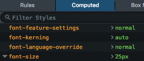
By the way, instead of doing all of these multiplication chains in your head, you can just use the Computed tab in the Inspector, which displays the actual, final value in pixels:

image01

em units are really versatile and make it really easy to change—even dynamically—all the sizes of a page (not just font-size, but other properties like line-height, or width).

If you like the “relative to base size” part of em but don’t like the compounding part, you can use rem units. rem units are like em‘s that ignore compounding and just take the root element size.

So if we take our previous CSS and change em units for rem in the h1:

article { font-size: 1.25em; }
h1 { font-size: 1.25rem; }

All h1 elements would have a computed font-size of 20 pixels (assuming a 16px base size), regardless of them being inside an article or not.

vw and vh

vw and vh are viewport units. 1vw is 1% of the viewport width, whereas 1vh is 1% of the viewport height.

They’re incredibly useful if you need a UI element that needs to occupy the whole screen (like the typical semi-transparent dark background of a modal), which is not always related to the actual body size.

Other units

There are other units that might be not as common or versatile, but you will inevitably stumble upon them. You can learn more about them at the MDN.

Use flexbox

We have talked about this in a previous article about CSS frameworks, but the flexbox module simplifies the task of crafting layouts and/or aligning things. If you are new to flexbox, check out this introductory guide.

And yes, you can use flexbox today. Unless you really need to support ancient browsers for business reasons. The current support for flexbox in browsers is above 94%. So you can stop writing all of those floating div‘s which are hard to debug and maintain.

Also, keep an eye open for the upcoming Grid module, which will make implementing layouts a breeze.

When using a CSS processor…

CSS compilers like Sass or Less are very popular in the front-end development world. They are powerful tools, and—when put in good use—can allow us to work more efficiently with CSS.

Don’t abuse selector nesting

A common feature in these processors or “compilers” is selector nesting. So, for instance, this Less code:

a {
  text-decoration: none;
  color: blue;

  &.important {
    font-weight: bold;
  }
}

Would get translated to the following CSS rules:

a {
  text-decoration: none;
  color: blue;
}

a.important {
  font-weight: bold;
}

This feature allows us to write less code and to group rules that affect elements which are usually together in the DOM tree. This is handy for debugging.

However, it is also common to abuse this feature and end up replicating the whole DOM in the CSS selectors. So, if we have the following HTML:

<article class="post">
  <header>
    <!-- … -->
    <p>Tags: <a href="..." class="tag">irrelevant</a></p>
  </header>
  <!-- … -->
</article>

We might find this in the CSS stylesheet:

article.post {
  // ... other styling here
  header {
    // ...
    p {
      // ...
      a.tag {
        background: #ff0;
      }
    }
  }
}

The main drawback is that these CSS rules have extremely specific selectors. We have already seen that this is something we should avoid. There are other disadvantages as well to over-nesting, which I have talked about in another article.

In short: do not let nesting generate CSS rules you wouldn’t type yourself.

Include vs extend

Another useful feature of CSS processors is mixins, which are re-usable chunks of CSS. For instance, let’s say that we want to style buttons, and most of them have some basic CSS properties. We could create a mixin like this one in Less:

.button-base() {
  padding: 1em;
  border: 0;
}

And then create a rule like this:

.button-primary {
  .button-base();
  background: blue;
}

This would generate the following CSS:

.button-primary {
  padding: 1em;
  border: 0;
  background: blue;
}

As you can see, very handy to refactor common code!

Besides “including” a mixin, there is also the option of “extending” or “inheriting” it (the exact terminology differs from tool to tool). What this does is to combine multiple selectors in the same rule.

Let’s see an example using the previous .button-base mixin:

.button-primary {
  &:extend(.button-base)
  background: blue;
}

.button-danger {
  &:extend(.button-base)
  background: red;
}

That would be translated to:

.button-primary, .button-danger {
  padding: 1em;
  border: 0;
}

.button-primary { background: blue; }
.button-danger { background: red; }

Some articles online tell us to only use “include”, whereas some tell us to only use “extend”. The fact is that they produce different CSS, none of them is inherently wrong, and depending on your actual scenario it would be better to use one or the other.

How to choose between them? Again, the “would I write this by hand?” rule of thumb applies.


I hope this can help you to reflect on your CSS code and write better rules. Remember what we said before: CSS is code, and as such, worthy of the same level of attention and care as the rest of your code base. If you give it some love, you will reap the rewards.

About Belén Albeza

Belén is an engineer and game developer working at Mozilla Developer Relations. She cares about web standards, high-quality code, accesibility and game development.

More articles by Belén Albeza…


25 comments

  1. awal

    > What happens if we use a selector that is more specific than it really needs to be? If we later want to override those styles, we need an even more specific selector. And if we later need to override this more specific selector, we will need… yes, it’s a snowball growing larger and larger and will eventually become very difficult to maintain.

    This is only one side of the coin. The another one is this:

    Say we need a selector with the minimum specificity needed. Now say we add some new elements to the DOM being styled. Our selector selects the new elements as well which is not what we want to happen for our use case. So we add some specificity to the selector, or add an extra class to the dom elements it was targeting. Former takes us the snowball you described above for CSS, and the latter for DOM.

    Now you can (justifiably) say that one should have a definite DOM structure ready which makes semantic sense first and *then* get to the styling part, but remember that often you have to change your DOM structure because of some CSS limitations *while* styling (for example no way to select and style parent based on child selector, so you wrap things in another div). And ofcourse, in real world, your manager doesn’t care about your DOM/CSS structure. He just wants one more button in the group of buttons :)

    On the other hand, if you have a technique to tackle this as well, I’d be glad to hear!

    May 18th, 2016 at 10:05

    1. Belén Albeza

      And ofcourse, in real world, your manager doesn’t care about your DOM/CSS structure. He just wants one more button in the group of buttons :)

      In the real world, your manager cares about the time it takes you to fix a bug. If it takes you long hours because you cannot even understand your own code, she will notice.

      So “this needs to be done ASAP” is not an excuse to write bad code all the time.

      On the other hand, if you have a technique to tackle this as well, I’d be glad to hear!

      It is obvious that if you add more features (well, in this case, more UI) to something, you will probably require more code. How much new code you add is the key question here.

      How do you keep a code base reasonable? By caring, by performing code reviews, by refactoring.

      In addition to that, IMHO the sensible way to keep CSS tamed in big, complex, ever-changing projects is by having an always-up-to-date CSS style guide.

      May 19th, 2016 at 02:02

      1. Jon

        I find low-specificity selectors are the biggest cause of CSS bugs, and by far the hardest to fix. These low-specificity rules are the equivalent of global variables, and changing them is very risky, because you don’t know what else they might effect. And because they’re not precisely targeted, it’s all too easy for new HTML to accidentally pick-up unwanted styles, because you’ve reused a class name like “article” or “navigation”, and there’s a low-specificity rule that applies to it.

        As a result, many projects accumulate a plethora of low-specificity utility classes that nobody has the confidence to change or remove, because doing so might break something else they’re not aware of. It’s these sort of low specificity rules that cause people to layer on more rules and !important overrides.

        Instead, the UI should be designed as a series of components, each with highly specific rulesets applying to them, and only to them. Global, low specificity rules should be kept to an absolute minimum, just applying common fonts and colors to the basic HTML elements. Everything other rule should tie closely to the DOM structure of the component it styles, and be specific enough to avoid affecting anything else.

        By writing CSS like this, styles are properly encapsulated, and developers can make changes to them with confidence, because it’s obvious exactly what they will effect, and what they won’t. When a component is removed, its associated styles can be safely deleted as well, and by co-locating styles with component HTML, it’s easy to work on both, and the developer will know exactly where in the codebase to go to address a bug reported on a particular component.

        Such specific, targeted and separated rules also help collaborative development. If I’m the only developer working on a ticket relating to a particular component, I can safely make changes to its styles, knowing I won’t have a merge problem when I commit my changes because someone else has been working on the same CSS file at the same time.

        May 20th, 2016 at 05:24

        1. awal

          > These low-specificity rules are the equivalent of global variables, and changing them is very risky, because you don’t know what else they might effect.

          Right. I think that’s a good “analogy”. The issue is that while global variables have an easy alternative in pretty much every programming language (function scope/local vars), CSS/HTML don’t have those. The primary selection targets – classnames and ids are globally scoped.

          But this doesn’t invalidate the very keen observation made in the article that highly specific rules also cause issues. That’s why I said there are two faces to the coin. You try to keep things sane on one side and other turns haywire.

          The solution is obviously to just put the blame on the language ;)

          May 21st, 2016 at 08:32

      2. Anon

        “In the real world, your manager cares about the time it takes you to fix a bug. If it takes you long hours because you cannot even understand your own code, she will notice.”

        I saw more unicorns in my life than managers of this kind. Don’t quit your job !

        June 7th, 2016 at 06:20

      3. Sam

        An funny observation: the CSS of this very comments system has a rule .comment.bypostauthor .comment__title::after that is not specific enough, giving a ‘author’ tag to every reply of Belén’s comment!

        June 9th, 2016 at 08:58

  2. Nils

    Flexbox does not seem ready to me. Yes support is 94% but that also includes broken implementations or implementations of an old standard (esp. IE). It is only implemented correctly by 76% of the browsers, which makes it a pain in the ass to use when supporting IE.

    May 19th, 2016 at 06:20

    1. Konstantin

      Totally agree with @Nils, I also think that it’s not a time for using Flexbox in production code yet.

      June 6th, 2016 at 02:06

    2. Peter

      I tend to agree. I always wonder curiously what I am missing when I read that “flexbox is ready to use”. The partial support for IE10/11, the Android browser and iOS Safari means that I still need to build a solid fallback layout if I choose to go down the flexbox road.

      June 8th, 2016 at 03:10

  3. Gerd Neumann

    Great article!

    The specificity of rules always bugs me. It would really help if the dev tools would show the computed specificity of a rule somewhere… Some time ago I googled for it, I did not find any tool (with any browser) which lets me know this rule is 0,1,2,2 but that is 0,2,0,0 So in the end you need to “compute” it yourself, which is hard because as a novice you don’t know the whole spec.

    May 20th, 2016 at 01:33

    1. Belén Albeza

      Hi Gerd, thanks for the feedback! I’ll pass it around

      May 20th, 2016 at 06:21

      1. Gerd Neumann

        Thanks, Belén! In case this ends up in a bugzilla report, please share it here as I would like to follow its status.

        BTW, your article just hit number 1 at hacker news: https://news.ycombinator.com/item?id=11736286 Congrats!

        May 20th, 2016 at 06:37

        1. Janne Clarson

          Here you go, already filed 2 years ago:
          https://bugzilla.mozilla.org/show_bug.cgi?id=977098

          May 23rd, 2016 at 04:22

    2. Ryan Johnson

      I’ve found this handy tool for calculating CSS specificity. https://specificity.keegan.st/

      May 20th, 2016 at 11:45

  4. Gerd Neumann

    Reading all this about CSS debugging using the dev tools makes me feel really sad about its JS Debugger (which is just “read-only”). Imagine I could enable/disable, play around with values and statements the same way in the debugger I can with css in the inspector – a completely different world. In the debugger I can only ‘look’ at the current state, nothing can be changed on the fly for testing…

    May 20th, 2016 at 01:51

  5. George Stephanis

    This is implied in the previous recommendations, but since it’s crucial I want to stress it: Don’t use !important in your code.

    Ehhhh, sometimes `!important` is a good option. I agree that just for the ‘quick fix’ it’s a bad idea, but it can solve other issues beautifully.

    For example: If you’re writing a plugin or some sort of module that will inject a block of styled content in websites whose normal styling you have no control over, and you need to not accidentally let the sites override your own styling, it’s a great fit.

    In that situation, it’s used to ensure that your block will display correctly across thousands or millions of websites and not fall victim to some awkward accidental local CSS rule like `#body #content #post strong {}` that some developer thought was a clever idea at one point, but didn’t realize the implications of the insane level of specificity that is assigned. (I’ve seen this happen and the support load that it causes).

    Far better to have reasonable selectors targeting only your markup, with `!important` so that sites, if they want to, can override your styling, but they just need to be explicit about it.

    Long story short, rigidly holding to rules like these in /all/ situations can lead to far worse results for your users than taking them with a grain of salt and making educated decisions while understanding the implications.

    May 20th, 2016 at 02:53

  6. peter

    Now that we’re writing almost all of our html in modular fashion, I have found mix-n-matching pre-defined css classes works the best. i.e. class=”inline-block bg-bbb text-333 padding-5-15″

    May 20th, 2016 at 08:50

    1. Jens

      Sounds like a *really* good idea – no more `style` attributes – you might be *very* interested in the universal.css project then which is a great project based on this very idea: https://github.com/marmelab/universal.css

      They have predefined classes like `border-top-width-1-dot-04em` or `margin-left-10px`, be sure to check the last question of their faq though ;)

      May 21st, 2016 at 01:57

    2. Greg Bell

      “class = bg-bbb text-333 padding-5-15”

      But then aren’t we just back to putting style semantics into content & layout?

      May 25th, 2016 at 04:29

  7. Johntrepreneur

    Funny thing about using the LESS nesting on teams is that, at least on our team, people tend to nest and use it to organize the styles so it’s easier to find and locate things. While this may work when editing the LESS file, you end up with huge unnecessarily heavy selectors which is obviously bad. Using LESS imports feature to import other files is a better way to solve for CSS organization and prevent heavy selectors from nesting IMO.

    May 20th, 2016 at 13:08

  8. Jaydev Gajera

    I am also thinking that Flex is a good solution to create responsive layouts. I have tried to create a sass module to create Flex based responsive layouts.
    Here is the Github repo: https://github.com/jaydevonline/floatless
    Feedback is always welcome so please suggest any changes or something that I did wrongly.

    May 22nd, 2016 at 22:10

  9. Alex Walgreen

    In the example you write ‘button-warning’. This is something I’ve seen a lot. But there are other, more flexible ways of doing it.

    You would also be able to write some stuff like:

    .button {
    /* default button styles here */
    }

    .warning {
    background: red;
    color: black;
    }

    .info {
    background: blue;
    color: white;
    }

    And then use it in HTML as:

    In my perception this is also a clean and good way of writing CSS, because on any element that you want to make look like a button, you just apply the button class. And, for any element that you want to represent a warning, or info, you just add the warning or info class.

    This allows for reuse of styles in a more flexible way. Let say you want a specific button to have a border:

    .bordered {
    border: 1px solid black;
    }

    So we create a bordered button like:

    Lets say we now want to create a DIV that provides an informational message to a user:

    contents

    What’s your opinion about this way of working with CSS?

    May 24th, 2016 at 05:55

  10. Adrian Bettridge-Wiese

    Re @include vs. @extend, you can’t @extend from within media queries, which causes some real issues. Personally, I hate that this is the case, but this is the world we live in, so @include it is!

    May 24th, 2016 at 10:18

    1. Alan

      Or just stop using preprocessors. I did and am very happy with pure CSS and some enhancements via postcss.

      May 28th, 2016 at 08:29

  11. feibinyang

    Great !
    Can i translate it to chinese? It’s non-commercial.

    May 26th, 2016 at 20:22

Comments are closed for this article.