
 By
By
In this article we’ll take a look at the wonderful world of the CSS Grid Layout, a relatively new W3C specification that has partially started to see the day in some browsers.
But before we dive into what this new CSS technique is all about and how to use it, let’s quickly review grid theory.
My really short introduction to grid theory
I am not a designer nor did I know much about grid theory before stumbling upon the CSS Grid Layout specification, so don’t take my word for it and go look it up yourself, but if you don’t care to, here’s my pitch:
In essence, a grid is a set of invisible vertical and horizontal lines that are used to position the various design and content pieces of a web page, magazine, or newspaper. The goal of a grid is to serve as a base for placing the various pieces of content and to make sure these pieces are aligned and spaced out evenly. A grid, even if not visible, provides the viewer with a way to navigate content visually.
So what has CSS got to do with it?
CSS is getting a set of entirely new properties that, when used together, allow you to define grids for your web content to go onto. These properties are defined in the CSS Grid Layout specification.
CSS hasn’t particularly been known for its ability to handle complex layouts. Although this may not have been a problem when CSS first came out, it has evolved to be a pretty common one over the years, as all sorts of complex layouts couldn’t be easily implemented. People have been very creative at getting around the lack of support by using floats or absolute positioning and a variety of CSS layout frameworks emerged.
So it’s about time CSS got some proper layout solutions to support today’s use cases.
Can I use it?
Yes you can start using it today, to experiment and learn. It’s a bit too early to use it on a commercial website.
Chrome has implemented the specification far enough to play with Grid. Turn the experimental Web Platform features flag on to get it to work. The Chrome implementation is currently the most up-to-date with the recent changes to the CSS Grid Layout specification.
Internet Explorer had the first implementation of CSS Grid (dating back to IE10), but the spec has evolved since it was added and so it’s not entirely compatible with the latest spec anymore. They’ll be updating their implementation soon.
Firefox has started implementing it too, so it shouldn’t be too long before you can use it in this browser.
Finally, a polyfill exists, so you have no excuses not to start experimenting. (And I strongly encourage you to do so!) You probably should not use the polyfill in production, however.
So what’s a CSS grid layout?
At its core, a grid layout in CSS is a set of vertical and horizontal lines that define cells into which content can be arbitrarily positioned.
So it looks like a table in a way, except for a few key differences we’ll see later.
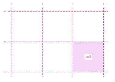
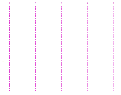
The figure above shows the building blocks of a grid:
- Lines: In this case there are 4 vertical lines and 3 horizontal lines. Lines are given numbers starting from 1. Vertical lines are shown from left to right, but this depends on the writing direction. Lines can optionally be given names, which helps with referencing them in CSS, as we’ll see later.
- Tracks: A track is simply the space between 2 parallel lines. So in the above example, there are 3 vertical tracks and 2 horizontal tracks. Lines are useful to indicate where content starts and stops, but tracks are ultimately where content goes.
- Cells: A cell is where a horizontal and a vertical track meet. In the figure above, only one cell has been highlighted, but there are 6 cells in the grid.
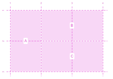
- Areas: An area is a rectangular shape that can span an arbitrary number of cells. Areas, like lines, can be named. In the above grid, we could for example define areas A, B and C as shown below:
Now that we know these simple definitions, let’s take a look at what makes grids so powerful.
One key advantage of CSS grids is that they enforce real separation of layout and markup.
Indeed, the grid itself is completely defined in pure CSS. This means that apart from the parent HTML element the grid is applied to, there’s no need to define any extra elements for the columns, rows, cells, or areas.
When you think of it, that’s a really interesting property. One aspect of it is that the visual order of elements on the page is decoupled from the order of elements in the markup. That’s important because on a page the source order is used for things like speech and tab navigation, so CSS Grids allow you to optimize the markup for accessibility without compromising your ability to manipulate the visual result. One other point is that the markup will be somewhat lighter and easier to understand, and therefore easier to maintain.
But more importantly, it gives us a very powerful tool for separating the content from the layout, effectively decoupling them in a way that makes it possible to change one without impacting or otherwise breaking the other.
As a designer, you can easily experiment with new layouts without having to change anything other than CSS, as long as your new layouts provide the expected lines and areas the content uses.
And as a developer, you simply use the numbered or named lines and areas to position your content on the grid.
Imagine the simple following grid layout:
In this layout, named areas have been defined, allowing content to be positioned in them simply by referencing the names. This means that not only can we change this layout relatively easily in the future, as long as we maintain the named regions (here the named regions act as the layout’s public API in a way), but media-queries can be used to change this layout dynamically too. Remember, the whole layout is defined in CSS, so media-queries play with grid layouts very well.
For instance, using a media query, the previous layout could switch to something like this on smaller screens:
Enough with the theory, let’s see how grid layouts are actually defined using CSS.
Creating grids with CSS
Defining a grid requires only one HTML element to be present: the grid container. That’s the element the layout is going to be applied to. Any HTML element that’s a child of the grid container is a grid item. Grid items are what go onto the grid.
Setting an element as being a grid container is as simple as:
<pre>.container { display: grid; }</pre>
Just doing this though isn’t nearly enough, we also need to define what this grid looks like, how many columns and rows it has, and how big they are.
This can be done using grid templates as shown in the following example:
<pre>.container {

  display: grid;

  grid-template-rows: 200px 100px;

  grid-template-columns: repeat(4, 100px);

}</pre>
In the example above, we’re explicitly defining a grid that has 2 rows and 4 columns. Note how the repeat() function is used here to avoid repeating a fragment of the tracks 4 times, this is equivalent to 100px 100px 100px 100px.
Each of the defined tracks is given a size, and so we end up with a grid structure that looks like this:
But grids can also be implicitly defined like in:
<pre>.container {

  display: grid;

  grid-template-rows: auto;

  grid-template-columns: repeat(4, 100px);

}</pre>
In this case, the browser will keep on adding rows as needed to fit the content.
Now let’s add some content. As we said previously, we only need 2 levels of elements, the container and the items, so let’s use this:
<pre><div class="container">

  <div class="item1">item 1</div>

  <div class="item2">item 2</div>

  <div class="item3">item 3</div>

  <div class="item4">item 4</div>

  <div class="item5">item 5</div>

</div></pre>
Which, without any specific CSS code to position the items, leads to the following arrangement:
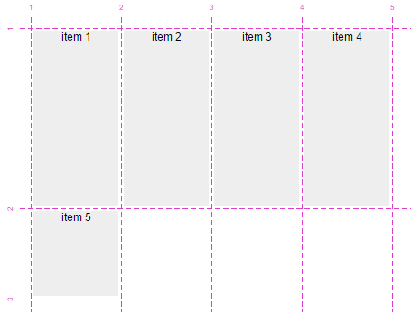
As you can see above, since we didn’t define where these items should sit on the grid, the browser has positioned them automatically by putting one item per cell until the first row got filled in, at which point it decided to put the rest of the items on the next row.
The spec defines an algorithm for automatically placing items on the grid if they haven’t been given a position. This is sometimes useful when, for example, you have either many items or a dynamic number of items and don’t want to or can’t define the position for them all.
Let’s see how our items can be positioned on the grid.
<pre>.item1 {

  grid-row-start: 1;

  grid-row-end: 2;

  grid-column-start: 1;

  grid-column-end: 3;

}

.item2 {

  grid-row-start: 1;

  grid-row-end: 2;

  grid-column-start: 3;

  grid-column-end: 5;

}</pre>
Here we’ve defined the position of the 2 first items, which means that the other ones will still be automatically positioned by the browser, as shown below:

The above example uses line-based placement in that it uses numeric indexes of lines to place items. Items 1 and 2 are defined to be positioned between horizontal lines 1 and 2, and between vertical lines 1 and 3 and 3 and 5.
What happens now if we keep on adding items, but there aren’t any grid cells defined to receive them?
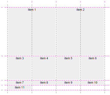
The grid keeps on adding rows and columns as needed. Note that these new tracks will have their sizes depend on the content size.
So that’s all well and good, but one thing that’s really useful when it comes to CSS Grids is grid areas, as we saw earlier. Let’s take a look at how grid areas can be used in CSS.
First of all you’ll need to define the grid container and its tracks and areas:
<pre>.container {

  display: grid;

  grid-template-rows: 100px auto 100px;

  grid-template-columns: 100px auto;

  grid-template-areas:

    "header  header"

    "sidebar content"

    "footer  footer";

}</pre>
In this example, we’ve defined 3 rows, the top and bottom ones being 100px high, while the middle one will just adapt to its content. We’ve also defined 2 columns, the left one 100px wide, and the right one adapting to its content.
We’ve also introduced the grid-template-areas property that may look strange at first, but it’s really simple when you realize it’s only a representation of the grid with names on it. Let’s explain this.
We said we had 3 rows and 2 columns right? Let’s represent them in ascii-art like this:
<pre>+---+---+

| . | . |

+---+---+

| . | . |

+---+---+

| . | . |

+---+---+</pre>
Each dot is a cell where areas can be defined. So let’s define areas for a typical website layout:
<pre>+--------+--------+

| header | header |

+--------+--------+

| sidebar| content|

+--------+--------+

| footer | footer |

+--------+--------+</pre>
We want the header and footer to span the whole width, so we’ve repeated them in the 2 columns.
Now, if we just remove all the useless ascii-art style borders and include each line in double-quotes, we get something like this:
<pre>"header  header"

"sidebar content"

"footer  footer"</pre>
which is exactly how grid areas are defined in CSS using the grid-template-areas property. It helps thinking about it as a 2D representation of the grid in ascii-art and aligning area names.
You can also use dots ‘.’ when a cell isn’t covered by an area. Here’s an example:
<pre>.container {

  display: grid;

  grid-template-rows: repeat(5, 100px);

  grid-template-columns: repeat(5, 100px);

  grid-template-areas:

    ". . . . ."

    ". . . . ."

    ". . a . ."

    ". . . . ."

    ". . . . .";

}</pre>
In this example, there are 25 cells and 1 area that is defined to occupy only the center cell.
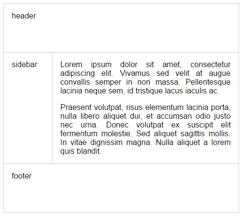
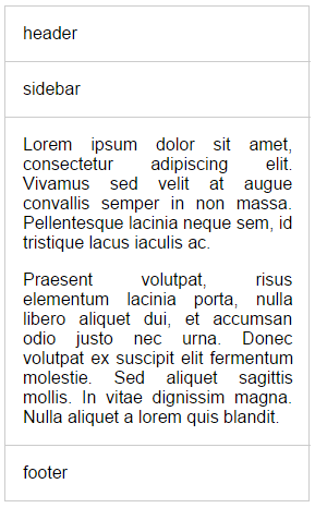
Now, going back to the previous header, sidebar, content, footer example, let’s add some markup to it:
<pre><div class="container">

  <div class="header">header</div>

  <div class="sidebar">sidebar</div>

  <div class="footer">footer</div>

  <div class="content">

    <p>Lorem ipsum dolor sit amet...</p>

 </div>

</div></pre>
The last thing that needs to be done now is position each grid item in the correct named areas (we’ve conveniently used class names that correspond to area names here):
<pre>.header { grid-area: header; }

.sidebar { grid-area: sidebar; }

.footer { grid-area: footer; }

.content { grid-area: content; }</pre>
Which would produce something like this:
Now, if we wanted to change this layout at any point, or make it adapt to variable screen sizes thanks to media queries, we would only have to change the grid declaration. Maybe to something like this:
<pre>.container {

  display: grid;

  grid-template-rows: auto;

  grid-template-columns: 100%;

  grid-template-areas:

    "header"

    "sidebar"

    "content"

    "footer";

}</pre>
Without any other changes to the CSS or markup, we’ve produced this:
We could even completely reshuffle the order of items in the grid without having to change their order in the markup.
CSS Grids in the real world
So far we’ve only seen simplistic examples of grids, but websites making use of grid systems often have much more complex grid structures. It’s not uncommon for such websites to be based on 12 columns, each of them separated by gutters (narrower columns used to space things out).
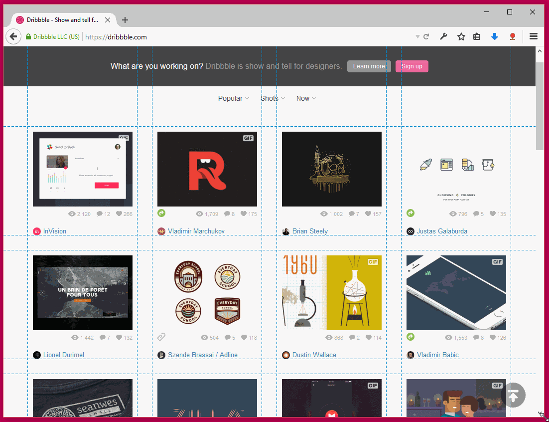
Take dribbble.com for example, this design showcase website makes use of a grid to display the designs uploaded by their users. Here the grid is very easily visible because each design occupies exactly one cell (excluding gutter rows and columns):

Dribbble’s grid layout is also responsive, so if the viewport size changes, the size and number of columns change gradually, as shown in the following animation:
Using the new properties that come with the CSS Grid Layout implementation, we can try and create a dribbble-like layout. For an added twist, let’s try and insert a piece of text content on the second row, and make that content span the whole row.
First of all, our markup will be something like this:
<pre><ul class="dribbbles">

  <li class="dribbble">...</li>

  <li class="dribbble">...</li>

  ...

  <li class="dribbble">...</li>

  <li class="advert">Some text ....</li>

</ul></pre>
Here the dribbbles element is the main container for all items, and each .dribbble element represents one of the designs showcased on the page. The last item, .advert, is the piece of textual content we want to show on the second row.
Now, let’s make a grid for it:
<pre>.dribbbles {

  display: grid;

  /* Let's assume the default design has a fixed width */

  width: 880px;

  grid-template-columns: repeat(4, 220px);

  grid-template-areas:

    ".      .      .      ."

    "advert advert advert advert";

  justify-items: center;

}

.advert {

  grid-area: advert;

}</pre>
Here we’ve defined 4 columns in our grid. We haven’t said anything about rows, so the browser will automatically create rows as needed.
We did, however, define a couple of rows using the grid-template-areas property and that’s because we need to place our advert text content on the second row. So we’ve just said that we want a first row with empty cells that are going to be filled in automatically with grid items, as they come, and then a second row that defines an advert area that spans all 4 columns.
Finally, the second rule in there uses the grid-area property to place the grid item that has the class advert inside the advert area.
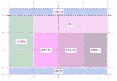
Given the markup we created earlier, this should end up looking something like this:
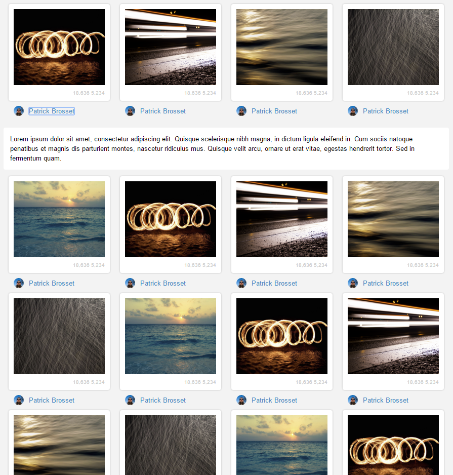
Pretty simple, right? Of course this requires some styling code to make the items look nice and all, but the layout CSS code is really short and there’s no extra markup required.
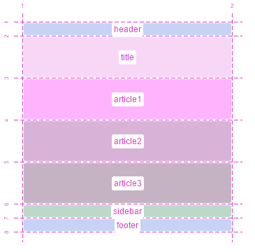
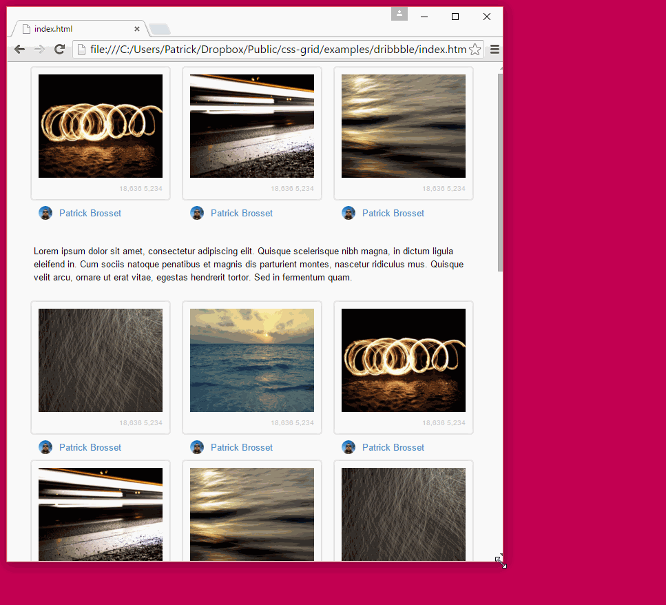
Now, we can make this responsive too. Let’s say we want to jump to a 3-columns layout for smaller screens:
<pre>@media (max-width: 880px) and (min-width: 660px) {

  .dribbbles {

    width: 660px;

    grid-template-columns: repeat(3, 220px);

    grid-template-areas:

      ".      .      ."

      "advert advert advert";

  }

}</pre>
And so on, for all the screen sizes we want to support. And so, just adding a couple more short media queries, we could end up with something like this:
Sites like Dribbble don’t use the CSS Grid Layout yet, but there are well known CSS libraries that provide grid systems.
A good example of a grid system in CSS is the Bootstrap CSS library but there are others like PureCSS, 960 Grid System, Responsive Grid System, Materialize, and more.
These grid systems unfortunately have to use arrangements of carefully sized and floated DIVs, and need extra DIVs for columns and rows, as well as pseudo-elements for clearing floats. It’s not all that complex—after all, the tricks that these libraries rely on have been known for years—but they’re still just tricks, and it’s time we get a proper built-in solution and get rid of them.
Don’t get me wrong, these libraries are awesome in all sorts of way, and most importantly, they helped make it clear we needed a new CSS feature for defining grids in web layouts. Ultimately, therefore, they are what made the CSS Grid Layout specification possible.
Closing words and references
As we saw, CSS grids are a pretty good tool for defining layouts that have nice characteristics like authoring simplicity, maintainability, separation of content and layout — characteristics that play well with responsive design.
But we’ve only barely scratched the surface of what is possible with CSS grids. The various properties and syntax possibilities allow for a lot of really cool things to be done, and I hope this article makes you want to dig further by yourself.
Here are some interesting references if you wish to know more:
- The spec: http://dev.w3.org/csswg/css-grid-1/
- Some grid examples by Rachel Andrew: http://gridbyexample.com/
- Bug to follow for the implementation in Firefox: https://bugzilla.mozilla.org/show_bug.cgi?id=616605
- How to use it in IE: https://msdn.microsoft.com/en-us/library/hh673533%28v=vs.85%29.aspx
- If there’s one talk you need to watch, it should be this one by Rachel Andrew:
- And Manuel Rego’s talk is also very useful:
About Patrick Brosset
Patrick manages the DevTools engineering team at Mozilla
10 comments