
 By
By
In this article, we will explore the use of Mozilla’s Brick and X-Tag libraries. First we’ll use Brick to rapidly prototype a simple application. Then, we’ll build a custom web component using X-Tag.
The Technology
Brick: Curated Web Components
Brick is a set of modular, reusable UI components. The components are designed for adaptive, responsive applications and are a great choice for going mobile first, which is by and large how web-based applications should be developed. This philosophy and its design patterns accomodate a wide range of devices. Brick components aren’t just for mobile apps, they are for modern apps.
Brick is kind of like a library, but really you should think of it as a curated collection of web components.
Brick’s collection of components are used declaratively in your HTML <like-this> and can be styled with CSS like regular non-custom elements. Brick components have their own micro-APIs for interacting with them. These components are building blocks. Do you like Lego? Good. You will like Brick.
Brick web components are made using the X-Tag custom elements polyfill.
What is X-Tag?
X-Tag is a library that polyfills several (and soon all) features that enable web components in the browser. In particular, X-Tag is focused on polyfilling the creation of Custom Elements so that you can extend the DOM using your own declarative syntax and element-specific API.
When you are using components from Brick, you are using web components made using the X-Tag library. Brick includes X-Tag core, so if you include Brick and then decide to make your own custom elements — you do not need to include X-Tag to do so, all the features of X-Tag are already available for you.
Download Demo Project Files
Download the demo project files. First we’ll use the material in the simple-app-with-bricks folder.
Using Bricks in an app
Here we will build a simple skeleton app using <x-appbar>, <x-deck>, and <x-card>. x-appbar provides a tidy header bar for our application, and x-cards placed as children of an x-deck give us multiple views with transitions.
First, we start with a barebones HTML document and then include Brick’s CSS and JS, along with our own application-specific code (app.css and app.js respectively in the example to follow).
Simple - Brick Demo
Now we add some Brick elements:
Simple Brick App
Below your x-appbar, create an x-deck with some x-cards as children. You can give the x-cards any content you like.
View 1
Hello, world!
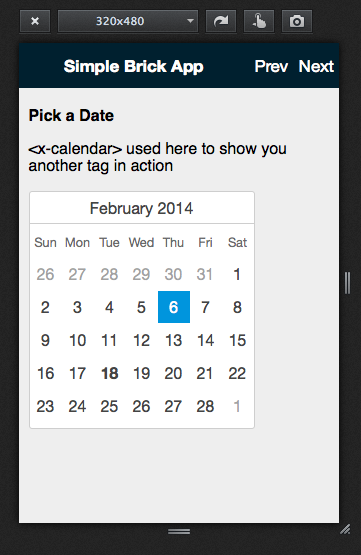
Pick a Date
<x-datepicker>s are a polyfill for <input type="date">
Just here to show you another tag in action!
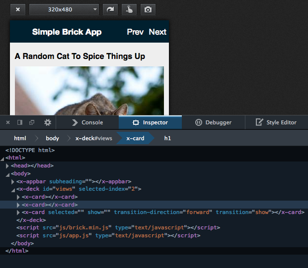
A Random Cat To Spice Things Up

We have already almost completed the structure for a simple application. All we need now is a little bit of CSS and Javascript to tie it together.
document.addEventListener('DOMComponentsLoaded', function() {
  // Run any code here that depends on Brick components being loaded first
  // Very similar to jQuery's document.ready()

  // Grab the x-deck and the two buttons found in our x-appbar and assign to local vars
  var deck = document.getElementById("views"),
  nextButton = document.getElementById("view-next"),
  prevButton = document.getElementById("view-prev");

  // Add event listeners so that when we click the buttons, our views transition between one another
  prevButton.addEventListener("click", function(){ deck.previousCard(); });
  nextButton.addEventListener("click", function(){ deck.nextCard(); });
});
Some simple CSS to style our fledgling application:
html, body {
  margin: 0;
  padding: 0;
  font-family: sans-serif;
  height: 100%;
}

h1 {
  font-size: 100%;
}

x-deck > x-card {
  background: #eee;
  padding: 0.6em
}
Ka-bam! With a little bit of declarative markup and a few tweaks, we have a skeleton that anyone can use to make a multi-view app within a single HTML document. If you check out the markup in the developer tools, you’ll see the Brick custom elements living happily alongside vanilla HTML elements – you can use the developer tools to inspect and manipulate them in the same way as regular old HTML.
Now let’s learn how to make our own custom element using X-Tag.
Creating Custom Elements (Your Own ‘Bricks’) Using X-Tag
Let’s say we have a mobile application in which the user takes an action that results in a blocking task. Maybe the application is waiting for an external service. The program’s next instruction to complete the user-initiated task depends on the data from the server, so unfortunately we have to wait. For the sake of our purposes here, let’s pretend we can’t modify our program too much and assume an entrenched architecture – maybe we can’t do much else other than communicate to the user until we find a way to deal with the blocking better. We have to do the best with what we have.
We will create a custom modal spinner that will tell the user to wait. It’s important to give your users feedback on what’s happening in your app when they don’t get to complete their task in a timely manner. A frustrated or confused user might give up on using your app.
You will want to switch to the x-status-hud folder inside of the demo materials now.
1. Registering Your Custom Element
X-Tag relies on several different events to detect and upgrade elements to custom elements. X-Tag will work whether the element was present in the original source document, added by setting the innerHTML property, or created dynamically via document.createElement. You should take a look at the Helpers section of the X-Tag documentation as it covers various functions that will allow you to work with your custom elements just like vanilla ones.
The first thing that we need to do is register our custom element with X-Tag so that X-Tag knows what to do if and when it encounters our custom element. We do that by calling xtag.register.
xtag.register('x-status-hud', {
  // We will give our tag custom behavior here for our status indicating spinner
});
!IMPORTANT: All custom element names must contain a hyphen. Why is this? The idea here is that there are no standard HTML elements with a hyphen in them, so we don’t trample existing namespaces and have collisions. You do not have to prefix with ‘x-‘, this is just a convention used for components create with X-Tag in the Brick ecosystem. Once upon a time in the early days of the W3C specification for custom elements, it was speculated that all custom elements would have an x- prefix; this restriction was relaxed in later versions of the specification. If you were to name an element ‘bacon-eggs’ or ‘adorable-kitten’, both of these would be perfectly valid names. Choose a name that describes what your element is or does.
If we wanted to, we could choose to set what HTML element is being used as our base element before upgrading. We can also set a specific prototype for our element if we want to involve functionality from a different element. You can declare these as follows:
xtag.register('x-superinput', {
  extends: 'input',
  prototype: Object.create(HTMLInputElement.prototype)
});
The element we are building doesn’t require these properties to be set explicitly. They are worth mentioning because they will be useful to you when you write more advanced components and want a specific level of control over them.
2. The Element Lifecycle
Custom elements have events that fire at certain times during their lifetime. Events are fired when an element is created, inserted into the DOM, removed from the DOM, and when attributes are set. You can take advantage of none or all of these events.
lifecycle:{
  created: function(){
    // fired once at the time a component
    // is initially created or parsed
  },
  inserted: function(){
    // fired each time a component
    // is inserted into the DOM
  },
  removed: function(){
    // fired each time an element
    // is removed from DOM
  },
  attributeChanged: function(){
    // fired when attributes are set
  }
Our element is going to use the created event. When this event fires, our code will add some child elements.
xtag.register('x-status-hud', {
  lifecycle: {
    created: function(){
        this.xtag.textEl = document.createElement('strong');

        this.xtag.spinnerContainer = document.createElement('div');
        this.xtag.spinner = document.createElement('div');

        this.xtag.spinnerContainer.className = 'spinner';

        this.xtag.spinnerContainer.appendChild(this.xtag.spinner);
        this.appendChild(this.xtag.spinnerContainer);
        this.appendChild(this.xtag.textEl);
    }
  }
  // More configuration of our element will follow here
});
3. Adding Custom Methods
We need to have control over when we show or hide our status HUD. To do that, we need to add some methods to our component. Let’s add some functions to do that. A simple toggle() may suffice for some use cases, but let’s throw in individual hide() and show() functions too.
xtag.register('x-status-hud', {
  lifecycle: {
    created: function(){
      this.xtag.textEl = document.createElement('strong');

      this.xtag.spinnerContainer = document.createElement('div');
      this.xtag.spinner = document.createElement('div');

      this.xtag.spinnerContainer.className = 'spinner';

      this.xtag.spinnerContainer.appendChild(this.xtag.spinner);
      this.appendChild(this.xtag.spinnerContainer);
      this.appendChild(this.xtag.textEl);
    }
  },

  methods: {
    toggle: function(){
      this.visible = this.visible ? false : true;
    },

    show: function (){
      this.visible = true;
    },

    hide: function (){
      this.visible = false;
    }
  }
4. Adding Custom Accessors
Something important to note about properties on custom elements: they do not have to map to an attribute. This is by design because some setters could be very complex and not have a sensible attribute equivalent.
If you would like an attribute and property to be linked, pass in an empty object literal to the attribute. You’ll see below where this has been done for the label attribute.
xtag.register('x-status-hud', {
  lifecycle: {
    created: function(){
      this.xtag.textEl = document.createElement('strong');

      this.xtag.spinnerContainer = document.createElement('div');
      this.xtag.spinner = document.createElement('div');

      this.xtag.spinnerContainer.className = 'spinner';

      this.xtag.spinnerContainer.appendChild(this.xtag.spinner);
      this.appendChild(this.xtag.spinnerContainer);
      this.appendChild(this.xtag.textEl);
    }
  },

  methods: {
    toggle: function(){
      this.visible = this.visible ? false : true;
    },

    show: function (){
      this.visible = true;
    },

    hide: function (){
      this.visible = false;
    }
  },

  accessors: {
    visible: {
      attribute: { boolean: true }
    },

    label: {
      attribute: {},

      set: function(text) {
        this.xtag.textEl.innerHTML = text;
      }
    }
  }
}); // End tag declaration
If the difference between attributes and properties is unclear to you, take a look at the top answer to this Stack Overflow question. Although the question being asked is about something else entirely (jQuery), the top answer has a great explanation that will help you understand the relationship between attributes and properties.
The Finished Component
When we write code that depends on custom elements having been loaded already, we add an event listener that fires when the components have finished loading. This is sort of like jQuery’s document.ready.
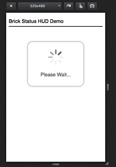
There you have it. We’ve created a simple modular, reusable widget for our client-side code. It’s a good starting point. But is it really finished?
Some ways we may improve this element:
- Have the element recalculate it’s size when the
attributeChangedevent is fired and have the component resize to fit the label as it is updated rather than truncate the label with an ellipsis - Let the developer set an image, such as an animated GIF, in place of the CSS spinner to customize the user experience further
- Have a progress bar instead of a spinner to give the user some additional information about task progress
Use your creativity to come up with a small set of practical features and improvements beyond these as an exercise on your own.
After following this tutorial you should understand how to extend the DOM with your own custom elements. If you’re stuck, leave a comment and we’ll do our best to get you back on track. If you’re not stuck, post your GitHub repo and show us what you’ve made with Brick and X-Tag. Happy hacking!
About Angelina Fabbro
I'm a developer from Vancouver, BC Canada working at Mozilla as a Technical Evangelist and developer advocate for Firefox OS. I love JavaScript, web components, Node.js, mobile app development, and this cool place I hang out a lot called the world wide web. Oh, and let's not forget Firefox OS. In my spare time I take singing lessons, play Magic: The Gathering, teach people to program, and collaborate with scientists for better programmer-scientist engagement.
4 comments