Some months ago we started thinking how could we reuse visual components inside Firefox OS, both to help designers create new apps in a consistent way and also to help developers share some markup. The UX team reviewed hundreds of generated screens to create a set of all components called Common Controls (Kudos to Sergi Vila). Common controls repeated in two or more core apps were considered Building Blocks (BB).
My mission in this process, together with Ismael Gonzalez, was converting those visuals into HTML/CSS markup (no JavaScript at all).
From the very beginning Mozilla was clear about not creating a framework, allowing devs build their own apps without any restriction. In a way that also meant not using arbitrary classes. The code, of course, had to pass the W3C validator for HTML5 and CSS3, which was still unstable. So we ended up with completely correct code, but nothing to see from an OOCSS perspective, if you are a fan of that.
Using Headers Building Block
For instance, imagine you want to use Headers BB but you want your header in red. You will need to link headers.css and include this in your css:
section[role="region"] > header:first-child {
    background: red;
}
You can see all BB in action in http://buildingfirefoxos.com/ (For a better browsing experience use Firefox Nightly). This page was initially meant to be used by devs working on the first release of Firefox OS as a bootstrap for core apps, so you will find CSS links there to Gaia’s (Firefox OS UI) shared folder.
Building Blocks and type of app
For core apps, any shared CSS file you link is copied to the app on build time, following the idea of one app containing all needed files, but also allowing us to have a shared folder. For third party applications – meaning any app that isn’t a core Gaia app – all BBs you want to use have to be copied manually from: gaia/shared/style or gaia/shared/style_unstable.
Why style_unstable? Could I use those BB’s? Yes you can, it’s just that at some point we decided not to include any extra BBs until it was not used in several apps, to test if markup was flexible enough. This folder should disappear soon, and all stable BBs will live in the same shared folder.
Using the Building Blocks
After this intro, I’ll show you how easy it is achieving Firefox OS look & feel. Find the code for this example on GitHub. You will find the links to each step in separate commits.
I will create a basic app containing the two most used components: headers and lists.
These are the steps:
- Create basic HTML structure
- Set base font size
- Getting files and assets
- Create two views
- Use lists’ markup
- Adding Settings button
- Add content to the Settings view
Create basic HTML structure
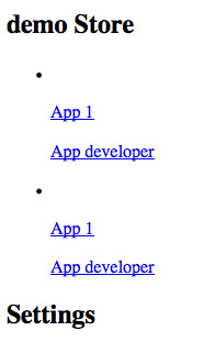
Initial screen capture of a basic HTML structure.
Commit 1
Set base font size
First things first! all CSS files in Gaia have this: html { font-size: 10px } that allow us to have an easy conversion to rems (1rem = 10px), and rems are the key for our scaling system.
Getting files and assets
We will need some headers.css and lists.css, and also the folders with those same names, which contain all the shared assets.
Create two views
We need two views: one will be a list of applications, and the second one a settings screen. We will hide the settings view by now, and add some extra markup for the headers. Our header’s parent container have to be: section role="region" to get the correct styling.
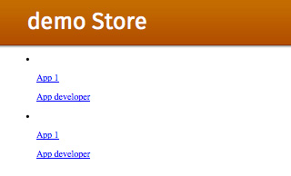
Commit 2
Use lists’ markup
Now we use lists’ markup:
asidefor left aligned contentaside class="pack-end"for right aligned contentp(first element) for main content- And
p(second element) for additional content
Note: It’s important to have all asides before p.
We will also add data-type="list" to the ul parent container. And after adding a couple of icons we can get something like this:
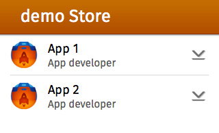
Commit 3
Adding Settings button
Now we will add a button in the header to show the Settings view. We need an icon, a click event in JavaScript, and two classes to animate the screen up and down. Adding also class="skin-organic" to our Settings view will change the color of the header.
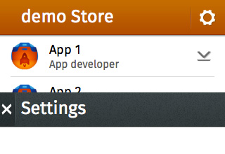
Commit 4
Add content to the Settings view
And now we will add some content in the Settings view, a small form logging in to our service. We will need to link a new BB (input areas) to make our inputs nicer.
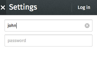
Commit 5
Files used in the app
Here’s the specific code needed for the app, with CSS files for the Building Blocks included:
Conclusion
That’s it! With some basic markup, we have Firefox OS styles integrated in our app. Go try it out!
About Arnau March
Arnau March is a "designloper" working for Telefonica. Not good enough to tell you why a button should be right aligned in a header, neither to code perfect javascript. But he is the guy who can apply visual solutions to programming limitations.
About Robert Nyman [Editor emeritus]
Technical Evangelist & Editor of Mozilla Hacks. Gives talks & blogs about HTML5, JavaScript & the Open Web. Robert is a strong believer in HTML5 and the Open Web and has been working since 1999 with Front End development for the web - in Sweden and in New York City. He regularly also blogs at http://robertnyman.com and loves to travel and meet people.


13 comments