
 By
By
Once upon a time, there was this good hearted web developer, who was everyday worried about learning new cool things and trying new crazy stuff his browser could barely be able to do. Also, there were some giants, working hard to increase the power of the magic web, allowing all the peoples to live, code, learn and share freely.
Among those things, there was CSS3 with its new features! I heard about something called Mozilla Dev Derby, and by that month, the focused feature was exactly CSS3 animations! What an opportunity to learn cool and be part of something like that! It’s awesome that companies like Mozilla are working so hard to keep these subjects and contents available to us!
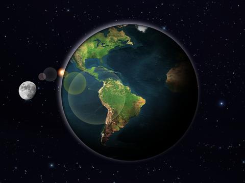
Two examples will be used here to both explain the technologies and tell the history. Felipe prepared a demo using HTML5 and CSS3 animations to do a Earth planet spinning, and, not aware of that, Deivid Marques had a similar idea.
Why a planet Earth?
Inspiration was the key. Since I was a child I have been fascinated with the Universe (both the micro, and macro ones) and the Earth, being what it is for us…such a good host! I decided to use it as inspiration!
Images
Obviously, images would be required. I tried to avoid images as much as possible, but I simply wouldn’t represent the Earth in a blurred image! Also, the moon, the stars in the background and the small sun are images.
What should be animating?
Before animating things around there, I mapped everything that could make sense to be moving, and how. First of all, the planet itself! The earth has to spin in one direction, while also bents to create the four seasons. Also, there is the day and night of the Earth due to its rotation.
The Moon runs around the globe, but once it is behind the Earth, it should get darker. Also, the Moon should come to the front of the planet, and then hide behind it. Also, a slow movement, added to the stars in the background, could be of use!
HTML Structure
I didn’t want to make it too complex, so I didn’t use pseudo elements. That forced me to have the HTML just a little bit bigger.
This is what is inside the Body tag:
Visual effects
Well, you know that everything seems pretty from out there! So the visual effects should be cool too!
The globe
The globe is basically a rounded div, with a global map as its background. It is centered with an absolute position and sizes, and uses a box-shadow effect to represent the side of the planet where it’s night.
#globe
{
    background-image: url(images/globe-hearth.jpg) repeat-x;
    border: solid 1px #000;
    position:absolute;
    top: 50%;
    left: 50%;
    width: 600px;
    height: 600px;
    margin-left: -300px; /* aligning it to the center */
    margin-top: -300px;
    border-radius: 50%; /* making it round */
    z-index:0;
    box-shadow: inset 2px 2px 10px #000, inset -140px -70px 100px #000;
}
The atmosphere
The atmosphere is another round div with a box-shadow effect.
#atmosphere
{
    position:absolute;
    top: 50%;
    left: 50%;
    width: 600px;
    height: 600px;
    margin-left: -300px;
    margin-top: -300px;
    border-radius: 50%;
    opacity: 0.7;
    box-shadow: -6px -6px 20px #eef;
}
The Sun
The Sun, in this demo is just another div with an image as background, although, there is a tricky detail here! I wanted the Sun to be positioned right in the horizon of the globe, so, just centering it would not work! Also, I couldn’t know the resolution to fit it exactly there! But, I knew the size of the planet and I also knew it was centered!
Therefore, I just had to center it, and then adjust its position by changing its margin values.
#sun
{
    background-image: url(images/sun.png);
    position: absolute;
    top: 50%;
    left: 50%;
    width: 50px;
    height: 47px;
    margin-left: -320px;
    margin-top: -110px;
}
The stars behind
The stars were simply a div with a repeatable background image.
The Moon
The Moon was quite more complex. It had to turn around the globe, so, I’d have to play with its z-index as well. Besides that, it was simply another round div.
Sun lights
Also, there are a few reflections of the light of the Sun. Those, are other round divs, absolutely positioned with different colours and opacity. Box-shadow could also be an optional nice touch! So I also used it.
Animation time
To animate the Earth, I created two animations using the keyframes CSS3 feature.
(Note: In these examples, I’m just showing the “-moz” definition of the animations, but you have to create them for each vendor if you want it to work in different browsers).
@-moz-keyframes dayByDay
{
    from{
            background-position: -1600px;
    }
    to{
            background-position: 0px;
    }
}
This way, the background of the globe would be passing, as pretending the globe was spinning. Also, I created the animation for the seasons:
@-moz-keyframes seasons
{
    from{
        -moz-transform: rotate(6deg);
    }
    to{
        -moz-transform: rotate(16deg);
    }
}
You know, the planet Earth is not fully straight to the 0 degrees. Now, I had to add those animations to the globe:
#globe{
    -moz-animation: dayByDay 24s linear 0s infinite, seasons 2688s linear alternate 0s infinite;
}
Animating the sky behind everything followed the very same technique as the dayByDay animation.
Animating the Moon was more of a challenge! To animate it, I had to change its size and position. Also making it darker or lighter and taking care of its z-index.
Below, is how I did that back then (on june 2011). Nowadays, I would try it with -moz-transform using the scale transform, instead of changing its width and height. Also, back then, I used negative and positive values for the z-index of the moon…instead, I could have added a z-index to the Earth, like 2, and use only positive values in the Moon’s z-index(1, and 3) to move it to the back or front of the planet. I didn’t want to change it here, because this is how it is running on the uploaded demo, in Mozilla Derby.
@-moz-keyframes moon
{
   0%{
       width: 30px;
       height: 31px;
       margin-left: -310px;
       margin-top: -40px;
       z-index:-1;
   }
   10%{
       margin-left: -450px;
       margin-top: -50px;
       width: 60px;
       height: 61px;
       z-index:1;
   }
   20%{
       margin-left: -500px;
       margin-top: -50px;
       width: 80px;
       height: 81px;
       z-index:1;
   }
   30%{
       margin-left: -450px;
       margin-top: -50px;
       width: 90px;
       height: 92px;
       z-index:1;
   }
   50%{
       margin-left: 0px;
       margin-top: -50px;
       width: 120px;
       height: 122px;
       z-index:1;
   }
   60%{
       margin-left: 300px;
       margin-top: -50px;
       width: 120px;
       height: 122px;
       z-index:1;
   }
   60%{
       margin-left: 410px;
       margin-top: -50px;
       width: 90px;
       height: 92px;
       z-index:1;
       box-shadow: inset 0px 0px 80px #000;
   }
   70%{
       margin-left: 460px;
       margin-top: -50px;
       width: 80px;
       height: 82px;
       z-index:1;
       box-shadow: inset 0px 0px 80px #000;
   }
   80%{
       margin-left: 420px;
       margin-top: -50px;
       width: 60px;
       height: 61px;
       z-index:-1;
       box-shadow: inset 0px 0px 80px #000;
   }
   90%{
       margin-left: 0px;
       margin-top: -50px;
       width: 30px;
       height: 31px;
       z-index:-1;
   }
   100%{
       width: 30px;
       height: 31px;
       margin-left: -310px;
       margin-top: -40px;
       z-index:-1;
   }
}
Mozilla Dev Derby
The above demo can be found as CSS3 up and running! in Mozilla’s Demo Studio.
Some time later, Deivid Marques did his Planeta Terra demo, using only one DIV. While studying CSS3, the idea of creating a planet Earth also came to his mind. He noticed the example in a flash tutorial and thought of creating that with CSS3 instead.
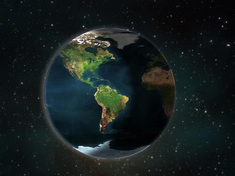
His planet Earth is made of a single div and uses the CSS to animate the background image. So, it is simpler to reproduce and understand.
The div has the following CSS applied to it:
.earth{
    background: url(images/terra.jpg) repeat-x 0 0;
    border: 1px solid rgba(26,18,101,0.3);
    border-radius: 225px;
    box-shadow: -8px 0 25px rgba(256,256,256,0.3), -1px -2px 14px rgba(256,256,256,0.5) inset;
    height: 450px;
    left: 50%;
    margin: -225px 0 0 -225px;
    position: absolute;
    top: 50%;
    width: 450px;
    animation: loop 80s linear infinite;
}
And here is his animation definition in CSS3:
@keyframes loop {
    0% { background-position: 0 0; }
    100%{ background-position: -900px 0;}
}
His demo was also posted to Mozilla Dev Derby once he was also inspired to tell the world about he had learnt while developing this demo! Planeta Terra is also available on GitHub.
This is how we both met and were invited to write this article.
Conclusion
It was great for me to learn new things, face new challenges, talk to a lot of people about their experiences with it, and …well, lots and lots of gains, no losses!
I hope it has motivated you somehow, to create your own demo, submit it…the least you get, is a lot of fun! :)
About Felipe Nascimento de Moura
A passionate developer working with Open Source Web Technologies for about 8 years, is nowadays a Senior Development Analyst at the Portal Terra in Brazil. Felipe is also one of the organizers of BrazilJS, the Brazilian JavaScript Conference, and one of the founders of the foundation with the same name. Likes to create new projects, as well as trying new technologies and pushing things to their limits! "Changing the world is the least I expect from myself!"
7 comments