
 By
By
CSS Grid is a great layout tool for content-driven websites that include long passages of text, and it has tremendous value for a variety of traditional UI layouts as well. In this article I’ll show you how to use CSS Grid to improve application layouts that need to respond and adapt to user interactions and changing conditions, and always have your panels scroll properly.
CSS Grid builds website layouts. It lets web designers create beautiful dynamic layouts using just a tiny bit of supported code instead of the endless float hacks we’ve had to use for years. My friend and co-worker Jen Simmons has been talking about CSS Grid for years, tirelessly pushing to get it implemented in browsers, and her work has paid off. As of the end of last year, the current version of every major browser, desktop and mobile, supports CSS Grid.
CSS Grid really is powerful, and you can build dynamic content driven websites easily, like in these examples. However, Grid is good for more than laying out pretty blocks of content. Grid gives you full control over both dimensions of your layout, including scrolling. This means features we take for granted in native applications like collapsing side-panels and fixed toolbars are now trivial to implement. No more hacks and no more debugging. Grid just works.
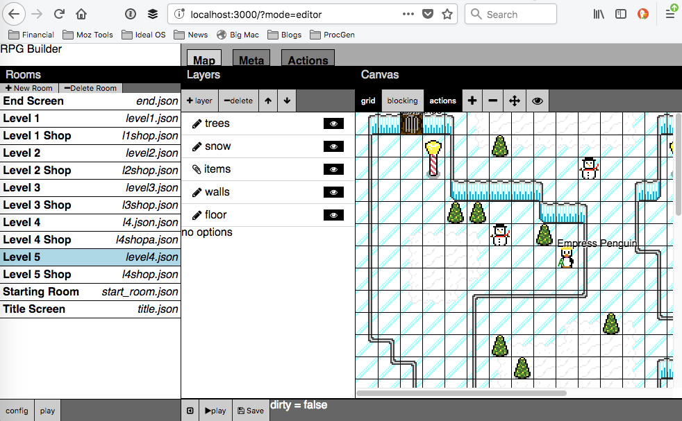
I’ve been building web tools for years. Here’s a screenshot of a game building tool I made for my retro RPGs. When Flexbox first appeared I immediately started using it. I built complex layouts using nested horizontal and vertical boxes, with a few utility classes for things like scrolling and stretching.
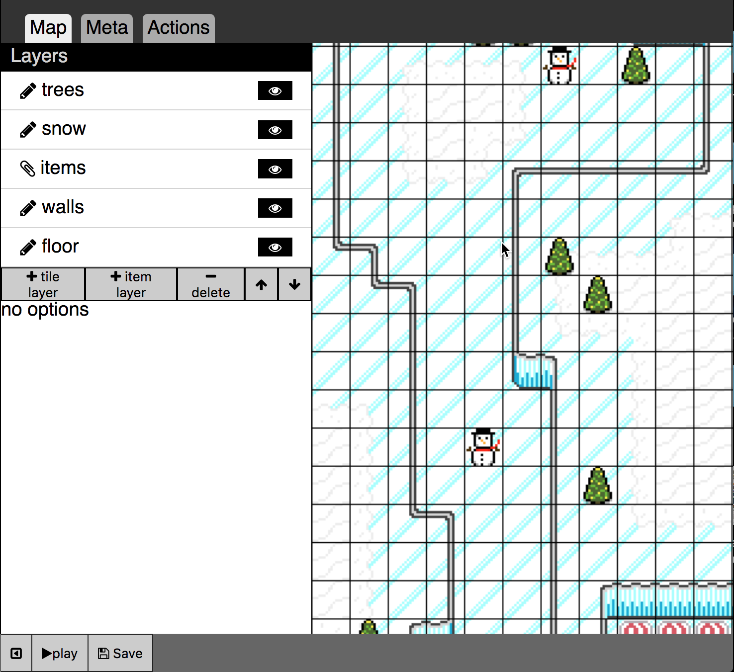
Flexbox has certainly made me more productive than absolutely positioned divs and float hacks, but it still has problems. Look at this closeup where panels come together. See how the footers on the left and right don’t line up?

Here’s another screenshot. The toolbar is at the top of the drawing canvas, and according to my framework it should be fixed at the top, but the minute you start scrolling this happens. The toolbar disappears:
Each of these problems can be fixed with more positioning and float hacks, but the result is always fragile. Every time I add a new panel I have to debug my layout all over again; searching to identify which div is grabbing the extra space during a resize. And the markup is ugly. The nested horizontal and vertical boxes become very complicated, and this example is only two levels deep. As interaction and functionality become more complex the design becomes even more challenging.
<div class='hbox'>
  <div class='vbox'>
    <div class='hbox'>header</div>
    <div class='scroll'>
      <div class='sidebar'>sidebar</div>
    </div>
    <div class='footer'>footer</div>
  </div>

  <div class=vbox>
    <div class='hbox'>button button
        spacer label spacer button button </div>
    <div class='center'>main content</div>
    <div class='hbox'>the footer</div>
  </div>

  <div class=vbox>
    <div class=’hbox’>header</div>
    <div class=’scroll’>
      <div class=’sidebar’>sidebar</div>
    </div>
    <div class=’footer’>footer</div>
  </div>
</div>
Entering the Second Dimension
The fundamental problem with Flexbox is that it is one dimensional. This makes Flexbox great for one dimensional uses, like toolbars and navbars, but it begins to fail when I need to align content both horizontally and vertically at the same time. Instead I need real two dimensional layout, which is why I need CSS Grid. Fundamentally Grid is 2D.
Here’s a similar kind of layout built with CSS Grid.
Look closely at the bottom footers. They come together perfectly. And by using the grid-gap for the lines instead of adding borders to each panel, I don’t have to worry about inconsistent grid line widths. Everything just works.

The biggest benefit I get from CSS Grid is adapting to changing conditions. My apps often have side panels. I need to make sure everything in the layout works regardless of whether the panels are expanded or collapsed, ideally without having to recalculate layout in JavaScript. Sidebars are made out of multiple components like headers and footers. All of these need to line up, regardless of which one is larger or smaller. Grid can do this too using a magic function called minmax().
If you’ve studied CSS Grid before then you know you can define your layout using templates for the rows and columns. A template like 200px 1fr 200px will give you 200px wide sidebars with a middle content area taking up the rest of the space. But what happens if the panel should collapse? Right now the column would stay at 200px, even though the content has shrunk. Instead we can use minmax with the min-content keyword for the max parameter.
<b>#grid </b>{
  <b>display</b>: <b>grid</b>;
  <b>box-sizing</b>: <b>border-box</b>;
  <b>width</b>: 100<b>vw</b>;
  <b>height</b>: 100<b>vh</b>;
  <b>grid-template-columns</b>:
      [<b>start</b>] <b>minmax</b>(<b>auto</b>, <b>min-content</b>)
      [<b>center</b>]1<b>fr </b>
      [<b>end</b>] <b>minmax</b>(<b>auto</b>,<b>min-content</b>);
  <b>grid-template-rows</b>:
      [<b>header</b>]2<b>em </b>
      [<b>content</b>]1<b>fr </b>
      [<b>footer</b>]2<b>em</b>;
  <b>grid-gap</b>: 1<b>px</b>;
  <b>background-color</b>: <b>black</b>;
}
Now the grid column will be always be just wide enough to hold whatever is in any of the columns using their minimum width. Thus if one part of the column (say the header) is wider than the others, the column will expand to fit them all. If they become skinnier or disappear altogether, then the column will adjust accordingly. Essentially we have replicated the expanding/contracting behavior of Flexbox, but made it work with everything in the column together, not just one item. This is real 2D layout.
Here is the code for the rest of the demo.
.<b>start </b>{
  <b>grid-column</b>: <b>start</b>;
}
.<b>center </b>{
  <b>grid-column</b>: <b>center</b>;
}
.<b>end </b>{
  <b>grid-column</b>: <b>end</b>;
}
<b>header </b>{
  <b>grid-row</b>: <b>header</b>;
}
<b>footer </b>{
  <b>grid-row</b>: <b>footer</b>;
}
.<b>sidebar </b>{
  <b>overflow</b>: <b>auto</b>;
}
<<b>div </b><b>id=</b><b>"grid"</b>>

<<b>header </b><b>class=</b><b>"start"</b>>header</<b>header</b>>
<<b>header </b><b>class=</b><b>"center"</b>>
  <<b>button </b><b>id=</b><b>"toggle-left"</b>>toggle left</<b>button</b>>
...
</<b>header</b>>

<<b>header </b><b>class=</b><b>"end"</b>>header</<b>header</b>>


<<b>div </b><b>class=</b><b>"start sidebar"</b>>sidebar</<b>div</b>>
<<b>div </b><b>class=</b><b>"center content"</b>>the center content</<b>div</b>>
<<b>div </b><b>class=</b><b>"end sidebar"</b>>
  sidebar<<b>br</b>/>
...
</<b>div</b>>

<<b>footer </b><b>class=</b><b>"start"</b>>left footer</<b>footer</b>>
<<b>footer </b><b>class=</b><b>"center"</b>>center footer</<b>footer</b>>
<<b>footer </b><b>class=</b><b>"end"</b>>right footer</<b>footer</b>>

</<b>div</b>>
To make the toggle buttons in the upper header actually hide the sidebars I added this code. Note that with modern DOM APIs and arrow functions we can essentially replicate JQuery in just a few lines:
<b>const </b><i>$ </i>= (selector) => <b><i>document</i></b>.querySelector(selector)
<b>const </b><i>$$ </i>= (selector) => <b><i>document</i></b>.querySelectorAll(selector)
<b>const </b><i>on </i>= (elem, type, listener) => elem.addEventListener(type,listener)

<i>on</i>(<i>$</i>(<b>'#toggle-left'</b>),<b>'click'</b>,()=>{
  <i>$$</i>(<b>".start"</b>).forEach((elem) => elem.classList.toggle(<b>'closed'</b>))
})
<i>on</i>(<i>$</i>(<b>'#toggle-right'</b>),<b>'click'</b>,()=>{
  <i>$$</i>(<b>".end"</b>).forEach((elem) => elem.classList.toggle(<b>'closed'</b>))
})
Also note that CSS Grid does not deprecate Flexbox. We still use Flexbox in the cases where it makes sense: namely one dimensional content like toolbars. Here are the styles that I’m using for my toolbars made out of headers:
<<b>header </b><b>class=</b><b>"center"</b>>
  <<b>button </b><b>id=</b><b>"toggle-left"</b>>toggle left</<b>button</b>>
  <<b>button</b>>open</<b>button</b>>
  <<b>button</b>>save</<b>button</b>>
  <<b>span </b><b>class=</b><b>"spacer"</b>></<b>span</b>>
  <<b>span</b>>filename.txt</<b>span</b>>
  <<b>span </b><b>class=</b><b>"spacer"</b>></<b>span</b>>
  <<b>button</b>>delete</<b>button</b>>
  <<b>button </b><b>id=</b><b>"toggle-right"</b>>toggle right</<b>button</b>>
</<b>header</b>>

<b>header </b>{
  <b>background-color</b>: <b>#ccc</b>;
  <b>display</b>: <b>flex</b>;
  <b>flex-direction</b>: <b>row</b>;
}

.<b>spacer </b>{
  <b>flex</b>: 1;
}
The spacer class makes an element take up all of the extra space. By using two spacers between the buttons I can make my toolbar shrink and grow as needed with the filename always in the middle. This is similar to native toolbars.
You can try out a demo live at this Codepen, then remix it to poke and prod.
See the Pen CSS Grid for UI Layouts by Josh Marinacci (@joshmarinacci) on CodePen.
CSS Grid is wonderful for designing interactive applications with two-dimensional complexity. We can keep the markup semantic. Panels and toolbar line up properly. The grid-gap gives us automatic borders. It adjusts our layout in complex ways without any JavaScript code, and it gives us control over both the horizontal and vertical. And we can do it all without using a heavy CSS framework.
Jen Simmons has started a new YouTube channel, Layout Land to help you grok how Grid works. If you work on web apps or any kind of richly interactive website, you should try out CSS Grid.
About Josh Marinacci
I am an author, researcher, and recovering engineer. Formerly on the Swing Team at Sun, the webOS team at Palm, and Nokia Research. I spread the word of good user experiences. I live in sunny Eugene Oregon with my wife and genius Lego builder child.
17 comments