
 By
By
Why A Single Div?
In May of 2013 I attended CSSConf and saw Lea Verou speak about the humble border-radius. It was an eye-opening talk and I realized there was much about CSS behavior I did not fully understand. This reminded me of my time as a fine arts student where I was constantly pushed to become a master of my chosen medium. As a web designer, CSS is my medium and so I challenged myself to learn all I could about it and to explore and experiment with its limits.
But why a single div?
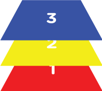
When I was learning to paint, my class did these color mixing exercises where we created the many colors of the spectrum from only the three primary colors: red, yellow, and blue. The purpose of the exercise is to learn the behavior of the medium and the constraints show us the power of combination. You can certainly buy green paint, but you can also create green from blue and yellow. Restricting your available options forces you to re-evaluate the tools you already have.
I decided to start a CSS drawing project, every few days illustrating something new with only CSS. To further challenge and explore what CSS is capable of, I gave myself the constraint of using only a single div in the markup. Instead of buying green paint (or adding another div), I’d need to stretch and combine CSS properties to achieve my goals.
The Toolkit
With only a single div and browser-supported CSS properties, it may seem like the tools are too limited. I found it’s not always what you have to work with, but how you look at them.
Pseudo elements
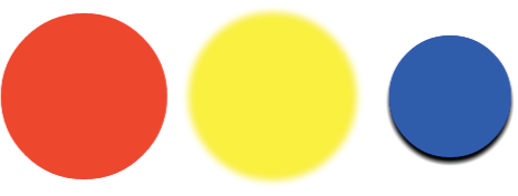
With one div in the HTML, I actually have three elements to work with because of CSS pseudo classes. So with div, div:before, and div:after, we can get something like this:

  div { background: red; }
  div:before { background: yellow; }
  div:after { background: blue; }
It helps to think about these three elements as things that can come in sequence and as three stackable layers. So in my mind, it would usually look more like this:
Shapes
With CSS and one element, we are afforded three basic shape types. We can use width and height properties to create squares/rectangles, border-radius to create circles/ellipses, and border to create triangles/trapezoids.

There are others we can create with CSS, but most things can be simplified to some combination of these shapes. And these are the easiest to create and manipulate.
Multiples of the same shape
With multiple box-shadows, we can create many versions of the same shape in varying size, color, and blur. Offsetting them on the x- and y-axes gives us almost endless multiples.
div {
    box-shadow: 170px 0 10px yellow,
                330px 0 0 -20px blue,
                330px 5px 5px -20px black;
}
We can even give our box-shadows box-shadows. Pay attention to the order they are declared. Again, It’s helpful to think of them as layers.
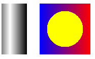
Gradients
Gradients can be used to add shading and depth by implying a light source. This makes the simple, flat shapes feel more realistic. Combining multiple background-images allows us to use many, layered gradients to achieve more complex shading and even more shapes.
div {
    background-image: linear-gradient(to right, gray, white, gray, black);
}

div:after {
    background-image: radial-gradient(circle, yellow 50%, transparent 50%),
                      linear-gradient(to right, blue, red);
}
Visualizing
The most difficult part is visualizing how to piece these parts into a whole recognizable drawing. As much as I focus on the technical aspects of the drawings, this part of the process is critical. To help with this, I’ll often look at a photograph of the subject and break it up visually into pieces. Everything is a shape and everything is a color. I simplify the overall picture into smaller shapes or blocks of color I know can (or suspect can) be achieved with CSS.
Demos
Let’s take a closer look at two drawings and break down some of the pieces that make up the larger pictures. First up is the green crayon.
A crayon is made up of two primary shapes: the rectangular body and the triangular drawing tip.

I had to guarantee the following things to capture a realistic image:
- the different color of the paper wrapper
- the printed graphics and words on the wrapper
- the shading that shows the roundness of the crayon
- the glossiness that shows roundness and a light source
So first, I created the main body of the crayon with the div and a background color, top-to-bottom gradient, and box-shadow to show some dimension:

(Note, I’m using a mixin of black(a) and white(a) here in place of rgba)
div {
    background: #237449;
    background-image: linear-gradient(to bottom,
                                  transparent 62%,
                                  black(.3) 100%);
    box-shadow: 2px 2px 3px black(.3);
}
Then I added a left-to-right linear-gradient to create the wrapper. It has an alpha value of .6 so some of that previous gradient shows through.

div {
    background-image: linear-gradient(to right,
                                  transparent 12px,
                                  rgba(41,237,133,.6) 12px,
                                  rgba(41,237,133,.6) 235px,
                                  transparent 235px);
}
Next I used the same left-to-right gradient technique to create the printed stripes on the crayon.

div {
    background-image: linear-gradient(to right,
                                  transparent 25px,
                                  black(.6) 25px,
                                  black(.6) 30px,
                                  transparent 30px,
                                  transparent 35px,
                                  black(.6) 35px,
                                  black(.6) 40px,
                                  transparent 40px,
                                  transparent 210px,
                                  black(.6) 210px,
                                  black(.6) 215px,
                                  transparent 215px,
                                  transparent 220px,
                                  black(.6) 220px,
                                  black(.6) 225px,
                                  transparent 225px);
}
And for the printed ellipse, a radial-gradient works great!

div {
    background-image: radial-gradient(ellipse at top,
                                  black(.6) 50px,
                                  transparent 54px);
}
I have it broken up to demonstrate each piece, but keep in mind the background-image would actually look like this:
div {
                      // ellipse printed on wrapper
    background-image: radial-gradient(ellipse at top,
                                  black(.6) 50px,
                                  transparent 54px),
                      // printed stripes
                      linear-gradient(to right,
                                  transparent 25px,
                                  black(.6) 25px,
                                  black(.6) 30px,
                                  transparent 30px,
                                  transparent 35px,
                                  black(.6) 35px,
                                  black(.6) 40px,
                                  transparent 40px,
                                  transparent 210px,
                                  black(.6) 210px,
                                  black(.6) 215px,
                                  transparent 215px,
                                  transparent 220px,
                                  black(.6) 220px,
                                  black(.6) 225px,
                                  transparent 225px),
                      // wrapper
                      linear-gradient(to right,
                                  transparent 12px,
                                  rgba(41,237,133,.6) 12px,
                                  rgba(41,237,133,.6) 235px,
                                  transparent 235px),
                      // crayon body shading
                      linear-gradient(to bottom,
                                  transparent 62%,
                                  black(.3) 100%)
}
So after completing the div, I moved on to the :before pseudo element to create the crayon’s triangular tip. Using solid and transparent borders, I made a triangle and positioned it next to the div I just drew.

div:before {
    height: 10px;
    border-right: 48px solid #237449;
    border-bottom: 13px solid transparent;
    border-top: 13px solid transparent;
}
It looks a little flat next to the crayon’s body, but it will be fixed with the :after pseudo element. With this, I added a top-to-bottom linear-gradient to create a reflective gloss effect that spans the width of the crayon.

div:after {
    background-image: linear-gradient(to bottom,
                                    white(0) 12px,
                                    white(.2) 17px,
                                    white(.2) 19px,
                                    white(0) 24px);
}
This adds even more dimension and realism and helps with that flat triangle. As a finishing touch, I added some text content to the :after and positioned it as another printed element on the crayon’s wrapper.

div:after {
    content: 'green';
    font-family: Arial, sans-serif;
    font-size: 12px;
    font-weight: bold;
    color: black(.3);
    text-align: right;
    padding-right: 47px;
    padding-top: 17px;
}
And that’s it!
Let’s take a look at another one
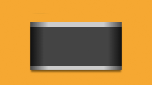
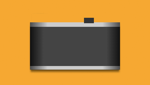
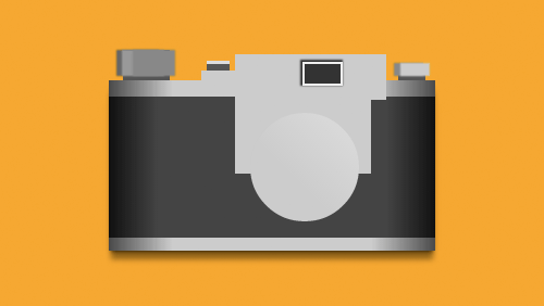
The crayon is a good example of using background-image and gradients to produce realistic results. Here’s an example that shows the power of multiple box-shadows: a single div camera.
Here’s the body of the camera, created with background-image and border-image.
Here’s a gif illustrating the :before pseudo element (the black rectangle) and the many details created with its box-shadows.
div:before {
    background: #333;
    box-shadow: 0 0 0 2px #eee,
                -1px -1px 1px 3px #333,
                -95px 6px 0 0 #ccc,
                30px 3px 0 12px #ccc,
                -18px 37px 0 46px #ccc,

                -96px -6px 0 -6px #555,
                -96px -9px 0 -6px #ddd,

                -155px -10px 1px 3px #888,
                -165px -10px 1px 3px #999,
                -170px -10px 1px 3px #666,
                -162px -8px 0 5px #555,

                85px -4px 1px -3px #ccc,
                79px -4px 1px -3px #888,
                82px 1px 0 -4px #555;
}
Similarly, here’s the :after (the grey circle) and its several box-shadow details.
div:after {
    background: linear-gradient(45deg, #ccc 40%, #ddd 100%);
    border-radius: 50%;
    box-shadow: 0 3px 2px #999,
                1px -2px 0 white,
                -1px -3px 2px #555,
                0 0 0 15px #c2c2c2,
                0 -2px 0 15px white,
                -2px -5px 1px 17px #666,
                0 10px 10px 15px black(.3),

                -90px -51px 1px -43px #aaa,
                -90px -50px 1px -40px #888,
                -90px -51px 0 -34px #ccc,
                -90px -50px 0 -30px #aaa,
                -90px -48px 1px -28px black(.2),

                -124px -73px 1px -48px #eee,
                -125px -72px 0 -46px #666,
                -85px -73px 1px -48px #eee,
                -86px -72px 0 -46px #666,
                42px -82px 1px -48px #eee,
                41px -81px 0 -46px #777,
                67px -73px 1px -48px #eee,
                66px -72px 0 -46px #666,

                -46px -86px 1px -45px #444,
                -44px -87px 0 -38px #333,
                -44px -86px 0 -37px #ccc,
                -44px -85px 0 -34px #999,

                14px -89px 1px -48px #eee,
                12px -84px 1px -48px #999,
                23px -85px 0 -47px #444,
                23px -87px 0 -46px #888;
}
A little crazy, but as you can see, multiple box-shadows can add a lot of detail to a single div drawing.
Biggest challenges
Two of the biggest obstacles I came across were limitations around triangle shapes and the natural behavior of gradients.
The trouble with triangles
Because triangles are created using borders, it limits how much I can do with them. Adding gradients with border-image apply to all the borders, not just one side. Box-shadows apply to the shape of the box, not the triangle shape the border creates, so creating multiple triangle shapes can be difficult. Here’s an example of what that looks like:

div {
    border-left: 80px solid transparent;
    border-right: 80px solid transparent;
    border-bottom: 80px solid red;
}

div:before {
    border-left: 80px solid transparent;
    border-right: 80px solid transparent;
    border-bottom: 80px solid red;
    border-image: linear-gradient(to right, red, blue);
}

div:after {
    border-left: 80px solid transparent;
    border-right: 80px solid transparent;
    border-bottom: 80px solid red;
    box-shadow: 5px 5px 5px gray;
}
Layering gradients
With gradients, their natural behavior is to fill the entire background. This can get a little tricky when layering multiple gradients on top of each other. It takes some extra time to think through transparency, z-index, and understanding what will and won’t be visible. By using this technique effectively, our drawings can have surprising detail.
The Tardis is a good example of showing and hiding gradients to create a detailed picture. Here’s the drawing mid-process that shows some of the top-to-bottom gradients that span the entire width of the container.
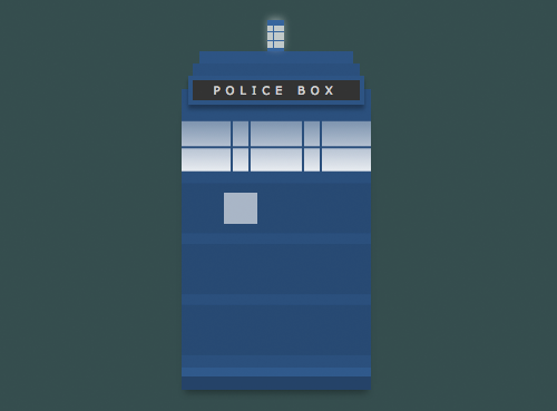
Using left-to-right and right-to-left gradients, I was able to cover parts of the gradient and leave some parts exposed.
The resulting drawing appears to have many shapes making up the front facade of the Tardis, but it’s strategically layered linear-gradients. Sometimes you have to fake it.
See them in action
One awesome thing that popped up because of this project is a really cool and useful Chrome browser extension by Rafael Carício called CSS Gradient Inspector. It extends the developer tools to inspect and toggle on/off each element’s gradients as if they were layers. (It’s very helpful with everyday projects, too.)
I’m super excited to see designers and developers experimenting and riffing on these drawings with animations and JavaScript functionality. Check out the site and play around with the CSS yourself at a.singlediv.com or on GitHub!
About Lynn Fisher
Lynn Fisher is an artist and designer based in Chandler, Arizona. She works with the fine folks at &yet where she designs and develops interfaces and occasionally draws pictures. She loves mixing art and technology and improving the way designers and developers work together.
About Robert Nyman [Editor emeritus]
Technical Evangelist & Editor of Mozilla Hacks. Gives talks & blogs about HTML5, JavaScript & the Open Web. Robert is a strong believer in HTML5 and the Open Web and has been working since 1999 with Front End development for the web - in Sweden and in New York City. He regularly also blogs at http://robertnyman.com and loves to travel and meet people.
17 comments