
 By
By
This is a guest post by Markus Stange. Markus usually works on the Firefox Mac theme implementation, but this time he went on a small side trip through the Gecko layout engine in order to implement -moz-element.
In Firefox Beta 4 we’re introducing a new extension to the CSS background-image property: the ability to draw arbitrary elements as backgrounds using -moz-element(#elementID).
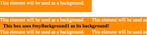
  This element will be used as a background.


  This box uses #myBackground1 as its background!
A -moz-element() image works just like a normal url() image. That means it’s subject to all the familiar background properties like background-position, background-repeat, and even background-size.
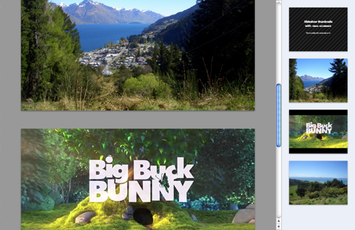
Using background-size you can create a thumbnail of the referenced element, for example:
#thumbnails li {
  width: 160px;
  height: 120px;
  background-repeat: no-repeat;
  background-size: contain;
}
There are three things to keep in mind about -moz-element:
-
It’s live: whenever something happens in the referenced element, the
-moz-elementbackground image will be updated. It will also show things like text selection or blinking carets. -
It’s purely visual. That means you can’t “click through” to the original element. That’s by design.
-
It works with any HTML element. Even with
<iframe>…
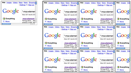
…
<video>…
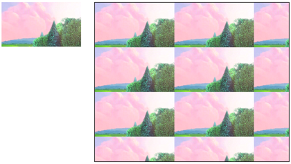
… and
<canvas>.
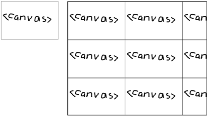
Canvas-as-background is in fact useful for some applications. For example, if you’re applying sepia tone to CSS background images in the browser, you now no longer have to convert the processed canvas image into a data URI. Instead, you can just set the canvas itself as the background image.
Using a canvas as a background image is supported by Webkit, too, using -webkit-canvas().
Painting loops
A quick note on recursive references: If you try to paint an element that is already being painted via -moz-element, a painting loop will be detected and prevented. So you’ll need to think of a different way of drawing your Sierpinski carpets.
Hiding the Referenced Element
Sometimes you don’t want the original referenced element to be visible, only the -moz-element background image. So what do you do? You can’t just set display: none or visibility: hidden on the element, because then there’s nothing to draw in the -moz-element background image either – it will be transparent.
Instead, you need to prevent the element from being rendered on the screen without really hiding it. One way of doing that is to wrap it with another element that has height: 0; overflow: hidden; set on it.
There are three types of elements that are exempt from this rule: images, canvases and videos. These kinds of elements can have display: none and still be used in -moz-element. In fact, they don’t even need to be in the DOM.
New DOM API:
document.mozSetImageElement
We added a new method to the document object: document.mozSetImageElement(<elementID>, <element>).
Consider this piece of code:
var slide5 = document.getElementById("slide-5");
document.mozSetImageElement("current-slide", slide5);
Now all elements with background-image: -moz-element(#current-slide) will draw the element with the ID slide-5, even if there is a real element with the ID current-slide!
Calling document.mozSetImageElement("current-slide", null) will stop the override.
This API can be handy in a variety of use cases. I already alluded to one of them in the previous section: with mozSetImageElement you can use canvas and image elements that aren’t part of the DOM tree.
var img = new Image();
img.src = "my_image.png";
document.mozSetImageElement("image", img);

var canvas = document.createElement("canvas");
canvas.width = canvas.height = 100;
var ctx = canvas.getContext("2d");
// ... draw into ctx ...
document.mozSetImageElement("canvas", canvas);
Another scenario that benefits from mozSetImageElement involves JavaScript utility libraries. You might have a function like this:
var runningNumber = 0;
function addReflectionToElement(reflectedElement) {
  var referenceID = "reflected-element-" + runningNumber++;
  var reflection = document.createElement("div");
  reflection.className = "reflection";
  reflection.style.backgroundImage =
    "-moz-element(#" + referenceID + ")";
  document.mozSetImageElement(referenceID, reflectedElement);
  // ... insert reflection into the DOM ...
}
This way you can minimize the impact of your utility function because you don’t have to manipulate the ID of the element that was passed in.
Finally, mozSetImageElement also allows you to reference elements from other documents, for example from inside iframes – obeying same origin restrictions, of course.
-moz-element for SVG paint servers: patterns and gradients
If you’ve ever written any SVG by hand you’re familiar with the concept of paint servers: those are the things you can use in your fill and stroke attributes when you don’t just want a single solid color. Now you can use them on HTML elements, too, using -moz-element:
  This element has both types of SVG paint servers
  in its background: a pattern and a gradient.
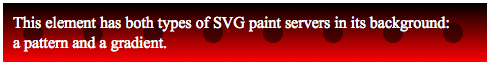
Note that we didn’t even have to use XHTML in order to be able to embed SVG thanks to our new HTML5 parser.
This feature overlaps the functionality of CSS gradients and SVG images, but is very useful in some situations, such as animations. For example, say you want to create a progress bar with an animated gradient like this:
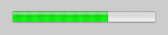
You could do this with a CSS gradient and some JavaScript that periodically updates the background-position property. But you could also use an SVG gradient that’s animated with SMIL, requiring no JavaScript whatsoever:
The same could be achieved with CSS animations, but as long as they’re not implemented in Gecko you can use this.
Support for SVG as a CSS background (bug 276431) will be added soon.
Also, here’s a CSS + SVG Pacman for you.
Applications
I have two more suggestions for -moz-element usage:
Reflections
What is a reflection?
#reflection {
  /* It's a copy of the original element... */
  background: -moz-element(#reflected-element)
              bottom left no-repeat;

  /* ... turned upside down ... */
  -moz-transform: scaleY(-1);

  /* ... with a gradual fade-out effect towards the bottom. */
  mask: url(#reflection-mask);
}
Because we can apply arbitrary styles to the reflection, we can produce effects like animated water ripples.
Fancy Slide Transitions
In this demo I’d like to have a slideshow transition that looks like the upper half of the previous slide gets folded down to reveal the next slide:
How would you implement this? You’ll obviously need to use some kind of transform, but on what element? The upper half of the slide needs to have a different transform than the lower half, so you can’t just set the transform on the slide itself.
I ended up creating four new elements: #previousUpper, #previousLower, #nextUpper and #nextLower. I put them into a separate container called #transition which is only made visible while a transition is in progress. Then I gave them the right size and assigned the corresponding subimage of the previous / next slides to them using background-image: -moz-element(#previous/nextSlide) and the right background-position. And finally I set the transform on these helper elements.
The code for it gets quite complex, though, so I’ll just direct you to the finished demo.
More?
My ideas for -moz-element demos have run out for the moment, but there’s bound to be more stuff one can do with it. Now it’s your turn!
Credits
Most of the credit here should go to Robert O’Callahan who cooked up the initial implementation back in 2008. After his initial experiments he had to work on more important things, though, so his patches lay dormant for about a year until he started a newsgroup thread to work out the right API in July 2009. Shortly after that, Ryo Kawaguchi revived roc’s work and spent the last weeks of his internship at Mozilla on it. Another year later I made the patch ready for review and drove it through the final stages until checkin.
The same warnings as for mozRequestAnimationFrame apply: -moz-element and document.mozSetImageElement are experimental APIs. We do not guarantee to support them forever, and we wouldn’t evangelize sites to depend on them. We’ve implemented them so that people can experiment with them and we can collect feedback. We’ll propose it as a standard (minus the moz prefix, obviously), and author feedback on our implementation will help us make a better standard.
About Paul Rouget
Paul is a Firefox developer.
37 comments